In the previous post I described how to visualize category data and a bar chart was the best choice then. However, when you want to illustrate data variables over time, the solution would be different, but very straightforward – mainly line charts. Why are they so popular? A major reason is that by linking data points you can present their continuity, which facilitates interpreting data as a timeline. As it was in the case of bar charts, there are many variants of line charts too. In the below post, I will try to present the best examples of visualizing data over time using a line chart and its varieties.
A line chart is the basis
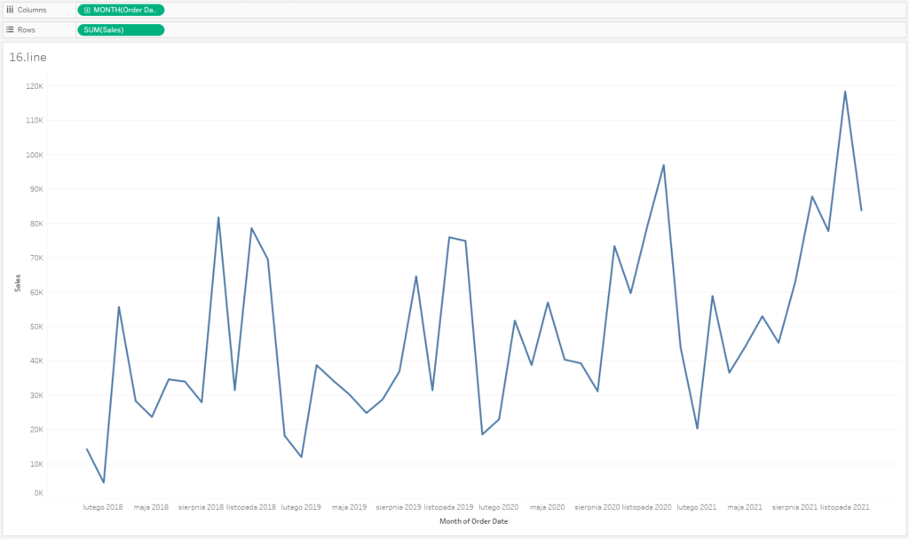
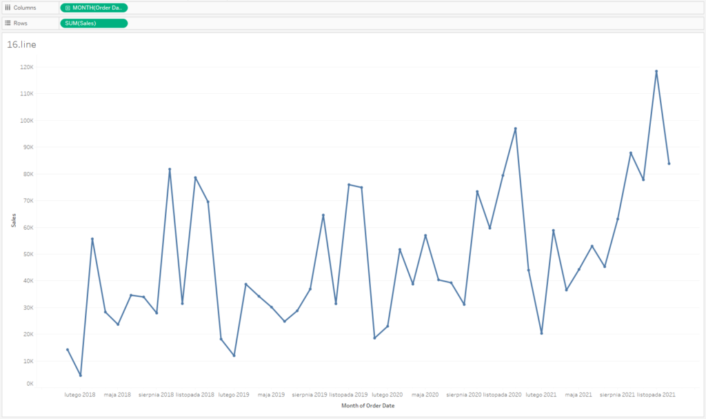
The basic line chart is a very helpful tool that can be used in most business dashboards. Why? Because it provides historical data about the trends of the analyzed factors. This way you add context to your data, which allows you to evaluate if the factors are growing, stable or declining. Let’s see how this works in practice. To create a line chart in Tableau you will need a measure which will be analyzed and a continuous time dimension, such as days, months, quarters, years:
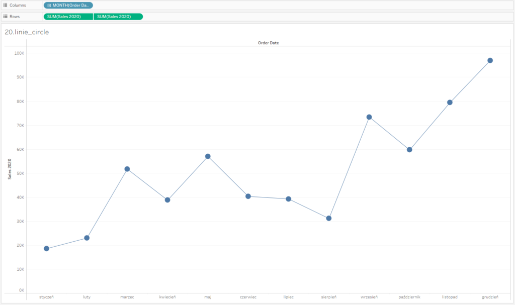
If you want to enhance the visual message, you can highlight data points with separate markers. This way you will focus users’ attention on data points, and by joining data points you highlight their continuity. You can achieve this effect in Tableau in two ways – by adding data markers or creating a dual-axis line and a point chart. Let’s start with data markers – you set this in the Color field and select Markers. The result will be as follows:
However, this approach is problematic – markers are rather small; you need to change their size, and also thickness of the line at the same time to keep a sense of proportion. If you want to separately control the size of a line and marker, it’s best to use a dual-axis for the same measure – a separate line chart and a separate point chart. It allows you to increase the size of markers and decrease the line thickness, directing users’ attention to data points.
A line chart and several categories
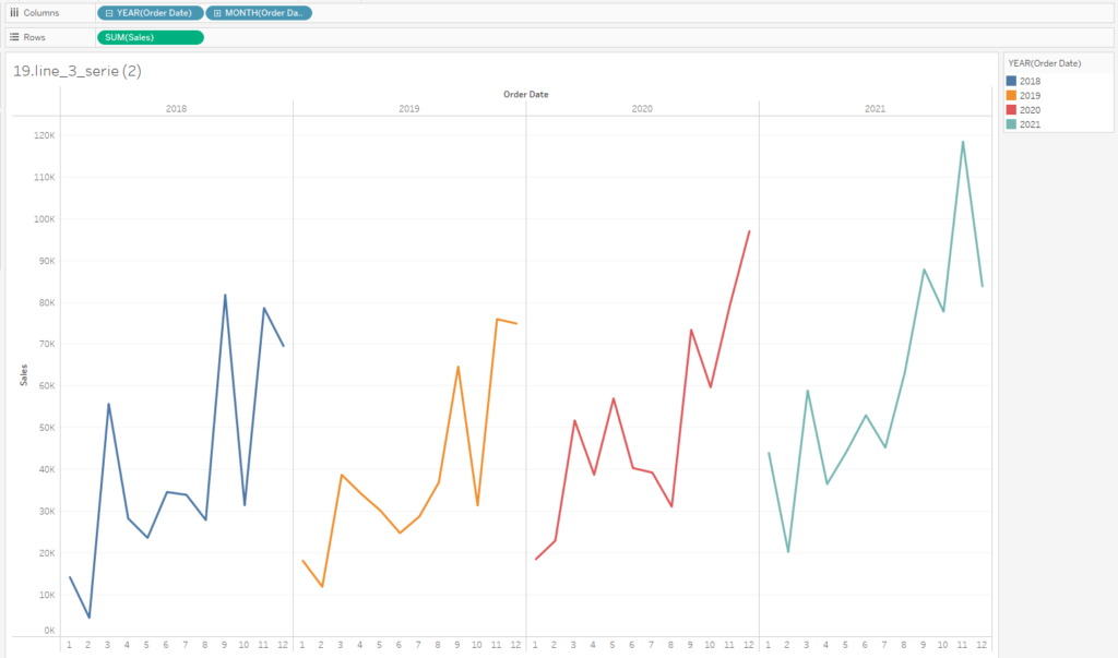
A line chart is a helpful solution for visualizing several categories in one graph. The easiest way to do that is to place the categories in the Color field. In our example, these are years – we are able to compare the size of a specific indicator in the same months over various years:
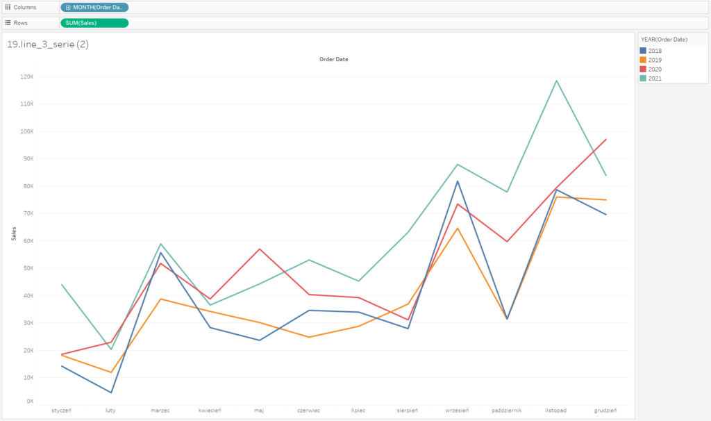
You need to be careful, as your chart might become illegible when you add many categories, and as a result you will get a “spaghetti chart.” What to do in this case? The best solution is to separate the charts either horizontally or vertically:
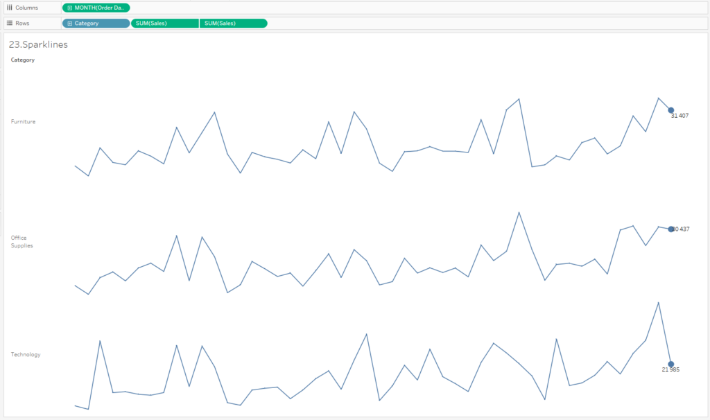
An extremely popular solution in the business dashboards is to use Spark lines – small graphs of trend lines that enhance visualizing KPIs. In the below case we also emphasize the most current value by adding a marker and a label. It’s worthwhile to remove all distracting elements on the charts (axes, grid lines, frames).
Alternatives for Line Charts
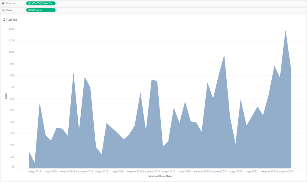
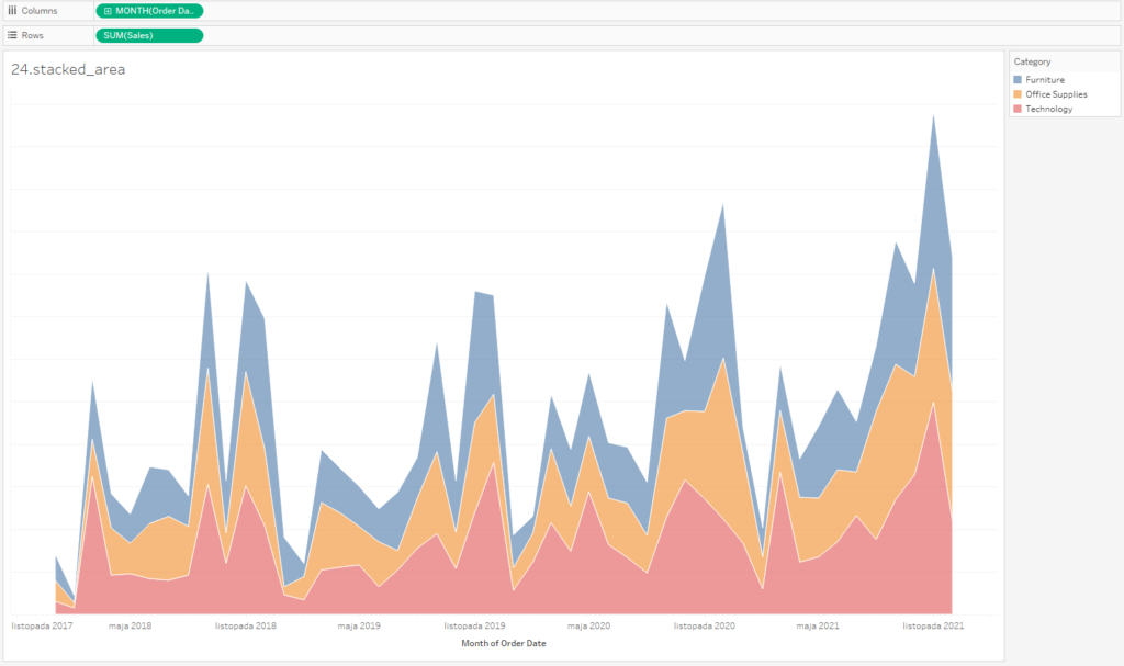
In most cases, a line chart is the best choice, however there are other alternatives. One of the most commonly used is the area chart – in addition to the line, there is also a color area between the zero axis and the data line. When analyzing the data that can be aggregated by a sum (e.g. sales value, quantity) – it is a good idea when the area represents the size of the data. However, if you analyze indicators (e.g., prices), a line chart will be a better choice.
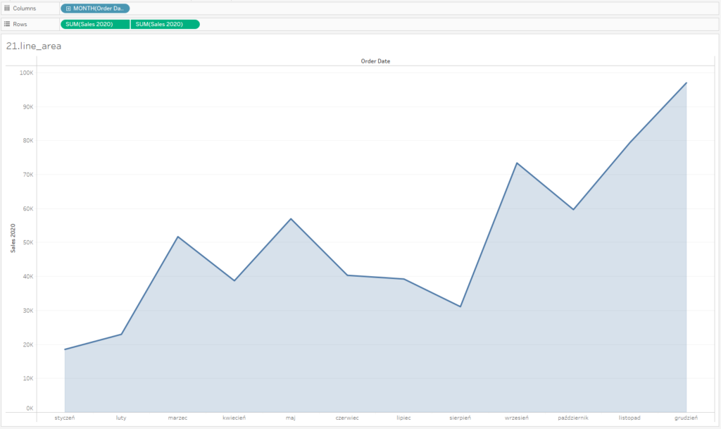
If you combine a line chart with an area chart, you will get a visually attractive alternative of a bar chart, with reduced transparency of the area below the line. This way you can focus users’ attention mainly on the line, and the area indicates that the data is aggregated:
A drawback of the area chart is its limited use when you have more than one set of data – then the data categories overlap each other and it’s hard to read the trends for the categories situated above, as they don’t have a common reference point. In this case it’s quite easy to analyze only the category on the X-axis:
What about columns?
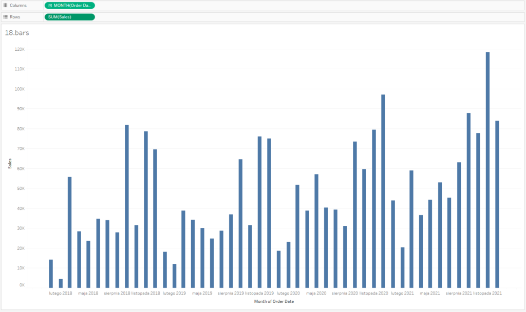
Column charts are widely used to visualize time data. A column chart is a vertically-oriented bar chart. Bar chart is a perfect choice when you want to visualize category data. For this reason, column charts (vertically aligned bar charts) are not a good option for visualizing timelines – there are no links between data points. Their advantage is that it’s easy to compare values.
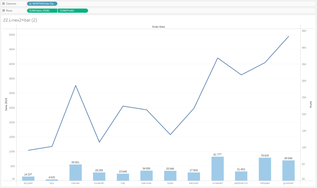
A column chart can be used to visualize two different indicators – you can display one indicator as bars (e.g., sales) and the other as a line (e.g., price).
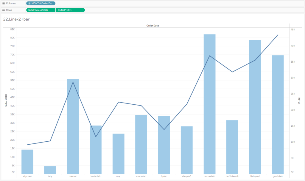
It’s recommended to separate series of data to ensure the transparency of both charts. In this situation you treat one information as the main input (in the below example the profit as a line-chart), and the second as the supplementary data input (sales as columns).
Categories – Bar Chart, Time – Line Chart
When visualizing business data, it’s not only good to use tried-and-tested solutions, but also the simplest ones. In terms of categories, the best option is usually to go for a bar chart, whereas for showing time trends – a line chart is recommended. It’s easy to interpret, it’s intuitive and provides a historical context. This is essential in analyzing performance indicators – by looking at the historical data, you are able to evaluate the actual condition of your business.
Mateusz Karmalski, Tableau Author


