In the previous posts of the series “60 Charts in Tableau”, I described visualization methods for presenting the category and time data, the elements of the whole and relationships. Let’s recall them – bar charts are recommended for category data and line charts are suitable for time data. There were more options for the elements of the whole, depending on the type of data. When it comes to relationships, we touched again on one preferred option – scatterplot. The above categories encompass a really wide area of the visual data analytics, however, there are many other solutions available. I will present some of them in the last post of this series.
Maps in Tableau
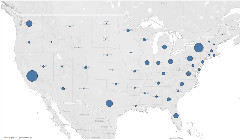
Wherever you need to work with the localization data, maps are a preferable visualization technique. They allow you to easily present the geographical exposition of your data to your recipients. The point map is the basic way to visualize geographical data, where you use points to represent the location (of the client, facilities, store, factory, collection point) – this can be the exact location (coordinates), or a post-code or administrative unit. The size of the data point represents the selected measure. In the below example you can see the sales for the United States:
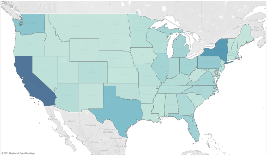
The second basic type of maps is filling. In this case the areas are the essence (usually administrative areas such as counties/states, but also smaller like provinces/municipalities), which is filled with color depending on the value of the specific measure:
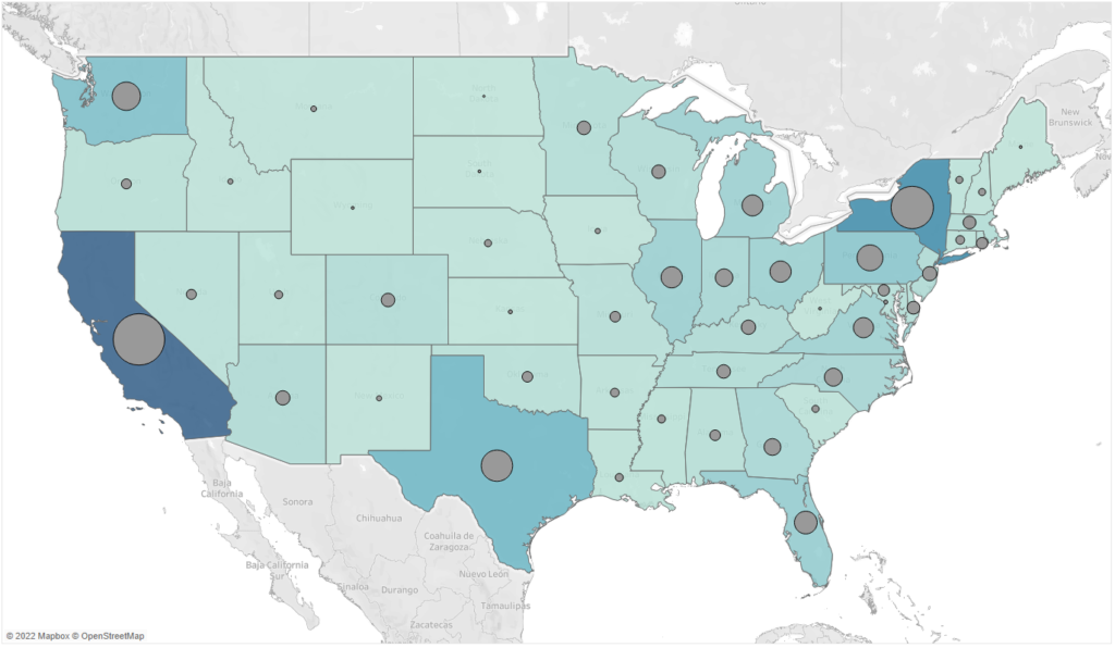
Which solution is better? It all depends on your business needs. In the case of filling, the interpretation is slightly more difficult – it’s harder for human beings to notice a difference in the color density. It is easier to compare the sizes – data points. But also, here it’s more difficult to compare the sizes of wheels than bars. Moreover, users can miss smaller areas which optically fade when placed near larger areas. For these reasons, maps are the best choice; they can also serve as the additional, illustrative source of information rather than the main source of data. The above examples don’t cover all applications of maps in data visualization, especially in Tableau. You can combine both these approaches and create a map with two layers – filling and points – and visualize two measures at the same time:
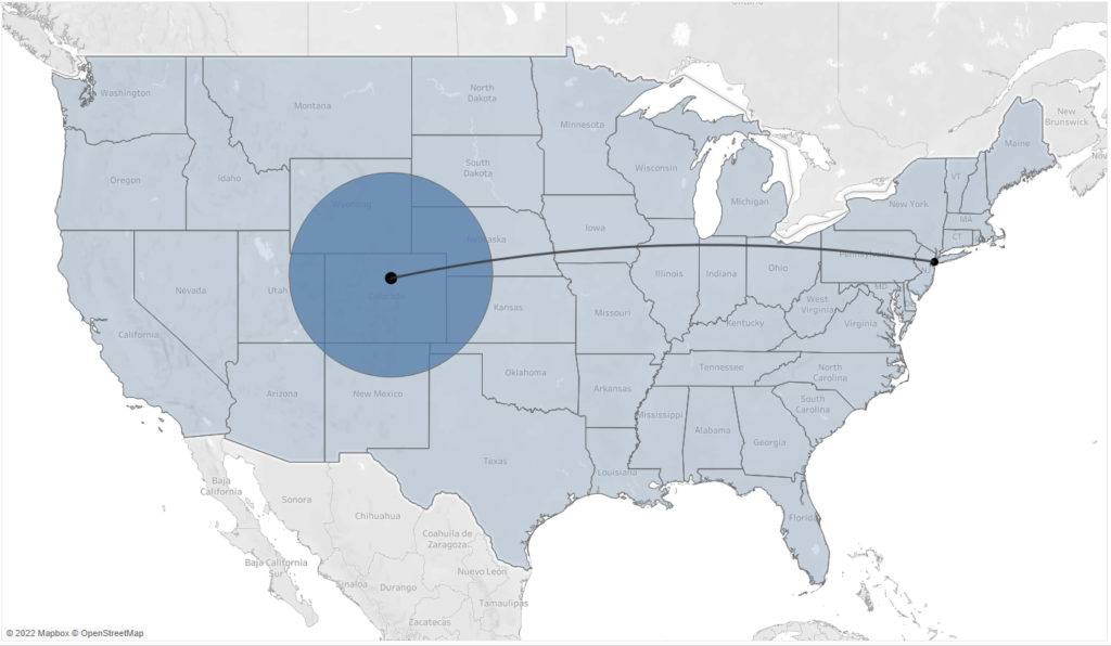
In addition to the informative function, maps can also support the optimization of the geographical exposition. For this purpose, you can use such functions as buffer (to mark the area around the data point) and makeline (to create links between points). The layer function that has been recently added to maps, helps combine several types of maps in order to create practical tools:
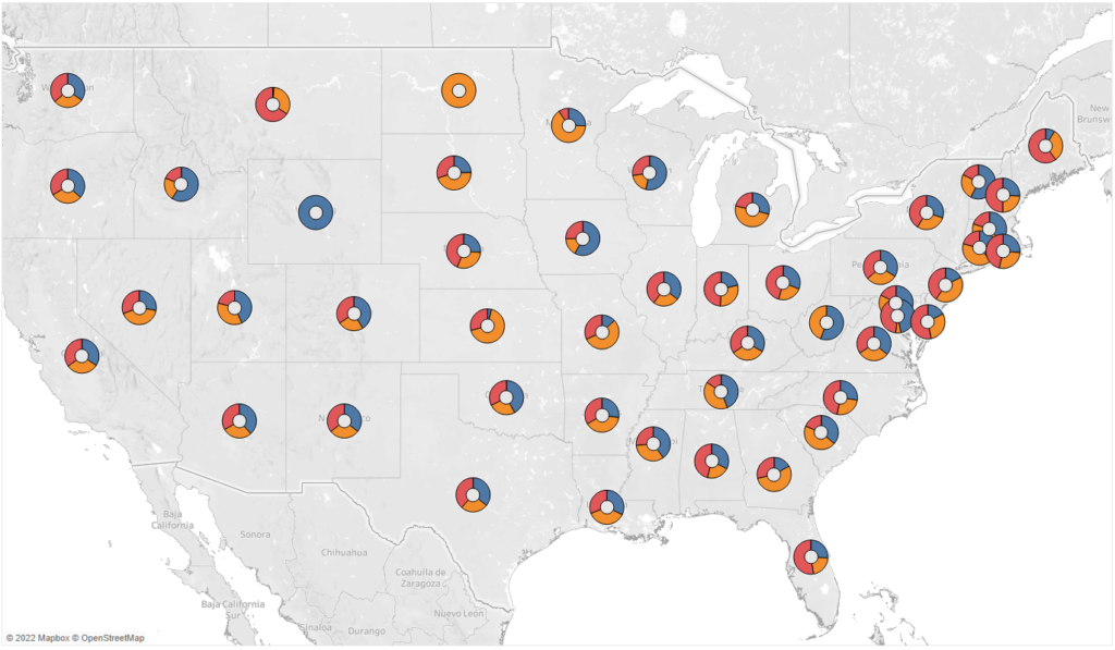
You can insert not only data points to your maps, but also whole charts. Below is an example map with donut charts:
Tables
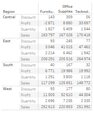
Tables are certainly associated with Excel and data visualization seems to be the area that avoids using tables, as they seem to be an unattractive medium of communication. However, they can be successfully used to facilitate the transition Excel BI Tools, but also to provide access to the desired detailed data. In addition, it is pretty easy to animate tables in Tableau and make them more attractive. Below you can see a standard table and a visually enhanced highlight table:
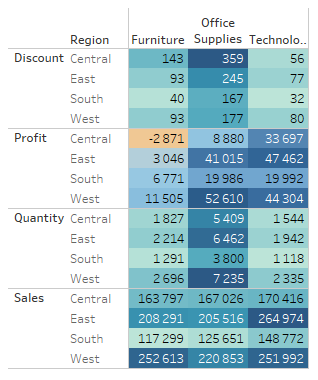
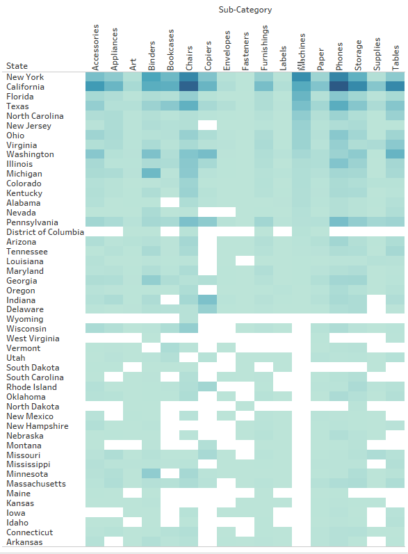
This simple operation will allow you to focus the user’s attention on the biggest values or deviations. When working with a large amount of data, and when the general position of the desired areas is more important than the exact values, you can remove the values and leave the colors to create a heat-map:
Tables, similarly to maps, are best suited as the additional function in visualization. They enable us to access detailed information, which might be important for some users. For this reason, tables are one of the tools used in data visualization, however they are not at the core of it.
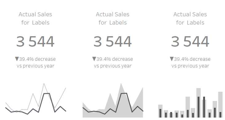
KPI Card
When designing dashboards, we usually use a top-down approach. We start from general, overall KPIs and we gradually go into details that enable us to understand the indicators, their deviations and evolution. In order to quickly find the most essential information in a dashboard we use KPI Cards, which usually contain:
- Performance of the KPI
- A deviation from the reference (target, budget, previous period)
- A time trend
Such a card allows you to quickly evaluate the content of the KPI, whether its performance falls above or below the reference, and understand the trend. From the management point of view, it’s an excellent starting point for further exploration of results, in particular that it doesn’t take up much space on the dashboard:
Sky is the limit
When it comes to other visualization techniques – there are plenty of them such as Sankey Chart, Likert Scale, Marimekko, bump, flow, stream or rose chart – the possibilities are unlimited. However, when visualizing data, you need to make sure the communication is simple, intuitive and easy to grasp by users. Therefore, in business applications it is preferable to rely on the basic charts, depending on the type of data you are working on. However, if your objective is to attract the user’s attention and to focus more on the visual aspect than on the functional one – then not even sky is the limit.
Mateusz Karmalski Tableau Author


