NewDataLabs

Tableau - Business Intelligence Tools

  • Solutions
    • ETL
      • Tableau Prep
      • Airflow
      • Power Query
      • Microsoft Integration Services
      • Fivetran
    • Data warehouses
      • Snowflake
      • Google Big QUERY
      • Microsoft SQL Server
      • PostgreSQL
      • Web analytics
      • Amplitude
    • Business Intelligence
      • Tableau
        • What is Tableau?
        • How to implement Tableau properly?
        • Interactive management dashboard
        • Tableau price list
        • Products of Tableau
          • – Tableau Desktop
          • – Tableau Server
          • – Tableau Prep
          • – Tableau Online
        • Tableau Audit
        • Tableau Day
      • Power BI
  • Services
    • Tableau workshops on your data – Proof of Concept
    • Preparation of data – ETL
    • Reporting and data visualization
    • Migration services
    • Tableau training courses
    • Embedded Analytics
  • Salesforce
    • Salesforce CRM
      • Customer relationship management
      • Sale
        • Sales opportunity management
      • Business Intelligence analysis
      • Salesforce Manufacturing Cloud
      • Salesforce Service Cloud
      • Salesforce Marketing Cloud
    • Services
      • Proof of Concept
      • CRM workshops
      • Implementation of CRM
      • Post-implementation support
      • Data migration
      • Salesforce training
      • CRM consultancy
      • Salesforce integrations
    • Tableau + Salesforce
  • About Us
  • Customers
    • Our Customers
    • Customer stories
      • Totalizator Sportowy Sp. z o.o.
      • Snieżka S.A.
      • Werner Kenkel Sp. z o.o.
      • DOZ S.A.
  • Events
    • Webinars >
      • Salesforce
      • Tableau
      • Power BI
    • Tableau Training Courses >
      • New Data Model
      • Tableau online course
      • Tableau training courses
    • Power BI Training Course
  • Blog
  • Download Tableau
    • Tableau Desktop – Trial
    • Tableau Server – Trial
    • Tableau Prep – Trial
    • Tableau Reader
  • Contact
EN / PL

Scatterplot – secrets

2022-04-14

Scatterplot is a very simple graph. In fact, two measures will suffice. In doing so, however, it focuses Tableau’s logic for creating visualizations as if through a lens. Here we can see the principle of aggregation of measures and the effect of dimensions on the detail of the image. And of course, he also has his little secrets.

The simplest scatteplot, or two measures

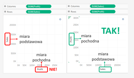
A basic scatterplot will be obtained by placing one measure on the Rows shelf and another on the Columns shelf. This process, by the way, can be further simplified. Just double-click on each measure and you’re done. But there is one small pitfall here as well. If the measures are dependent, then the primary measure should be on the x-axis and the derivative on the y-axis. A good example is sales and profit. Profit and loss are always related to sales volume. So sales should be on the x-axis.

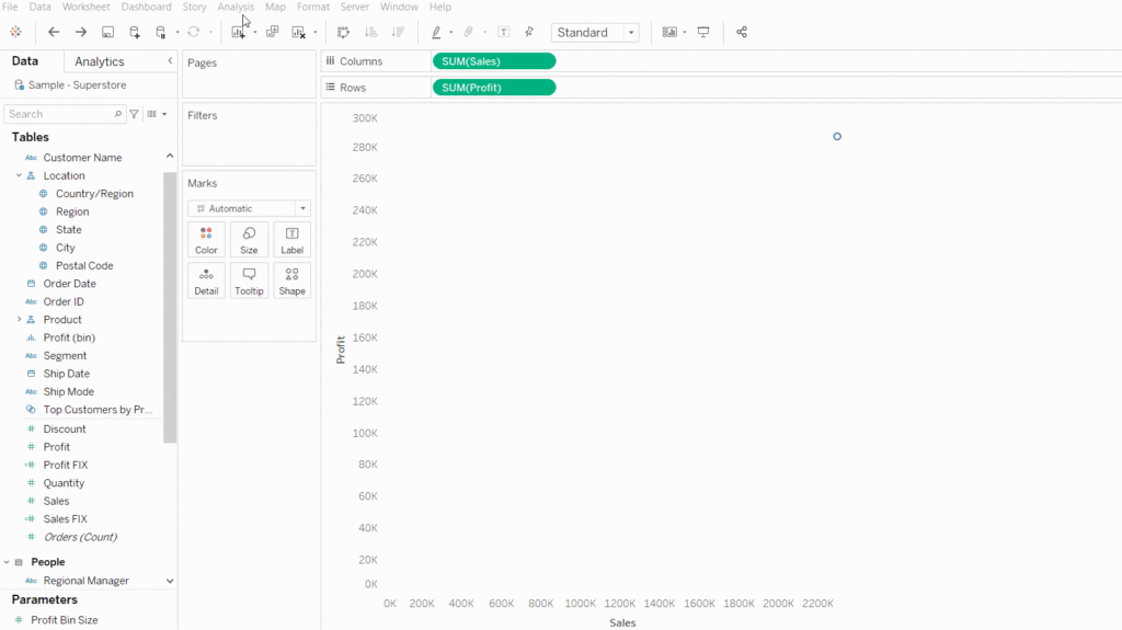
This simplest scatterplot has a drawback. It consists of exactly one dot. Why? Because if our visualization does not have a specific level of detail, summary data for the entire dataset will be displayed. One aggregate sales value and one aggregate profit value. What can be done to make the chart more useful? There are two possibilities.

Multiple points, or the more practical side of scatterplot

The first option is to show the chart at the level of a single table row. For example, Sample Superstore data is a table where a single row is one type of item on an order. In our reality we would say – an item on an invoice. So, in such a graph, we will see a point representing the combination of sales and profit for each item on each order. How can we achieve this? Simply select Analysis in the top text horizontal menu, then uncheck Aggregate Measures. Instead of a single “aggregate” dot, the graph will show a dot for each row of data in the table being analyzed.

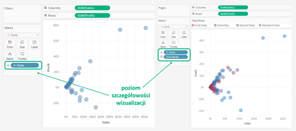
The second alternative is to create a scatterplot where each point represents an element of a particular dimension or combination of dimensions. To achieve this effect, we place the dimensions we are interested in on one of the shelves that affect the level of detail in the visualization (Rows, Columns and Marks, except Tooltip).

In the first example below on the Marks shelf, the Detail tab places the State dimension. This allows the points to represent the combination of sales and profit for each U.S. state. In the second example, there is additionally a Ship Mode dimension in the Color tab. In this situation, four points of different colors are displayed for each state, showing the measure level for the four dispatch modes. Adding more dimensions will multiply the number of points on the graph.

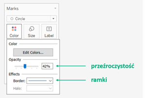
For this graph, it is recommended to change the base visualization type from Shape to Circle, and to reduce the transparency level of the graph so that points under others are also visible. In addition, best practice involves adding delicate frames to them.

Scatter Pie Chart: Don’t do it at home!

Sensitive readers, I apologize in advance for the remainder of this post. This visualization has nothing to do with visual best practice. It is not safe for either the creators or the audience. Some say it looks like lurking voracious maggots. Others only hiss “Brain-shake!” So don’t do it alone at home. Nevertheless, this visualization has one interesting feature. Shows how to break the rule for determining the number of points on a scattreplot.

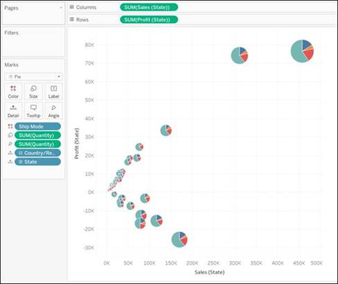
This particular variety of scatterplot is a scatter pie chart. Here, the level of detail at which each point will be drawn must be specified right away in the calculations. So I create a circle graph for each state in the U.S. and write calculations accordingly:

Instead of sum([Sales]): {FIXED [State]: sum([Sales])},

and insteadofsum([Profit]): {FIXED [State]: sum([Profit])}.

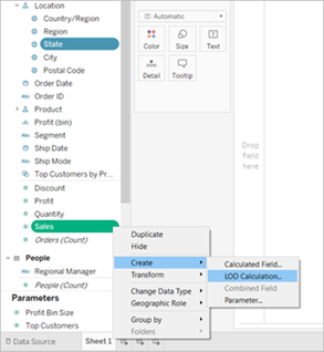
When creating them, as of Tableau 2021.2, you can use quick LOD calculations, which you create as shown below.

When the calculations are ready, we can place the measures in rows and columns, respectively, and the [State] dimension on the Marks shelf in the Detail tab. We change the visualization type to Scatter Plot. Just a dimension [Ship Mode] to the Color tab, and an additional measure [Quantity] to the Angle and Size tabs, and the visualization is ready.

Agata Mężyńska

Tableau Desktop Certified Professional

Webinars
> Amplitude Webinars
> Tableau Webinars
> Power BI Webinars

Tableau training courses
Power BI online course
ETL
> Tableau Prep
> Airflow
> Power Query
> Microsoft Integration Services
Data warehouses
> Snowflake
> Google BigQuery
> Microsoft SQL Server
> PostgreSQL
Business intelligence
> Tableau
> Salesforce
> Power BI
Web analytics
> Amplitude
Salesforce
> Customer relationship management
> Sale
> Sales opportunity management
> Analysis Business Intelligence
> Salesforce Manufacturing Cloud
> Salesforce Service Cloud
> Salesforce Marketing Cloud
Contact

contact@newdatalabs.com


601797783
+48 781 648 194


Adres
Correspondence address:
al. T. Boy’a – Żeleńskiego 26,
51-160 Wrocław

Copyright © 2025

Manage Consent
To provide the best experiences, we use technologies like cookies to store and/or access device information. Consenting to these technologies will allow us to process data such as browsing behavior or unique IDs on this site. Not consenting or withdrawing consent, may adversely affect certain features and functions.
Functional Always active
The technical storage or access is strictly necessary for the legitimate purpose of enabling the use of a specific service explicitly requested by the subscriber or user, or for the sole purpose of carrying out the transmission of a communication over an electronic communications network.
Preferences
The technical storage or access is necessary for the legitimate purpose of storing preferences that are not requested by the subscriber or user.
Statistics
The technical storage or access that is used exclusively for statistical purposes. The technical storage or access that is used exclusively for anonymous statistical purposes. Without a subpoena, voluntary compliance on the part of your Internet Service Provider, or additional records from a third party, information stored or retrieved for this purpose alone cannot usually be used to identify you.
Marketing
The technical storage or access is required to create user profiles to send advertising, or to track the user on a website or across several websites for similar marketing purposes.
Manage options Manage services Manage {vendor_count} vendors Read more about these purposes
View preferences
{title} {title} {title}