Data visualization can be a great tool that helps tell a story, explain the past and draw conclusions about the future. It can also overload the audience with excessive information, charts and colours. Bearing that in mind, you should use visualization techniques carefully, paying attention to such aspects as usability and transparency. You need to remember that data visualization is used for a specific purpose and requires the relevant content. How to do that? I will try to outline it below in just a few steps.
Keep in mind who your audience is
Before working with data visualization, it is worth considering who the audience of your dashboard is. Your approach will be different when designing a tool for the top management and preparing a dashboard for the operational staff. Some recipients will be happy with the general overview, while others will need a deeper insight. Thus, when designing visualization, you must know who it is directed to and what purpose it will serve. This will allow you to focus on the function of your dashboard and move to the next step – its form.
Ensure high-quality of data
Perhaps this may seem obvious, however, there is nothing worse than having incorrect data. If the recipients discover any discrepancies in the information presented by the visual data analysis, they will treat your message suspiciously. Therefore, it is vital to make sure that you have high-quality data before commencing the creation of your visualization or dashboard. If any elements are uncertain or estimated – you need to indicate this. This way you can demonstrate being transparent and win the trust of your recipients.
Context matters
Information without context often doesn’t have any value at all. Let’s assume that you are going to visualize sales for the company, with sales revenues of PLN 1,5 million. Is it a lot or a little? The answer will differ depending on the company. Is good or bad? You cannot say. It’s essential to provide the context in the form of reference, such as a forecast, target, objective, goal or previous year, month, or week. Any insight that allows us to evaluate if the delivery of KPIs is good or bad will be helpful. In addition to the references, it is also worthwhile to show the time trend. This will facilitate the understanding if the KPI was achieved because of the long-term changes or if it is a one-time anomaly. All this will allow our recipients to better understand the data presented.
Data visualization – informed choice of charts
This is a very important step that can impact the success of your visualization. Choosing the right type of chart will best portray the nature of your data. Usually, you are guided by your intuition and experience, however, it is worthwhile to consider some of the best recommendations for specific kinds of data:
– Categories – a bar chart (other options: table, column, bullet, lollipop, panel, radial)
– Time series – a line chart (dot, column, area, slope)
– Relationships – a scatterplot (bubble, chord, network, funnel, Gantt, heatmap)
– Part of the whole – a stacked bar chart (treemap, donut, pie, area, waterfall, column)
– Distribution of values – a histogram (box plot, jitter plot, violin)
– Details – tables
If you have doubts about what chart to use, start with a bar chart. It will be a good choice in most cases. It is a simple chart, easy to interpret, and will not cause confusion for the audience.
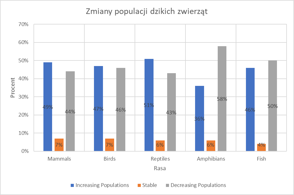
For example – the below chart shows the population structure of the animal species depending on whether the population is growing or declining. The default chart suggested by Excel is the category bar chart in Excel:
Because you are dealing with parts of the whole, a Stacked Bar Chart will be a better choice here. In addition, as you are presenting the data according to the categories and not the time scale, go for bars, not columns:
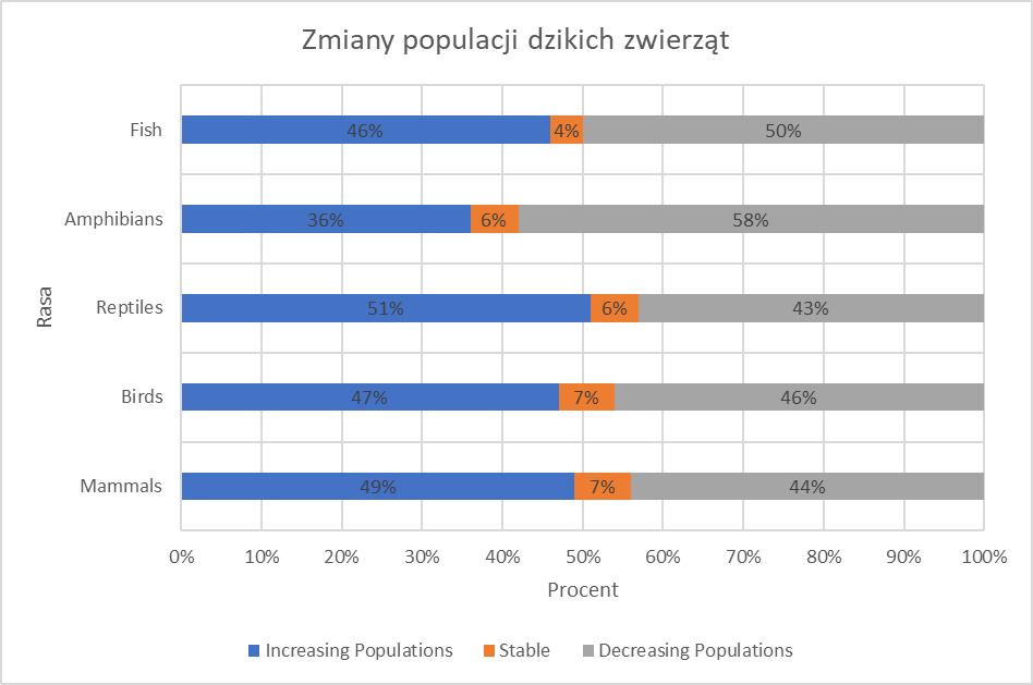
Your chart requires further work, but let’s touch on that in the following sections.
Keep it simple
Bearing in mind the previous step, try to choose the simplest option. Complex charts may attract attention, however, from the business perspective, the function is more important than the form. It will help focus on the objective rather than on the message itself. You should therefore try to make sure that visualization tools facilitate the understanding of data, instead of bringing it to the forefront to grab the audience’s attention.
Discard „rubbish”
Considering the previous point, the chart or visualization should show only the strictly necessary elements. All other details are rubbish which occupies the space and distracts the attention of your recipients. Therefore, you should remove everything that you can and leave only the essence of the information. This approach applies to charts, dashboards, and presentations. Where the element has no function – it doesn’t have to be visible. Most often these are frames, grid lines, labels, too-detailed figures, duplicated information showing the same aspect.
Given the above, let’s go back to our example and remove all unnecessary items:
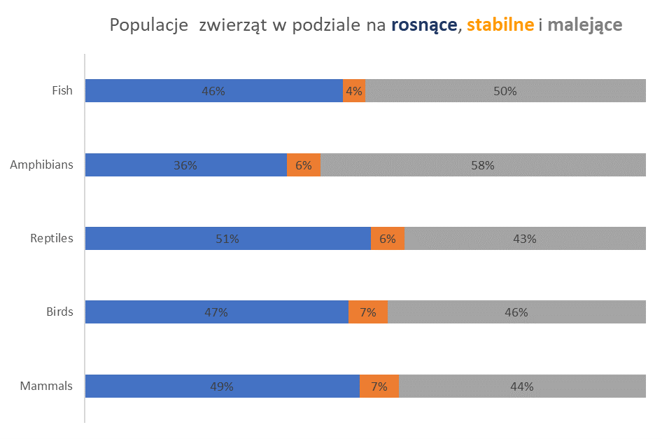
We have removed: axis titles, vertical and horizontal grid lines, x value axis (we have labels), legend (moved to titles), and chart frames.
Reasonable use of colours
Colours are a very important aspect of visualizations and can help you convey your message or on the contrary, it can spoil it. It’s a very broad topic and is based on the human perception of colours. Thus, I will present several useful tips without going into details:
- Carefully use colours – only when it is necessary
- Limit the number of colours to a minimum
- Use sequential palettes (different hues of the same colour) to show numerical values (e.g., sales)
- Use different palettes for different categories
- Be consistent about using colours – do not change their meaning in different areas of visualization
- Be mindful of the emotions triggered by colours (e.g., red is associated with something wrong)
- Use contrasting colours for comparisons
- Use colours to highlight the information
A common practice is to start with grey. You set your chart to grey and then think about what you want to highlight or distinguish.
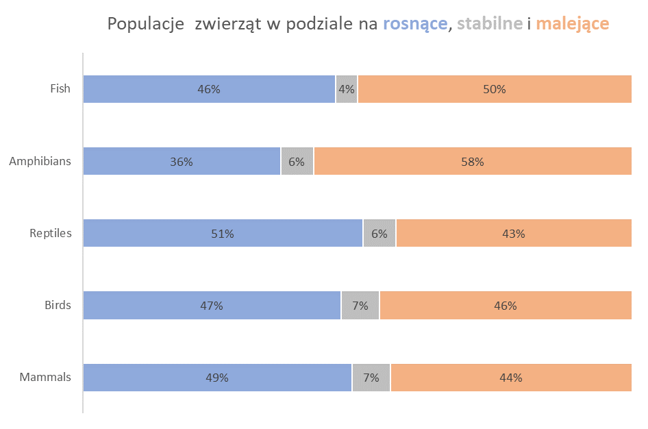
Let’s try to use these principles to improve our chart. Because we use categories, we should apply different colours. We will use blue for the ascending category – it shows a positive value. A stable value is depicted by neutral grey, and a descending value, more negative – orange. All hues are gentle.
Attracting audience – data visualization
In order to knowingly use the techniques of attracting the audience’s attention, you must understand the concept of preattentive processing. It’s the automatic process of our perception, which allows us to highlight certain elements before we focus on the information being conveyed. These are the elements that we immediately spot. The elements that allow us to draw attention quickly and automatically are the attributes of the preattentive processing. By using these attributes, you can direct the recipient’s attention to specific elements during short exposure. This way nothing is left to chance: you decide what your audience should pay attention to. These attributes are Length, Width, Orientation, Size, Shape, Enclosure, Position, Grouping, Colour Hue, Colour Intensity, and motion:
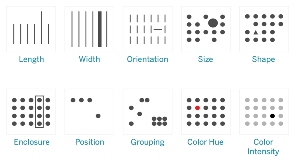
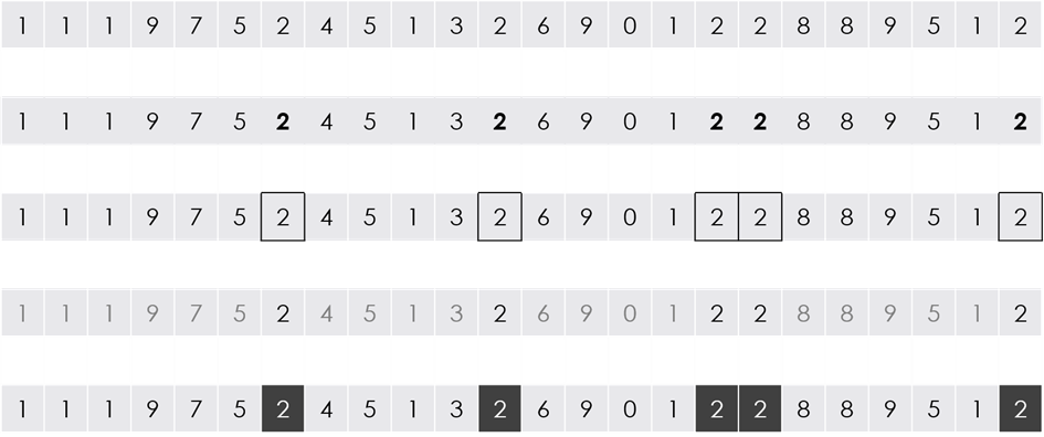
In practice, we use these techniques to emphasize certain information. We should also remember that when we highlight some information, in a way we hide the other details . When telling a story, we create a certain narrative, and by using the attributes of the preattentive processing we influence the recipient’s perception. Below are the examples of how various attributes can be utilized to highlight text – the number 2:
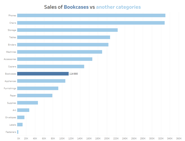
Data visualization – how to use these techniques? The following is the example of how to apply them to a bar chart. You can use colours to highlight a category. In addition, you can use a title as a legend, and remove the rubbish from your chart.
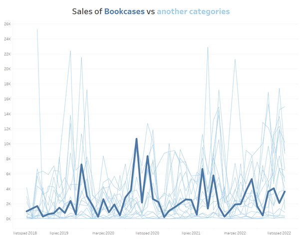
Similar techniques can be applied in line charts – by selecting colours and size (line thickness):
Data visualization – What to avoid?
You could write a book about what to avoid in data visualization, however, I will focus on the most essential aspects which, if followed, will help you avoid the most common errors.
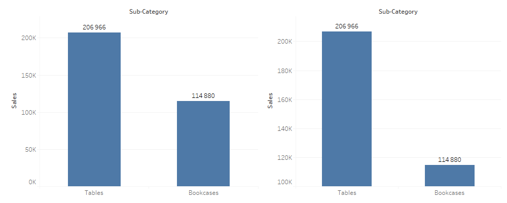
1. Cutting the axis means you are manipulating the data. You should start your axis from zero in almost all cases. This way you will get a common base that will allow you to show the actual differences between data. The technique of cutting an axis is often utilized by the media to manipulate the audience’s perception.
2. 3D charts are always bad. Try to avoid them at any cost, as they influence the perception and help manipulate the data.

3. Avoid pie charts. This is true for most cases, as we struggle more with comparing the angles or areas than length. That is why it’s better to use bar charts instead of bar charts. Pie charts are also illegible when you have more categories, and they aren’t suitable for tracking changes over time.
4. Wrong types of charts. Certain chart types work well for visualising certain kinds of data. For example, categories: bar chart, time: line chart. Remember to choose the right chart for your data.
5. Rotated category or axis labels. It makes it more difficult for recipients to read the chart, and the main message will be more complicated to understand. Wherever possible, arrange labels in the layout that facilitates the reading.
6. Too many elements on the chart. We have discussed this issue in the “Discard rubbish” section. Remove all that you can and leave only what is necessary.
7. Too many colours. Colours should facilitate the understanding of visualizations and not hamper them, so you need to use them carefully.
8. Choosing form over content. In the business environment, it is always better to prioritize the function, and then adapt the form accordingly.
9. Data manipulation. If you understand how the visual information is perceived, you can manipulate your message by emphasising certain information and hiding other details. Bear in mind that you may lose credibility with your recipients and struggle with winning their trust back.
Feedback is always welcome
Data visualization should be treated as a living and evolving organism. Business needs and the environment in which we operate vary, and we must be able to adapt our visualizations to reflect that. Iteration is a natural process in developing and maintaining dashboards. It is vital to consider your recipients and treat them as your internal customers at all times. Their feedback is important, and it is they key factor for the success of your tools. You can create the most attractive dashboard in the world, but if it isn’t used, it won’t add any value to the business. Therefore, feedback is imperative in developing visualization.
Data visualization – start with good practice
The best approach to designing better and more effective data visualizations is to gain practical experience. Evolution, development and iteration – all help achieve excellent outcomes. However, it’s good to bear in mind some basic principles to avoid the most common errors in preparing visual presentation of data.
Mateusz Karmalski Tableau Author
