What are statistics? Of course, there are several scientific definitions, however it is the practical aspect that appeals to me – statistics allows us to summarize a large dataset with the help of just a few measures. On that basis, you can better understand the data and extract hidden, inaccessible values. When analysing data, you can often be overloaded with the information, causing the information noise. Statistics helps shorten the message and summarize it with several simple measures that are easy to understand.
As a tool designed for visual data analysis, Tableau is not a strictly statistical software. However, it is hard to analyze the data without such measures as the average or the median, and for this purpose Tableau offers a number of dedicated functions. Moreover, Tableau allows you to expand your charts wit the help of additional visual components, including various measures, in order get a better insight into the presented data.
In the below entry, I will go through the basic statistic measures available in Tableau and show how they can be applied in practice.
Statistics – basic measures
The average is one of the most basic measures – in other words, the expected value – using scientific language – it is the expected value of a specific phenomenon. Let’s assume that you are analysing the salaries of employees, which are as follows:
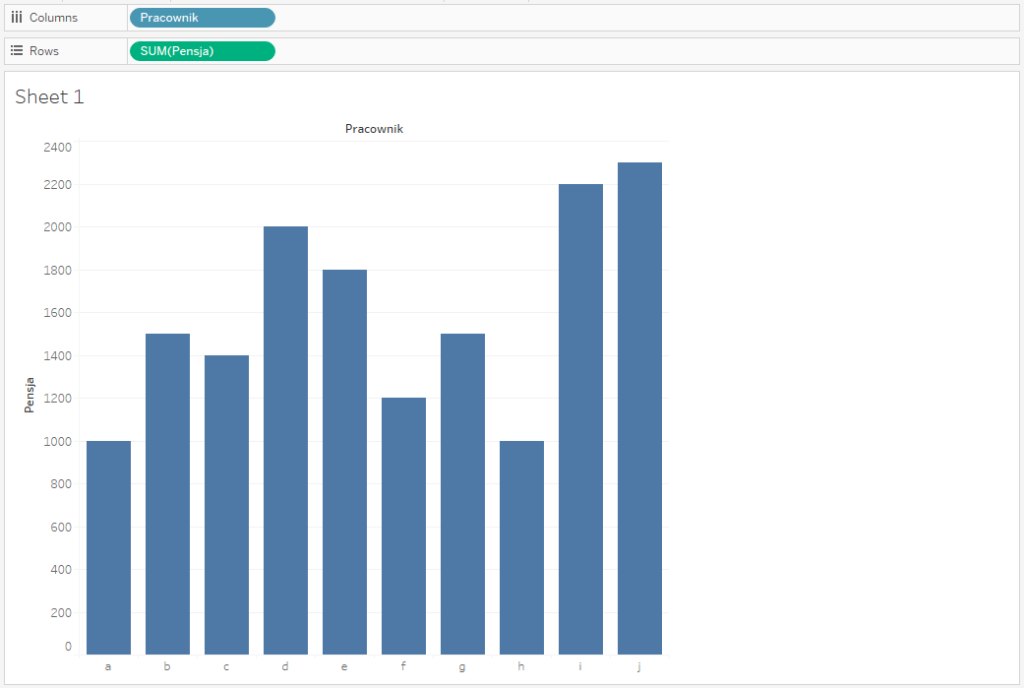
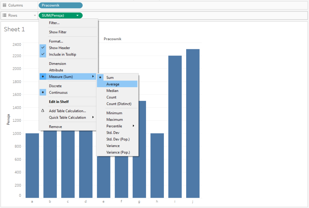
Tableau as default sets the aggregation of the measure as the total – we change it to the average, but it does not affect our chart yet:
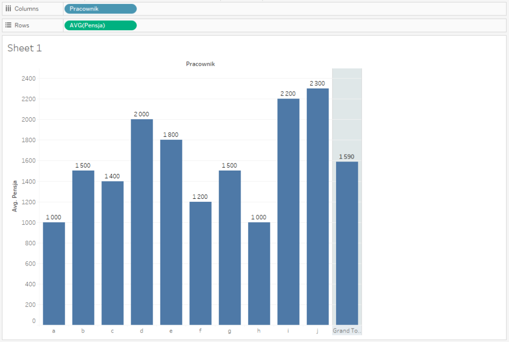
You will see the difference when you add the total – this way you will get the average value in the summary:
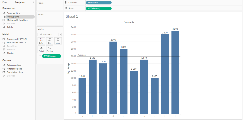
Using the total value is not always the best option – in particular when you need more space in your dashboard. Moreover, it’s hard to compare the bars that are far apart. Tableau has a very useful functionality that helps with this issue – the reference lines. You add them from the Analytics pane and then you select the Average line. This allows you to have a line with the average value across the entire chart. It is much easier now to compare the values from the dataset with the average value:
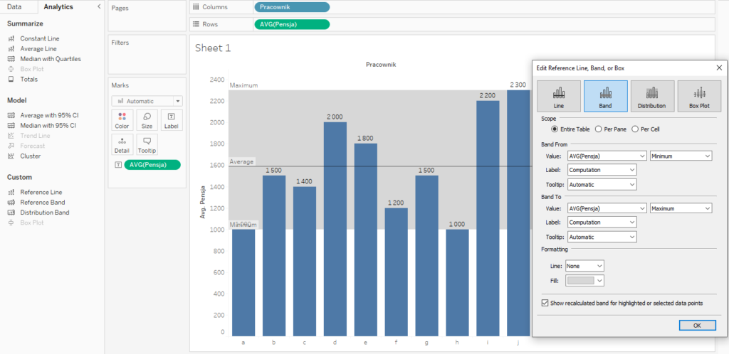
In addition to the average, the basic measures also include the minimum and maximum values – they show the range of the data. Visually in Tableau you can use the Reference Band function, and select From Minimum and To Maximum:
Statistics – median, quartiles and percentiles
Sometimes, the average value is too narrow or simplistic to show the full picture. Instead of providing compacted information, it gives you a piece of information that does not accurately reflect the reality. To better explain it, let’s add to our data a very high salary for X employee and extract the average:
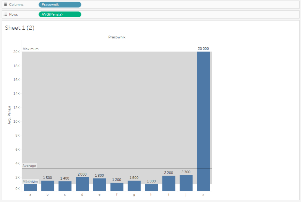
The value jumped from 1590 to 3264, which is almost twice the average. Statistically, this value is correct, however, it may lead to wrong conclusions about the salary levels. In the said scenario, 10 out of 11 employees earn less than the average, which means that the average salary is unattainable for regular employees. This highlights the basic disadvantage of the average – susceptibility to outliers. In such a case you can use the median, which is the midpoint value:
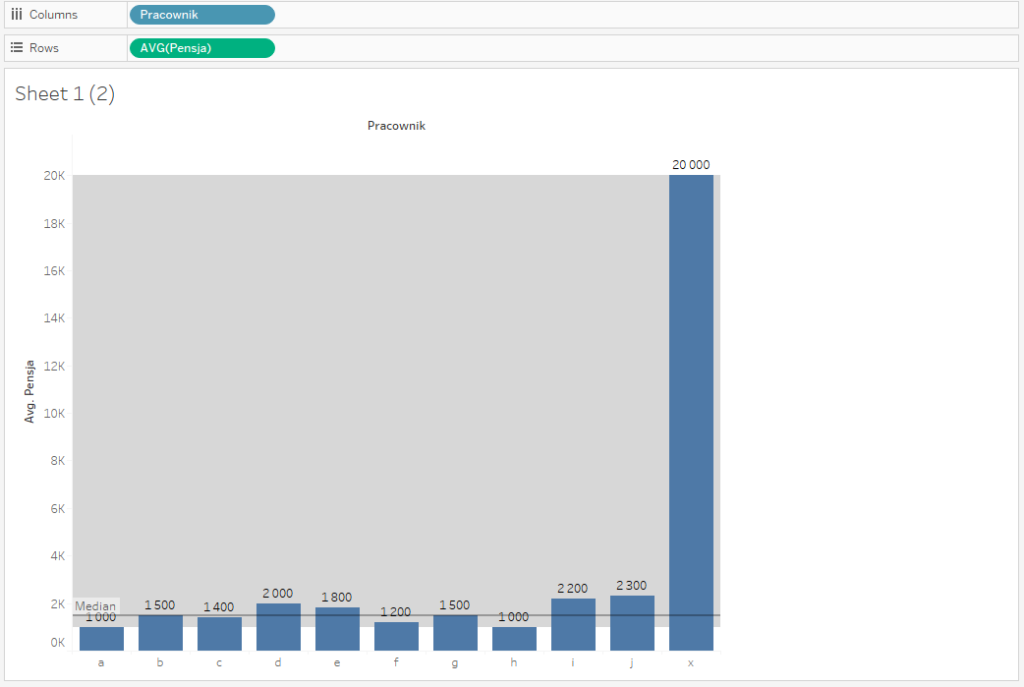
In this example, the median of 1500 is much closer to most of the data points and better reflects reality. The median returns the midpoint value in the dataset – with half of the values less than the median and half of the values greater than the median. If the dataset is even, the median returns the average value of two midpoint values. The following is a graphic interpretation of the median on the dataset arranged in the ascending order:
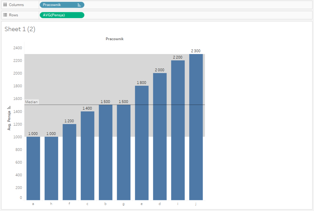
The term median is related to another definition used in the statistics – the percentile. The percentile of X determines a point, below which X% of the observation (data) appears. Thus, the median is the 50th percentile – 50% of the values fall below the median. In statistics, in addition to the median, there are two essential quartiles: the first quartile (lower quartile: 25th – for which 25% of observation falls underneath) and the third quartile (upper quartile: 75th – for which 75% of observation falls underneath).
Graphically in Tableau you can put the median with the quartiles on the chart by selecting Median with Quartiles in the Analytics tab:
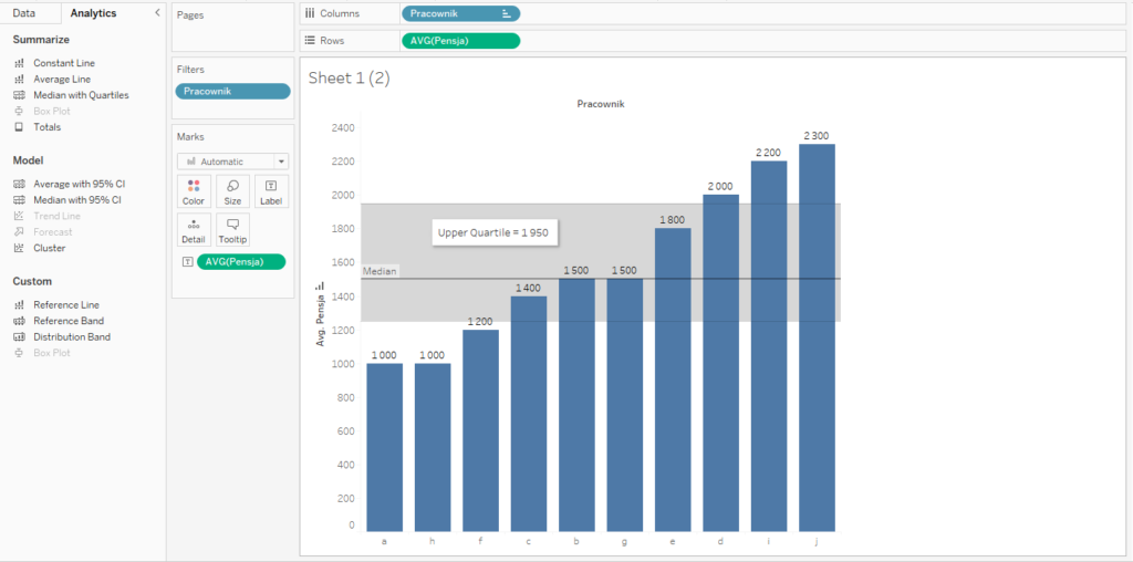
The line shows the median, and the upper and lower quartiles show the range. The gap between the upper and lower quartiles is called the interquartile range – which includes 50% of the observation. The wider the range, the more dispersed the data is.
Calculation of basic statistics as calculated fields
Tableau offers great visual functionalities for presenting statistics that describe the distribution of data. You can add the reference lines with the average values or the median, the range of data, and interquartile ranges. However, visuality is just one aspect – we often need the values that can be applied in the calculations at a later stage. For this purpose, Tableau developed statistic functions, and we are going to use them to describe our dataset. Let’s start from the basics – the average. You can do that in two ways: either by creating a new calculated field or by adding a basic field and modifying the aggregation:

In both approaches, the outcome will be the same:
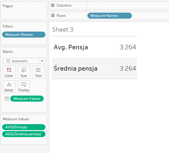
What is the difference then? First of all, when you create the calculation field, you don’t have modify the aggregation, since the measure created in this way is the aggregate itself. You can also use this measure in other calculations later. However, the drawback of this approach is that you will have to create a new field, and if you need more measures, this may be time-consuming.
Let’s create new measures:
- Minimum: MIN([Salary])
- Maximum: MAX([Salary])
- Median: MEDIAN([Salary])
- Lower Quartile: PERCENTILE([Salary],0.25) – with quartiles you use the PERCENTILE function and indicate the raw (between 0 and 1)
- Upper Quartile: PERCENTILE([Salary],0.75)
- Interquartile range: [Upper Quartile]-[Lower Quartile]
As a result, you will get the summary of the basic statistic measures of the dataset:
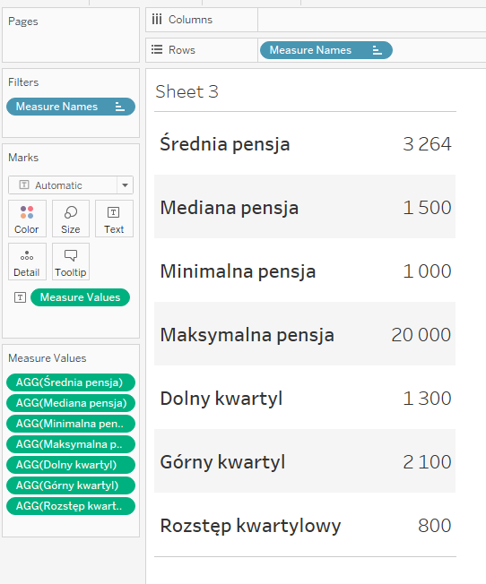
Basic statistics are important – it is a good way to start your analysis
When commencing the analysis of any dataset it is good to review the basic statistics to get a general idea of what it is about. It allows you to take the first step in exploring the data, which will help focus your work on the relevant objectives. For example, if the average value considerably differs from the median, it may indicate significant outliers. The minimum and maximum fields will help notice that. The quartiles will show the ranges of your data. With this essential knowledge, you can start performing the visual analysis of data, having the basic view of what you are dealing with.
Mateusz Karmalski, Tableau Author
