A dual-axis chart is a tool that every Tableau user can quickly learn how to use it. Sometimes you may come across a Combo Chart. At times, these names are used interchangeably, but not always and incorrectly. In the list of terms for Tableau certificates these are two separate positions. Today I’m going to explain how they differ and what tricks help work with them.
Dual Axis Tableau: a review of the dual axis
As the name suggests, a dual axis combines two measures in the same visualization with a parallel scale for each o them. When we have two pills on the Rows or Columns shelf, the steps are straightforward. You need to right-click on the second pill or second numerical axis. From the displayed menu, select Dual Axis and that’s it. Not really, as the following question should come to our minds: Should the axes be synchronized? If yes, click again on the second axis and select the Synchronized Axis option.
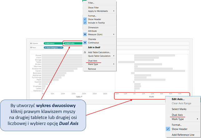
There also one “but”. It happens quite often, when your axes are based on the automatically selected chart, the chart would be modified when the axes are being connected. For example, a bar chart can suddenly change into a dot plot.
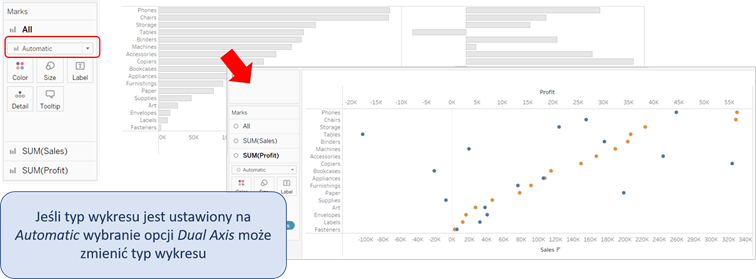
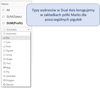
You can easily repair it, by going to the Marks shelf, and in the tabs corresponding to the relevant pills change the types of charts to the ones you need. If you do that before the axes are combined, there will be no problem.
What is a Combo Chart?
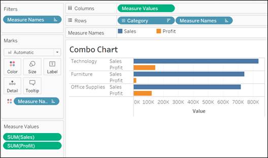
A Combo is a type of chart that allows us to get two or more measures at the same time. The only issue is that they will not have separate axes. To create it, we use the fields automatically created by Tableau [Measure Names] and [Measure Values]. If you want to do build it manually, start from placing the [Measure Names] pill on the Filters shelf. This will allow you to choose the measure you want to work with. Next, place on the shelves the fields [Measure Names], [Measure Values] and any dimension that you need. As a result, the measures will appear next to each other and there can be more than two measures at a time.
Combo Chart and Dual Axis- quick tricks!
In Tableau, you are able to achieve the same result in a number of ways. For example, the Dual Axis and Combo Chart are for those, who like to keep it simple. Let’s start from drawing the simplest chart for modification, such as a sales bar chart for selected subcategories. When the chart is ready, we can start extending it by adding another measure. Let’s take Profit and pull it over… Where? It depends on the expected result. For Dual Axis – pull it on the top part of the chart. A dotted line will appear above the chart and a small green rectangle with a metric scale. When you let the mouse go, the chart will change into a Dual Axis.
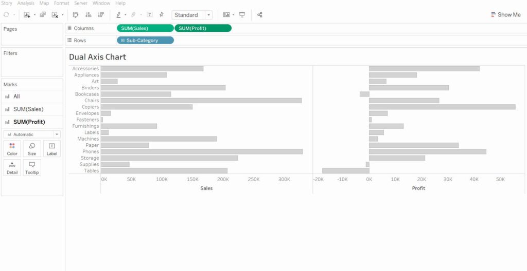
When you pull the measure pill on the lower part of the chart – on the axis – two green rectangles with scales will appear. Let the mouse go, and you will get a Combo Chart. Simple and hassle-free.

Agata Mężyńska,
Tableau Desktop Certified Professional
