In the previous post “Statistics with Tableau – the Basics“, we discussed the essential statistical measures: average, median, minimum and maximum, quartiles, percentiles, and interquartile range. You learned how to adjust them on the charts using such Tableau functions as reference lines and how to apply them to the calculation fields. In this post, we will take one step forward and present more advanced statistical measures such as variance and standard deviation and will explain when to use them.
Statistics with Tableau: measuring dispersion of values – variance
In addition to the basic statistical measures, for example, the average value of a specific situation, it is important to understand the variability. To illustrate this, let’s look at the example from the previous post – the employees’ salaries. This time we are going to compare the salaries in two departments that have the same average:
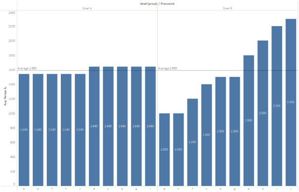
As shown in the chart, despite the same average, the arrangement of the values significantly differs in both cases. For this reason, we are going to introduce variability, and more specifically: variance. It measures the deviation of the values from their average. The easiest way would be to take the differences for each point and sum up the resulting values:

The problem is that when you sum up the differences of the salary and the average, you will always get zero, as some values will be above the average while other will fall below it. For this reason, the resulting difference is then squared to solve the problem of the opposite signs. By diving the resulting value by the number of observations, you will get the following variance:

A more intuitive variability measure – standard deviation
To simplify the interpretation of the variance, which is expressed as the squared difference, the standard deviation function is often used, which is the square root of the variance:

This makes the interpretation of the data a little easier: the average salary is 1590, and the deviation is 446. Let’s take a look at the comparison of the two departments – where the average salary was identical in both cases:

In this scenario, the standard deviation shows, in which case the variability of salaries is higher, and in which case it is lower. That was our intention.
Statistics with Tableau – variability measurements as calculation fields and chart elements
In the above section, we manually calculated the variance and standard deviation, however, we can use the built-in statistic functions in Tableau to calculate these measures. These functions are:
– VAR ([Measure]) –variance of the sample, VARP ([Measure]) –variance of the population
– STDEV ([Measure]) –standard deviation of the sample, STDEVP ([Measure]) –standard deviation of the population
The resulting measures can be used as calculation fields in the analysis:
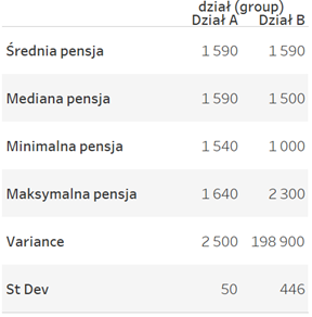
As Tableau is a visualization tool, these measures are depicted in the graphical format. Standard deviation can serve to show the distribution of data by applying the Distribution Band function from the Analytics tab:
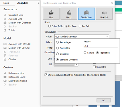
Select Distribution Band, next in the Value list choose: Standard Deviation (default +-1), click on Sample (when you have sample data) or Population (when you have all the data) and that’s all you need to do:
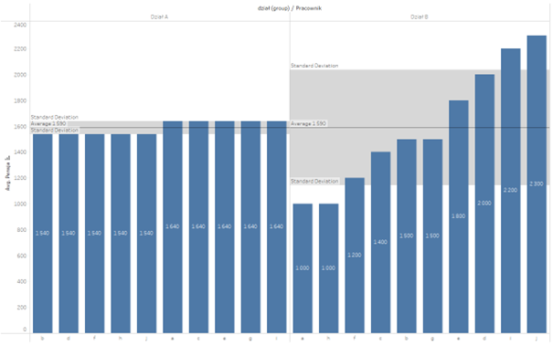
Grey areas show the ranges from the average minus the standard deviation to the average plus the standard deviation. You can clearly see in the chart, which dataset has higher variability.
Statistics with Tableau – what to focus on when analysing variability
In the previous post, I pointed out that in the case of datasets with outliers, such measurements as the average may not be fully representative and thus distort the actual picture. The same applies to the standard deviation which is another classic measure. Let’s take a look at the previous example with the salaries, but this time we will add a high salary to the x-employee:
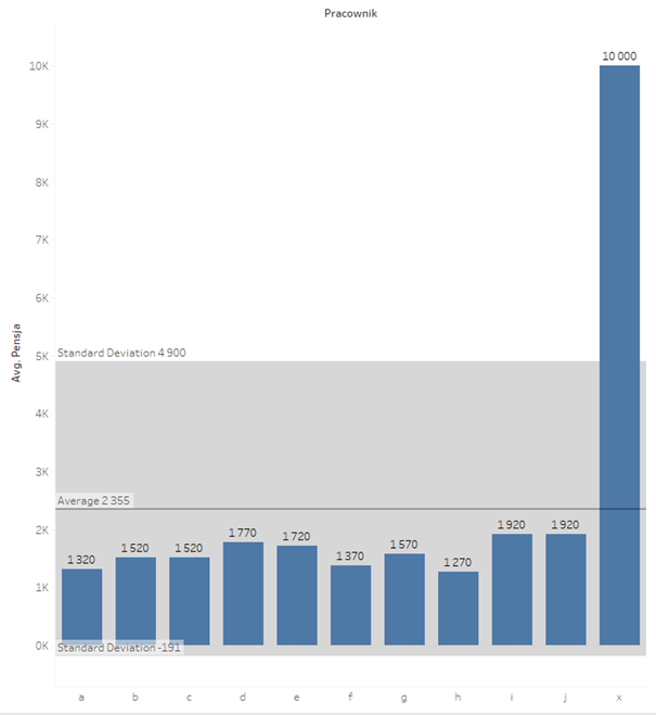
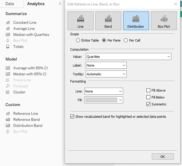
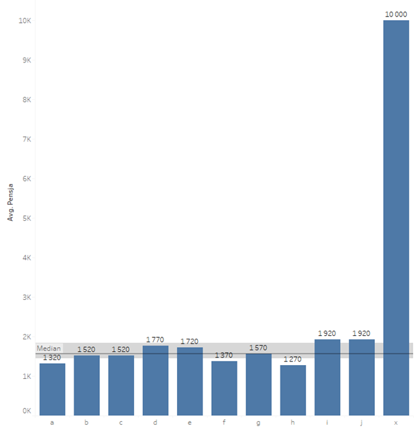
As you can see, the standard deviation went to the extreme. At this point saying that the average salary is 2355 +- 2456 doesn’t mean much, taking into account that the salary cannot be a negative value. What to do in this case? The best would be to go to the position measures and look at the median instead of the average, and at the interquartile range instead of the standard deviation. As explained in the previous post, the median is the middle value, with the same number of smaller and larger data points. The interquartile range is the difference between the lower and the upper quartile, which covers 50% of the data. In Tableau, you can add visually the relevant range from the Analytics tab, by selecting Median with Quartiles:
The resulting outcome on the chart – it is much clearer now than the average/standard deviation
Basic statistics are important
When beginning the analysis of data, it’s good to start with the basic statistics. They will help build up the essential knowledge about the data and indicate the direction of analytics. However, you should bear in mind the limitations – for example, when it comes to the average, which is sensitive to outliers. If the average substantially differs from the median, you can expect significant outliers. In such a case, it is worthwhile to leave the classic measures and move to the position measures. Tableau will support you here both in terms of the calculations (by using in-built statistic functions) as well as the visual aspects (by using reference lines, distribution or box plots).
Autor: Mateusz Karmalski Tableau Author
