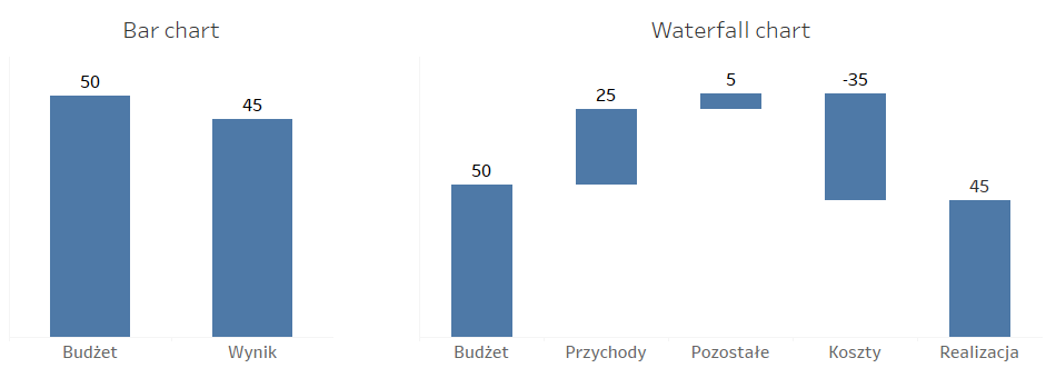
A Waterfall chart, also known as the Bridge chart, is a unique type of bar chart. It shows the difference between two values, specifying the factors which affect that difference. This way you can evaluate the variables that underpin the change in the specific factor. Waterfall charts facilitate the understanding of the context behind the change of the KPI – instead of showing one or two bars (a reference and the actual value), it shows what’s going on between them. These charts are most often used in the financial analysis to visualize the company’s result (a profit-loss statement); however, they are becoming increasingly popular in other areas too (e.g., HR).
How does a Waterfall chart work?
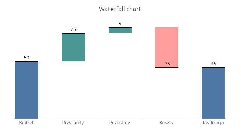
Waterfall is a type of bar chart with some modifications. The “before” and “after” are standard bars, and the elements between them which show the indicators affecting the change are also bars, however, they are suspended in between them. The beginning of the next bar is determined by the end of the previous bar. This way you can track the changes induced by specific factors, but this approach has some drawbacks – it is hard to compare the bars without having a common reference (they start at different points). To help the recipients interpret this chart, in addition to labels also colors are used to highlight the positive or negative change. You can also use lines to guide the recipient where to find the direction of a particular change:
Another area, in which Waterfall charts can be applied, is to show the elements of any given value. For example, the Waterfall chart will be a good option if you want to present the impact of specific regions on making profit:
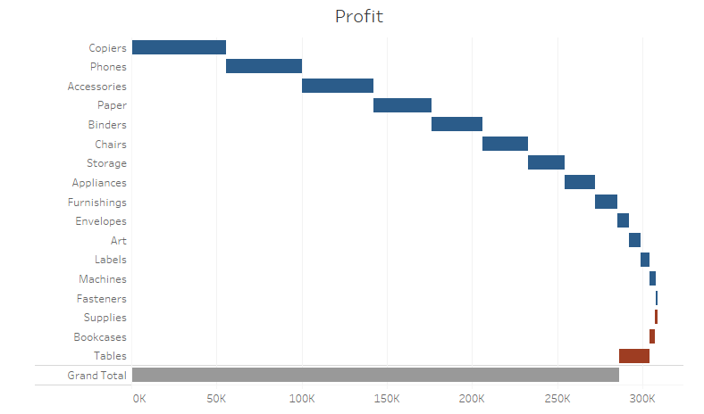
It will show the categories which are the major contributors to the underlying value, followed by the categories that decrease this value to its final amount. You should bear in mind that it is vital to sort the values to help evaluate the significance of each category. If you have multiple categories, you can easily rotate the chart by 90 degrees to help the recipient read the labels.
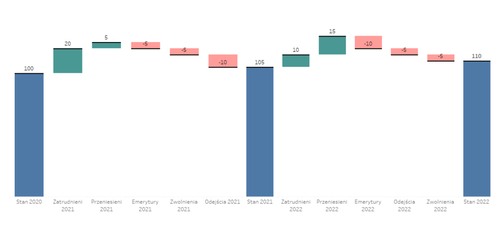
You can also use the Waterfall chart to depict a wider time horizon, not only the points in time such as “before” and “after”, but also the points in between them:
Drawbacks of Waterfalls
There are several basic rules you should keep in mind when creating Waterfall charts. They also have some drawbacks. First of all, in accordance with the principles of visualization, bar charts should start at “0”. It’s not good to shorten the axis and start it at a different point, as this way you manipulate the data. For this reason, the Waterfall charts are unsuitable in the case of large values “before” and “after”, and small indicator values – you will have two large bars at the beginning and end, and marginal bars in between. The second drawback is that it is hard to interpret and compare the values when there is no common axis for the factors which appear between the beginning and the end. Another issue concerns the interpretation of individual bars – positive values should be read from bottom to top while the negative values from top to bottom. This makes understanding of the chart more difficult. However, these drawbacks don’t disqualify Waterfall charts – on the contrary, having them in mind you can maximize the effectiveness of this visualization techniques.
How to create a Waterfall chart in Tableau
Once you know the characteristics, applications and drawbacks of the Waterfall chart, you can prepare it in Tableau. It isn’t available in Show Me, but its creation is pretty straightforward. Although Waterfall is a type of bar chart, in order to create it in Tableau you need to use a Gantt chart. Let’s start with a simple dataset of the company’s result compared with the budget:
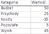
Use a simple bar chart to feed the data to Tableau:
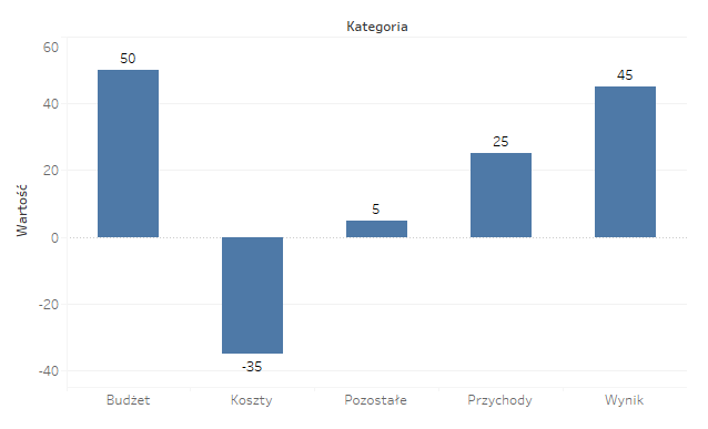
The steps that follow are key in creating the chart. First you need to change the calculation to the Running Total and remove the last value (Result) – it will be calculated as total, and you need to add the Grand Total row to the chart:
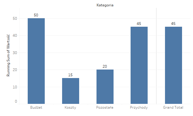
Next, change the chart type to Gantt, and in the size field add a field – [Value] (value with a minus sign):
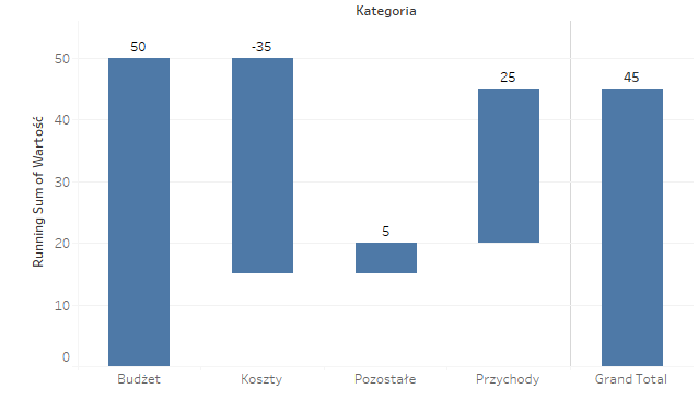
Your Waterfall chart is ready now! All you need to do is to format the colors to help the users read the values. You can also add another Gantt chart to a dual axis, but without the size field – only the lines. This will allow you to track the current location of the chart and where to find references. Remember also to sort the categories according to the following key: the largest positive values to the largest negative values. The last but not least: remove the “noise” – grid lines, axes, column/row separators, and you chart is ready:
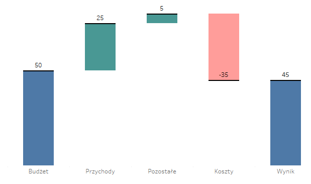
Waterfall can be helpful
Waterfall is a type of the most popular and practical bar chart, and can be a helpful form of visualization. It will work best when you need to analyse the changes in detail, in addition to the aggregated values in the respective references (e.g., this and last year). This chart can help depict the history of changes from point A to point B, also through point C or even D. They are often used in finance, but can be applied in other areas too – sales, production, costs, and HR. To make the best use of Waterfall charts, you should pay attention to the appropriate formatting and arrangement to help users understand them, and not overwhelm users.
Mateusz Karmalski Tableau Author
