NewDataLabs

Tableau - Business Intelligence Tools

  • Solutions
    • ETL
      • Tableau Prep
      • Airflow
      • Power Query
      • Microsoft Integration Services
      • Fivetran
    • Data warehouses
      • Snowflake
      • Google Big QUERY
      • Microsoft SQL Server
      • PostgreSQL
      • Web analytics
      • Amplitude
    • Business Intelligence
      • Tableau
        • What is Tableau?
        • How to implement Tableau properly?
        • Interactive management dashboard
        • Tableau price list
        • Products of Tableau
          • – Tableau Desktop
          • – Tableau Server
          • – Tableau Prep
          • – Tableau Online
        • Tableau Audit
        • Tableau Day
      • Power BI
  • Services
    • Tableau workshops on your data – Proof of Concept
    • Preparation of data – ETL
    • Reporting and data visualization
    • Migration services
    • Tableau training courses
    • Embedded Analytics
  • Salesforce
    • Salesforce CRM
      • Customer relationship management
      • Sale
        • Sales opportunity management
      • Business Intelligence analysis
      • Salesforce Manufacturing Cloud
      • Salesforce Service Cloud
      • Salesforce Marketing Cloud
    • Services
      • Proof of Concept
      • CRM workshops
      • Implementation of CRM
      • Post-implementation support
      • Data migration
      • Salesforce training
      • CRM consultancy
      • Salesforce integrations
    • Tableau + Salesforce
  • About Us
  • Customers
    • Our Customers
    • Customer stories
      • Totalizator Sportowy Sp. z o.o.
      • Snieżka S.A.
      • Werner Kenkel Sp. z o.o.
      • DOZ S.A.
  • Events
    • Webinars >
      • Salesforce
      • Tableau
      • Power BI
    • Tableau Training Courses >
      • New Data Model
      • Tableau online course
      • Tableau training courses
    • Power BI Training Course
  • Blog
  • Download Tableau
    • Tableau Desktop – Trial
    • Tableau Server – Trial
    • Tableau Prep – Trial
    • Tableau Reader
  • Contact
EN / PL

Bar Charts – Are They Good for Everything?

2023-12-21

In visualization, bar charts can be used for almost everything, which makes them the most universal of all graphs. Moreover, recipients can intuitively understand what they convey. They are simple and easy, however, it’s worthwhile to keep in mind some aspect.

Bar chart: a gift from the gods

While reviewing Twitter, I came across the post written by the visualization consultant – Steve Wexler, who wrote:

“A bar chart is the gift from the data visualization gods that allows ordinary people to make accurate comparisons without needing to study science. But if you cut the value axis, you will bring the goods’ anger on you (and you will let your audience down).”

Today, I’m going to explain what can be illustrated by using bar charts. I will also advise how to avoid the “anger of the gods”.

According to the Financial Times’ chart classification, there are 9 main applications of charts. The bar chart will always work for five of them and can work for two or three more if you modify or enhance it. It will hardly work for maps and for illustrating flows.

Let’s compare it on the bar chart!

Chart bars are usually used to present all kinds of comparisons. Going back to the aforementioned classification, these are mainly comparisons of various categories over time and illustrate the intensity ratings. Our vision is well prepared to compare section lengths and we intuitively understand such visualizations. We can also easily estimate the relationships on their basis. There are only two “but’…” First of all, it’s good to have the elements for comparison arranged next to each other. Second of all, it’s important to have the correct chart scale.

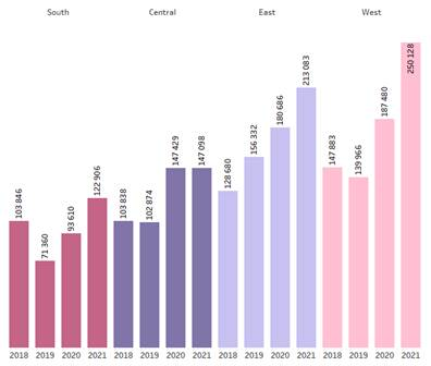
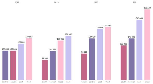
The following illustrations show two charts built on the same data. The difference between them is what they emphasize. In the first case, it is the evolution of the sales time in each region. In the second, it is the ranking of regions in each year. This example shows how to combine the data to deliver the right message.

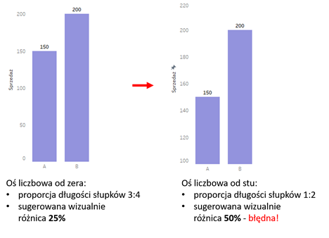
Is it possible to spoil such a chart? Yes! And this can bring the anger of the gods of visualization. The worst sin in creating bar charts is to change the scale of the numeral axis and exclude zero. This will change the proportion of the bars. We usually don’t look at the numbers, but we analyze the situation based on the illustration. As a result, the problem may seem to be much more serious or trivial than it actually is. Political parties often use this technique. All over the world, and by all political sides. They can easily get a terrifying scale for a decline of a few hundredths of a percent.

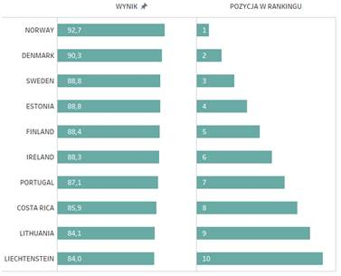
Podium steps – chart bar in ratings

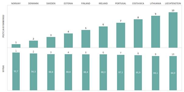
A bar or column chart is a perfect choice for presenting ratings. However, when using vertical bars, you need to keep in mind that their size will not correspond with the position in the ranking. The better the result, the podium step will seem to be less impressive. You can solve this issue in two different ways. First of all, you can link the size of the bars with the result. The better the score, the higher they get. The second option is to illustrate the ranking with horizontal lines. This way leaders will be on the top.

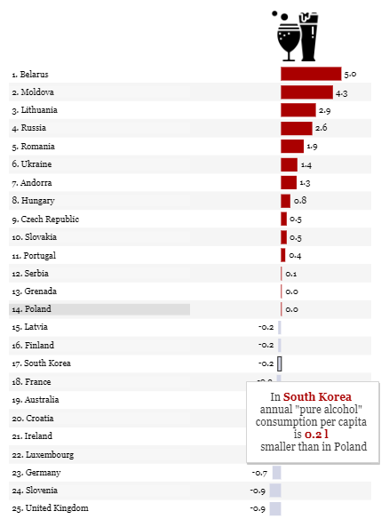
Bar charts and deviations

Another visual category which you often work on is the illustration of a deviation from the specific norm, and bars are very helpful in this case. You should remember that in order help your audience read the chart correctly, they need to know what this norm is.

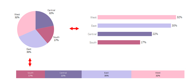
A piece of cake: a part-to-whole ratio

Another interesting issue is to know how to present a part-to-whole ratio. Usually, it is illustrated on a pie chart or a tree map. However, the bar chart can also be a fine choice here. Why? We intuitively associate the first two graphs with the elements of the whole. But when you need to estimate what part a particular element is, bar charts will be the best of all.

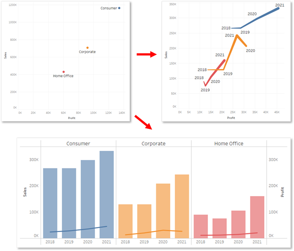
Correlations – maybe not directly, but a bar chart

The last two visualization categories according to the Financial Times are correlations and flows. The bar chart on its own is not sufficient, but it will work if it is combined with the line chart. Let’s start with the correlation of two measures. We usually present it on the scatterplot chart, however when you want to show the dynamics of the correlation over time, this option is no longer intuitive. In this case, you can combine both the line chart and the bar chart.

All analysts may have moments of doubt when considering the use of the bar chart for the hundredth time. However, there is no point in resigning from them. Their universality as well as simplicity to create and interpret them are invaluable.

Agata Mężyńska, Tableau Desktop Certified Professional

Webinars
> Amplitude Webinars
> Tableau Webinars
> Power BI Webinars

Tableau training courses
Power BI online course
ETL
> Tableau Prep
> Airflow
> Power Query
> Microsoft Integration Services
Data warehouses
> Snowflake
> Google BigQuery
> Microsoft SQL Server
> PostgreSQL
Business intelligence
> Tableau
> Salesforce
> Power BI
Web analytics
> Amplitude
Salesforce
> Customer relationship management
> Sale
> Sales opportunity management
> Analysis Business Intelligence
> Salesforce Manufacturing Cloud
> Salesforce Service Cloud
> Salesforce Marketing Cloud
Contact

contact@newdatalabs.com


601797783
+48 781 648 194


Adres
Correspondence address:
al. T. Boy’a – Żeleńskiego 26,
51-160 Wrocław

Copyright © 2025

Manage Consent
To provide the best experiences, we use technologies like cookies to store and/or access device information. Consenting to these technologies will allow us to process data such as browsing behavior or unique IDs on this site. Not consenting or withdrawing consent, may adversely affect certain features and functions.
Functional Always active
The technical storage or access is strictly necessary for the legitimate purpose of enabling the use of a specific service explicitly requested by the subscriber or user, or for the sole purpose of carrying out the transmission of a communication over an electronic communications network.
Preferences
The technical storage or access is necessary for the legitimate purpose of storing preferences that are not requested by the subscriber or user.
Statistics
The technical storage or access that is used exclusively for statistical purposes. The technical storage or access that is used exclusively for anonymous statistical purposes. Without a subpoena, voluntary compliance on the part of your Internet Service Provider, or additional records from a third party, information stored or retrieved for this purpose alone cannot usually be used to identify you.
Marketing
The technical storage or access is required to create user profiles to send advertising, or to track the user on a website or across several websites for similar marketing purposes.
Manage options Manage services Manage {vendor_count} vendors Read more about these purposes
View preferences
{title} {title} {title}
The newdatalabs.com/en website uses cookies. We use information saved using cookies and similar technologies, including for advertising and statistical purposes and to adapt our website to the individual needs of users. By continuing to use the site, you agree to the terms.Close