Few simple visualizations arouse as many extreme emotions as the so-called Box Plot. Some are delighted with it. Others are happy to move on to the next topic during the training. Today, we’re talking about why this is so and how to use the box for analysis in Tableau.
What is Box Plot?
Box Plot is a visualization of the decomposition. It is loved by statisticians, because it brings with it a lot of additional information. People less familiar with statistics react to it even with an allergy. And that’s because it’s very hard to read something from it without preparation. It requires understanding several terms and concepts. Although it takes seconds to draw it in Tableau, it is used rather sparingly.
Construction of the box plot
As the name indicates, the Box Plot has a box and whiskers. The box is crossed inside with a line. This line is median. It is such a value that for half of the population the analyzed variable has lower values and for half of it higher. For example, the statistical yearbook shows the age of marriage. If it was 29 years old for women, it would mean that half of them got married by their twenty-ninth birthday. The rest later.
The box boundaries are obtained by finding the first and third quartile. These are the values of the variable for twenty-five and seventy-five percent of the population. So, from wall to wall, we have a range of values that fall on the middle 50% of the population. What would that mean for the age of marriage for women? Let’s take the value of the first quartile for 27.8 years and the third quartile for 31 years. This would mean that the middle and most typical 50% of the ladies get married somewhere between these borders.
The difference in value from wall to wall is the so-called quadrant compartment. In literature, it is also called the interquartile or interquartile range. The abbreviation IQR is often used. Interquartile Range.
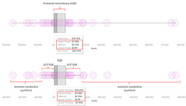
So we have a box. Time for whiskers. And here we have two options. Simpler but less used assumes that each whisker extends from the value for the most extreme representatives of the population to the box boundaries. Most often, however, to build the whiskers we need a quarter gap. A distance and a half from the walls of the box determines the maximum range of the whiskers. Whiskers does not have to reach all components of the population. Those elements of it which will be further on are the extreme values, outliers, or, as I was taught a long time ago on statistics, free values.
Example of a box in Tableau
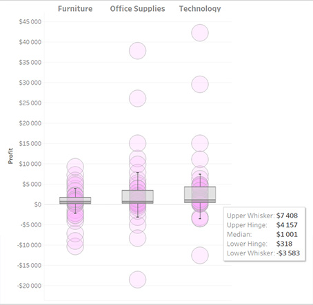
The picture shows the distribution of profits of the legendary Sample Superstore by the individual US states. The upper part is a box with whiskers from one end of the population to the other. On tooltip we have information about extreme values (maximum and minimum), i.e. for the state with the lowest profits and the state with the highest profits. The box shows a range for the most typical half of the states. Its boundaries are described as Upper Hinge and Lower Hinge. The distance between them is IQR. Here:
IQR = $7 286 – $230 = $7 256
In the lower figure, we have whiskers determined by the offset:
1.5*IQR = 1.5*$7 256 = $10 884
So the bottom whisker ends at $230 – 10 884 = – 10 654 and the top one at $7 286+10 884=18 170. The smaller and larger values are outliers. The median value of $2,196 indicates that half of the states had lower profits and half higher profits.
How to draw a box plot in Tableau?
After a long introduction it might seem difficult, but no. Just open the Analytics menu and from its top or bottom drag the Box Plot to the visualization presenting the layout.
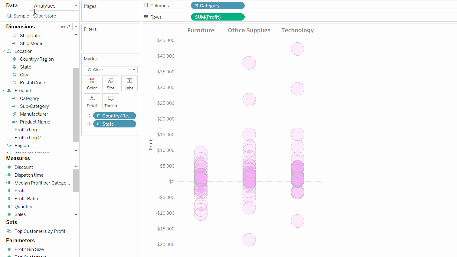
Another issue is editing and formatting. Both are accessible by clicking on our box plot. It is good to choose the edit option right away, because it allows both. It opens this dialog:
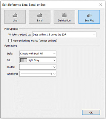
In the Plot Options section you can choose between a whiskers for 1.5*IQR or for the entire population range. In the former case, we may not show those elements of the decomposition that fall within the whiskers range. Then the visualization will cover the whole box plot and outliers.
We can also choose the style of the box, colours, frames and whiskers’ style. Each visualization is different and it is worth to use the possibility of personalization. I like the Classic with Dual Fill style best.
A box plot in the eyes of the statisticians
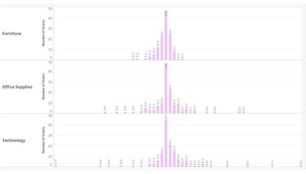
Returning to the first words of this post, it is worth to realize once again the differences in approach to this chart. The statisticians see it as access to all the information I have described. This is crucial when it can be compared for several different populations. The alternative is a simple histogram. It is readable to everyone almost without preparation. However, if you have the opportunity to prepare your visualizations for the recipient and you care about the precision of comparisons, you should consider Box Plot.
Box Plot Histogram