When you want to analyse category data, there is only one option in general – bar charts. If you need to compare the indicators according to such dimensions as segments, regions, producers – bar chart will always be a good choice. Preparing the chart is pretty straightforward, and it is easy to interpret. Human beings can handle well lengths, so users can easily spot the dependencies which are not visible in the similar charts. However, you need to remember about the transparency of your visualization and not to overdo it with the amount of information. In the below post I will describe 15 types of bar charts worth to know and use in dashboards.
A bar chart is a king among graphs
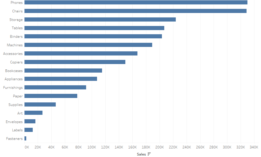
The above statement may sound excessive, but it’s how bar charts should be perceived. Let’s look at the example of the sales analysis according to categories. You can easily see the sales leader and the difference between sales of individual categories:
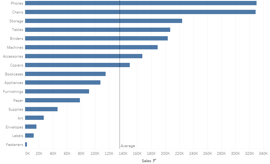
In addition, by using reference lines in Tableau you can add a line with the sales average. This way you provide the user with the information about the categories below the average and the categories above it:
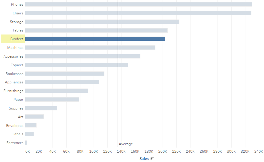
By doing so, you can enhance you visualization with an additional information vector, which is always desirable. If you add a highlighter, your users will be able to analyze the selected category in comparison with others:
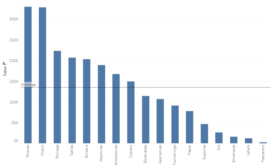
A column chart is a popular variation of the bar chart – it’s a bar chart rotated by 90 degrees. This chart is also easy to interpret, but it has one major drawback – it usually requires turning the labels on the X-axis, which makes them difficult to read. Column charts are sometimes common in time trend analyses, but line charts would be the best option in that case, as they ensure the continuity of data.
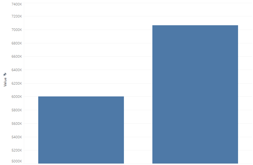
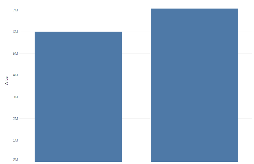
When using the bar chart, you should bear some general principles in mind to ensure the integrity of the presentation. First of all, never use 3D chars. Second of all – an axis should always start from zero. If you start your axis at a different point, your users will get confused. Unfortunately, this happens and is done on purpose – for example, mass media often use this morally ambiguous technique:

The actual comparison of values – the axis starts at 5 million and at 0 million in the second case. The message is completely different, especially when you remove the axis.
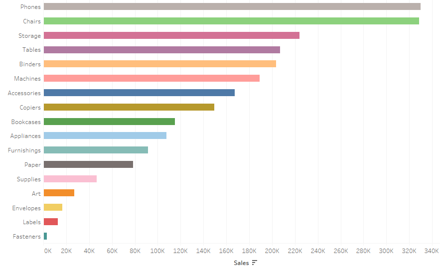
The last rule is to use colors in a sensible manner. A bar chart automatically divides the data into categories, so there is no point to color each subcategory – it makes the chart look chaotic:
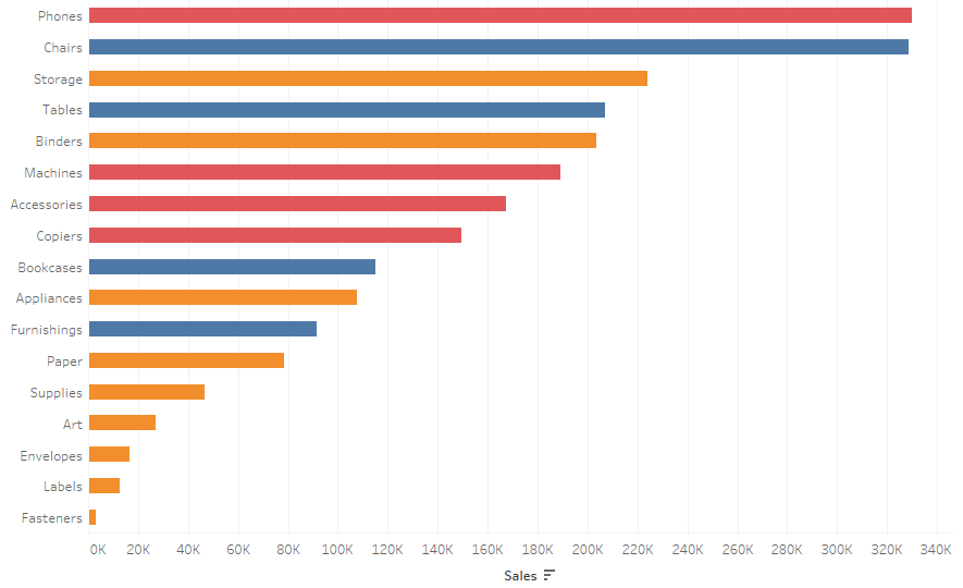
Whereas, if you have a relatively small amount of the higher level in the hierarchy – you can apply colors – as in the below example with three categories:
Bar chart variations
Bar chart is usually sufficient on its own, however there are some more visually attractive options. The first is a lollipop chart – bars are formed as thin lines with round endings, which are perfect for adding labels. To create this chart in Tableau, you need to use a dual axis function: the first axis will contain a bar chart, and the other one a circle or shape:
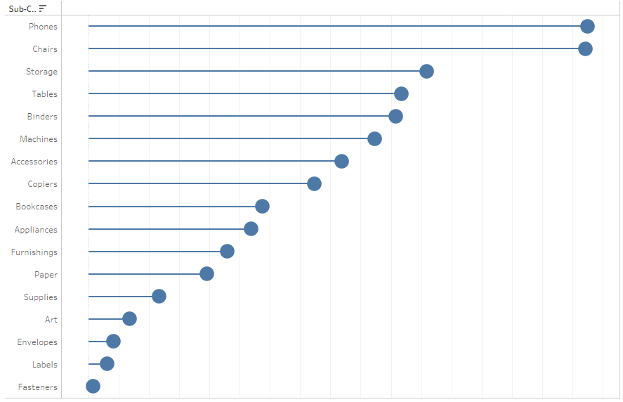
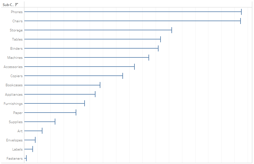
There are objections regarding lollipop charts – it’s hard to identify what should the categories be compared to – the end point or the middle? For large circles, this could be confusing for end users. Therefore, sometimes a lollipop would have a line instead of a point at the end:
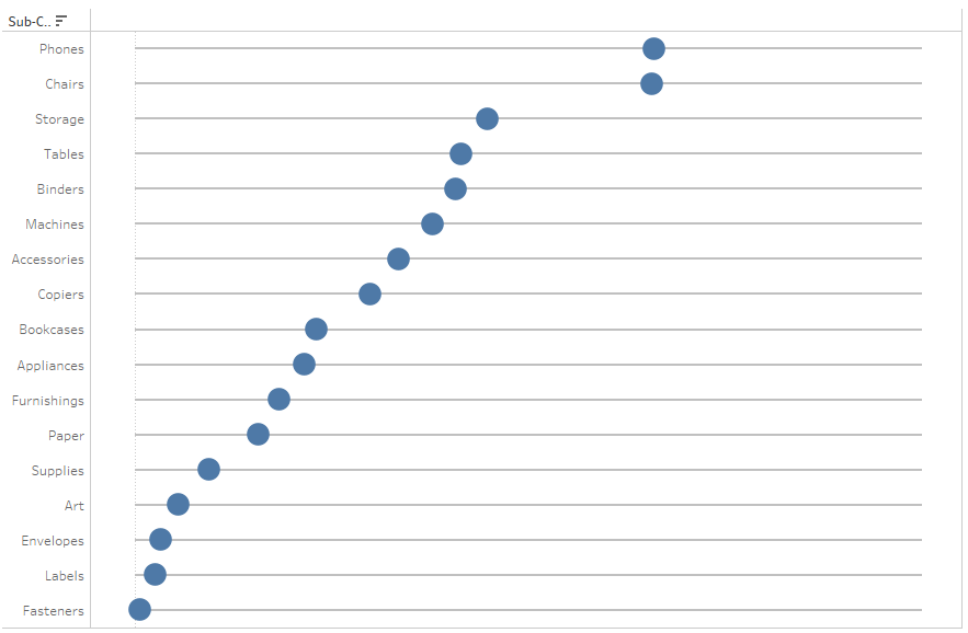
Dot plots are another useful tool – here you have data points instead of bars. It’s easy for human beings to compare the lengths and identify the position. This chart resembles the adjusting slides:
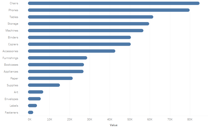
If you want to enhance the visual aspect of bar charts, you can use round bar charts – rounded bars look fresher, however for more accurate comparisons, standard bars will work better:
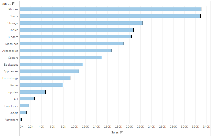
Another interesting option is to combine the bar chart with the Gantt chart to improve the visual aspect of the chart, by highlighting bar ends. To create this chart, use a dual axis consisting of the bar chart and the Gantt chart:
Bar chart – a tool for comparing business indicators
One of the essential aspects of visualization (of business indicators in particular) is the ability to compare them against a certain reference. When analyzing the sales according to subcategories, you can understand where the sales of one category stands compared to other categories. But you cannot see whether the sales is better than the last year, if it’s in line with the budget or forecast. The basic information „the sales of paper has reached 1 million this year” doesn’t say much. Is this a lot or too little? Is this good or bad? You are not able to assess it without having a reference point. For this reason, bar charts are often enhanced with additional references. The easiest way is to add another measure to the bar chart:
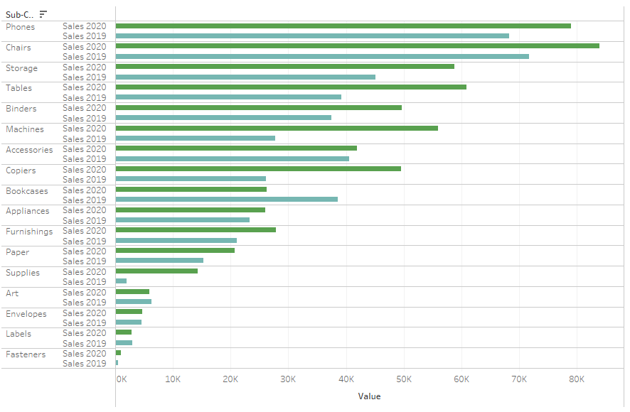
It’s pretty easy to compare values in this chart, however it’s visually overwhelming. There are too many bars, which impacts the interpretation. There are other, more user-friendly options, such as a bar-in-bar chart:
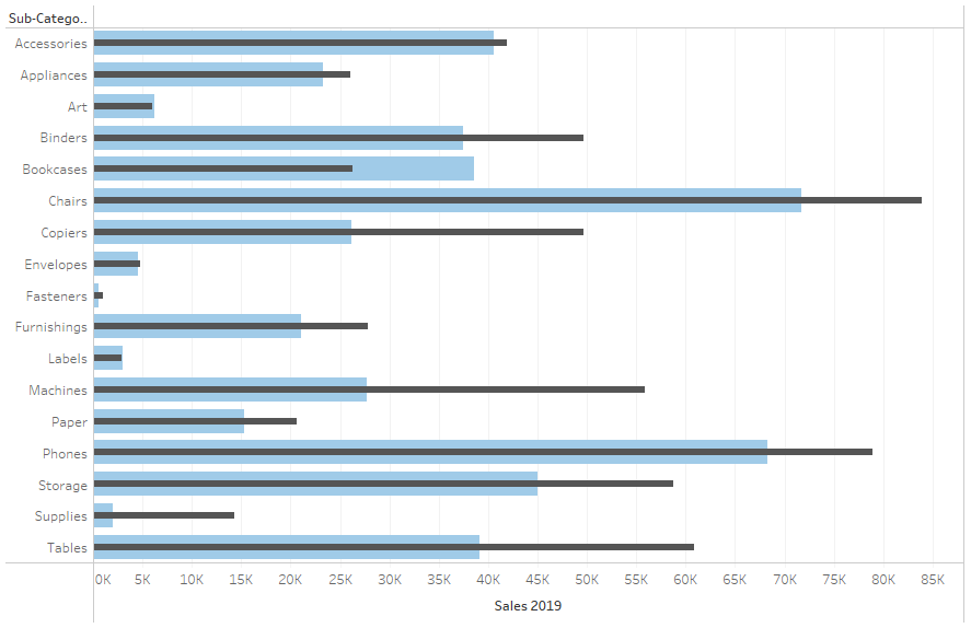
The thinner bar is the main indicator, and the thicker indicator in the background is a reference. This way you can save space and simplify the message. Another option is to use the Gantt chart on a dual axis to show the reference:
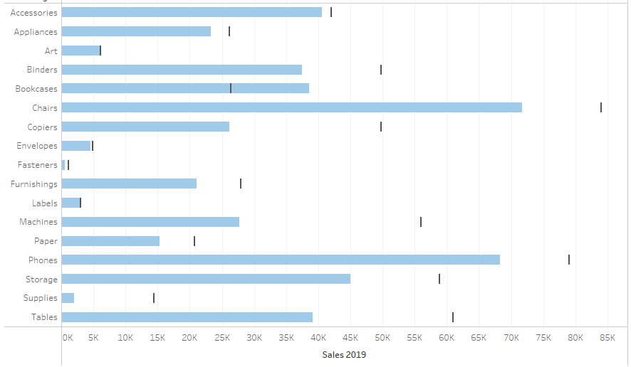
Or use reference lines:
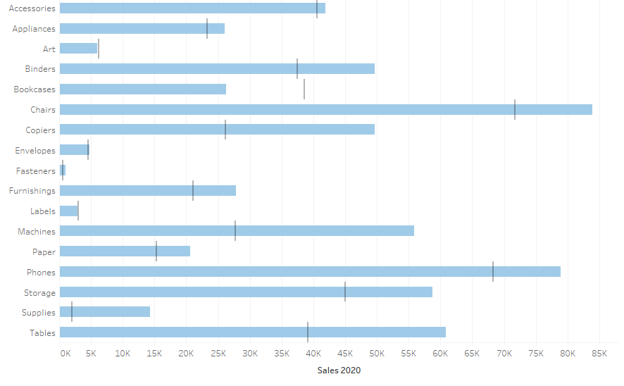
The situation gets complicated when you want to link your indicator with two references. It’s not a good idea to do that as it covers too much information. However, you can mix the above methods – the easiest is a bar-in-bar and a reference line, which is a special type of a bullet chart:
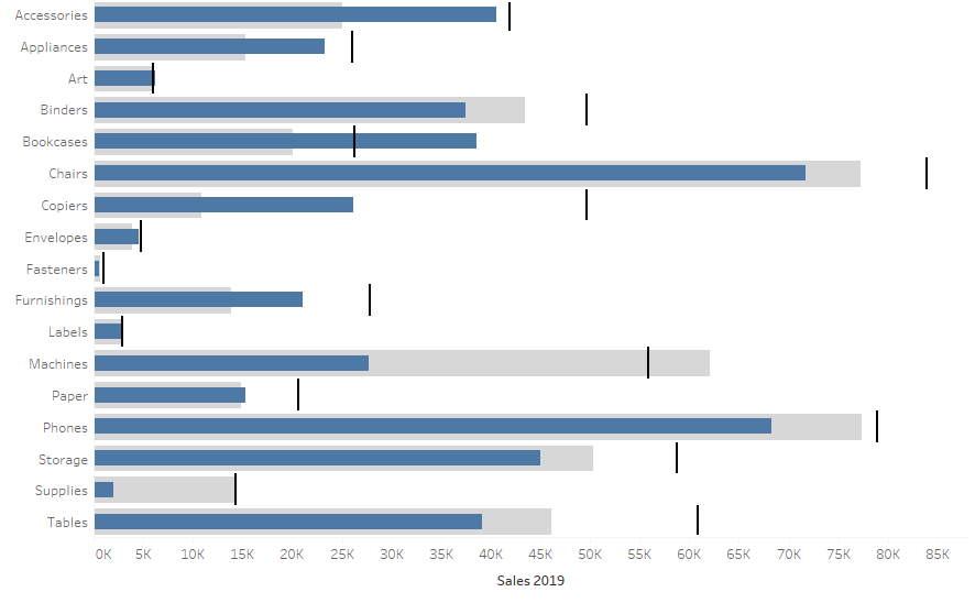
Bar charts are great!
A bar chart is one of the most useful types of graphs. You can come across it in almost all business dashboards. Its interpretation is straightforward as we can easily compare the lengths of bars. It’s much easier than comparing the sizes of points. There are many types of bar chart, and they can be enhanced by adding references. This way, in addition to the information on the performance of the business indicator, it also shows a relation to the reference. One important aspect to remember is to ensure the transparency of your visualization and to not overwhelm users with colors or references. If you follow a “keep it simple” principle, your bar charts will definitely be a reliable foundation for any dashboard.
Mateusz Karmalski,
Tableau Author
