In the previous posts of the “60 charts in Tableau” series, I described the techniques for visualizing the category and time data as well as the elements of the whole. Let’s recall – bar charts were recommended for the category data, and line charts for the time data. There were more options available for the elements of the whole, depending on the type of data. In terms of relationships, we are going to discuss one preferred option – a scatterplot.
Visualizing deficiencies between variables with a Scatterplot
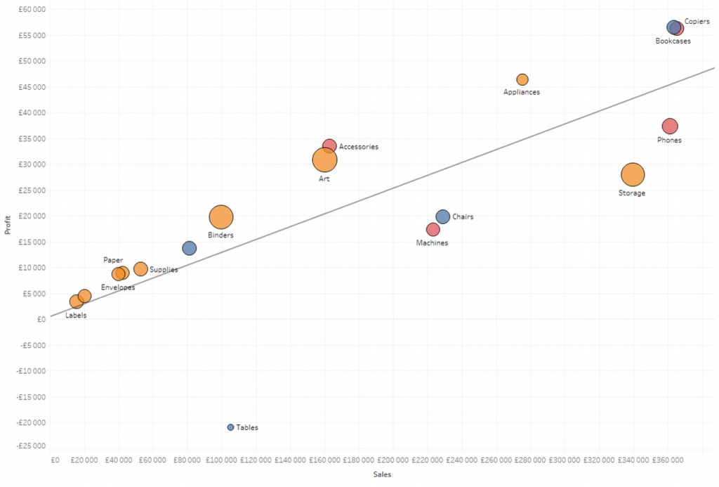
Scatterplot – a point chart – is a perfect way to show the deficiencies between two variables according to the level of detail chosen. This chart presents selected variables on two axes and the data point represents the level of detail. For example, the below chart shows the dependencies between Sales and Profit values. Data points represent product categories:
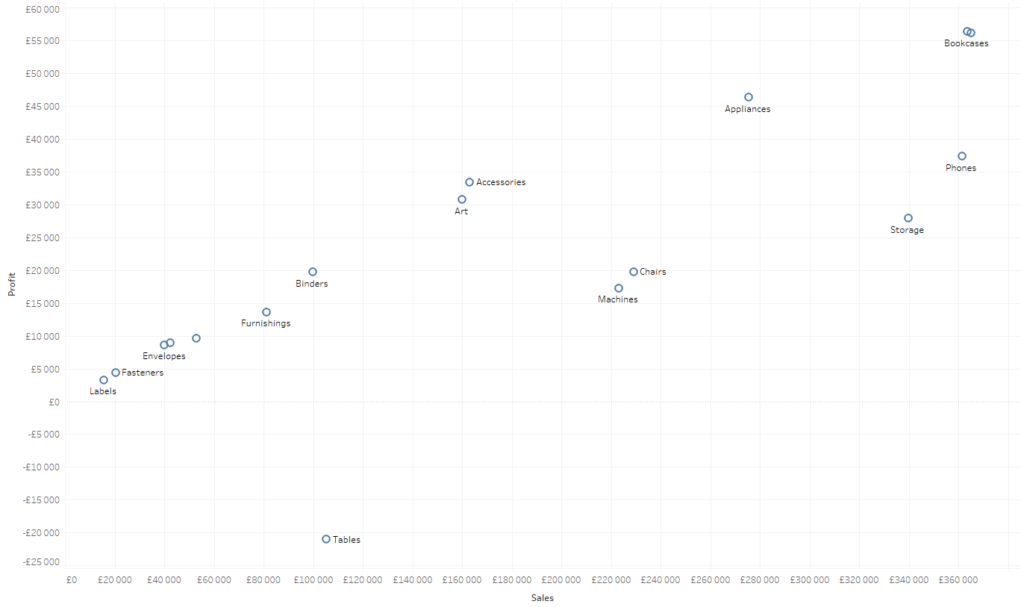
The above chart clearly shows the dependence – the higher the sales, the higher the profit. Scatterplot is intended for this purpose – it allows you to quickly evaluate visually if the correlation exists or not. Another advantage is the possibility to identify the outliers. In this case, it is the Tables category, which is the only one with a negative profit. It is the extreme outlier; in addition, there are also positive and negative outliers. To better visualize this, we can add a trend line to our chart:
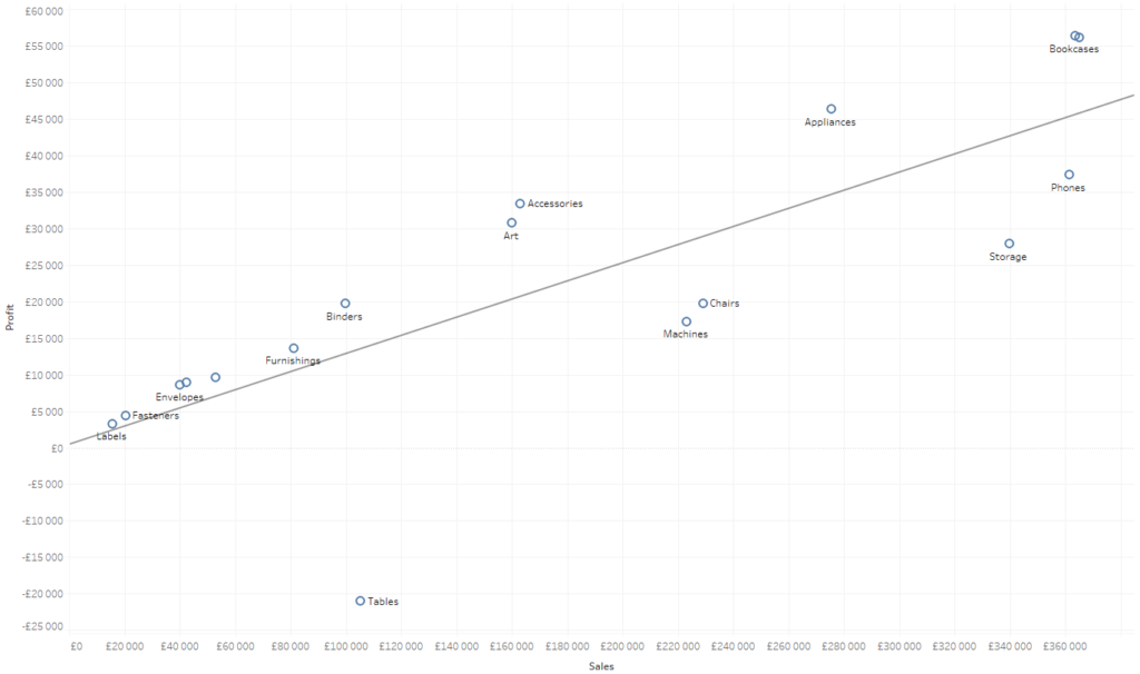
The trend line confirms our observation about the linear dependence of the sales and profit. In addition to the clearly outstanding Tables value, we also have such categories as Chairs, Storage and Phones, which are below the trend line, meaning they are less profitable. On the other side, we have such categories like Art, Accessories and Appliances, which are more profitable than shown by the trend line.
Adding further analysis dimensions to a Scatterplot
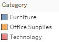
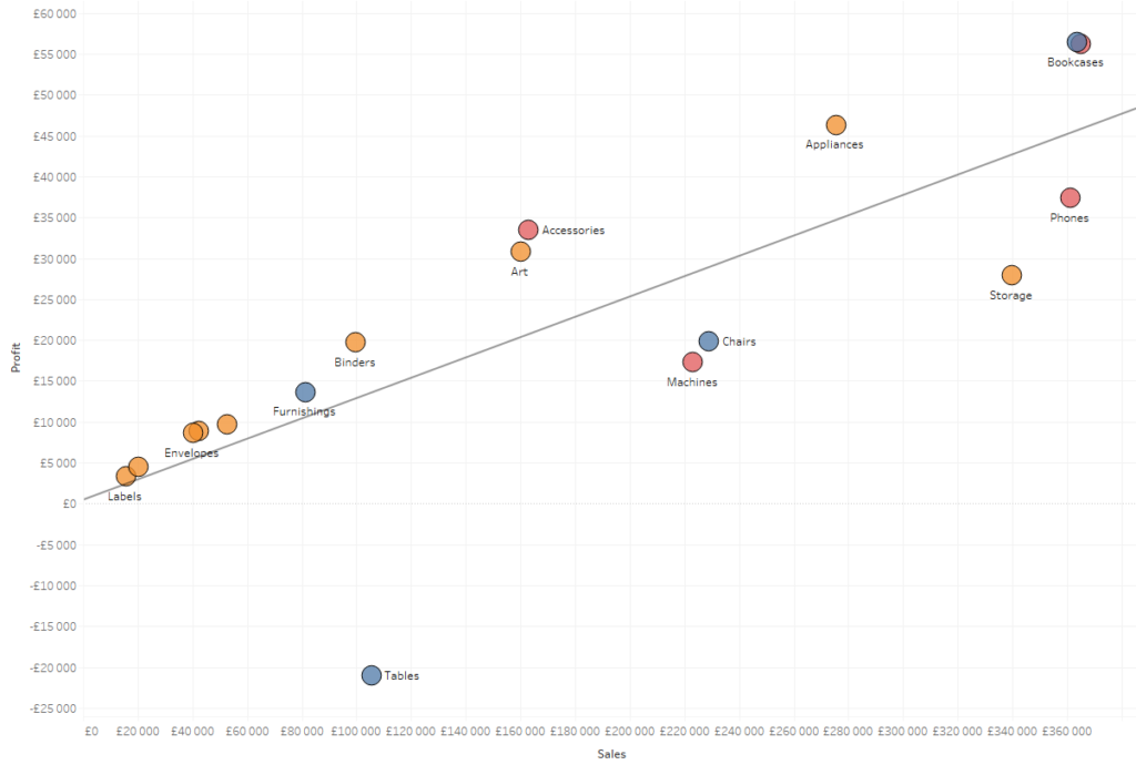
A Scatterplot can be extended by additional data dimensions to increase the amount of information provided by the chart. Let’s start with color – we will add color to the aggregate product category in accordance with the legend:
This helps to identify where the subcategories of a given category are on the chart:
The last element that can be used to show another dimension of data is the size of data points. We will add the quantity field which shows the category size:
That’s not all when it comes to the analytical capacity of the scatterplot. By using reference lines, you can also add to the chart the lines that show the average values of the sales and profit:
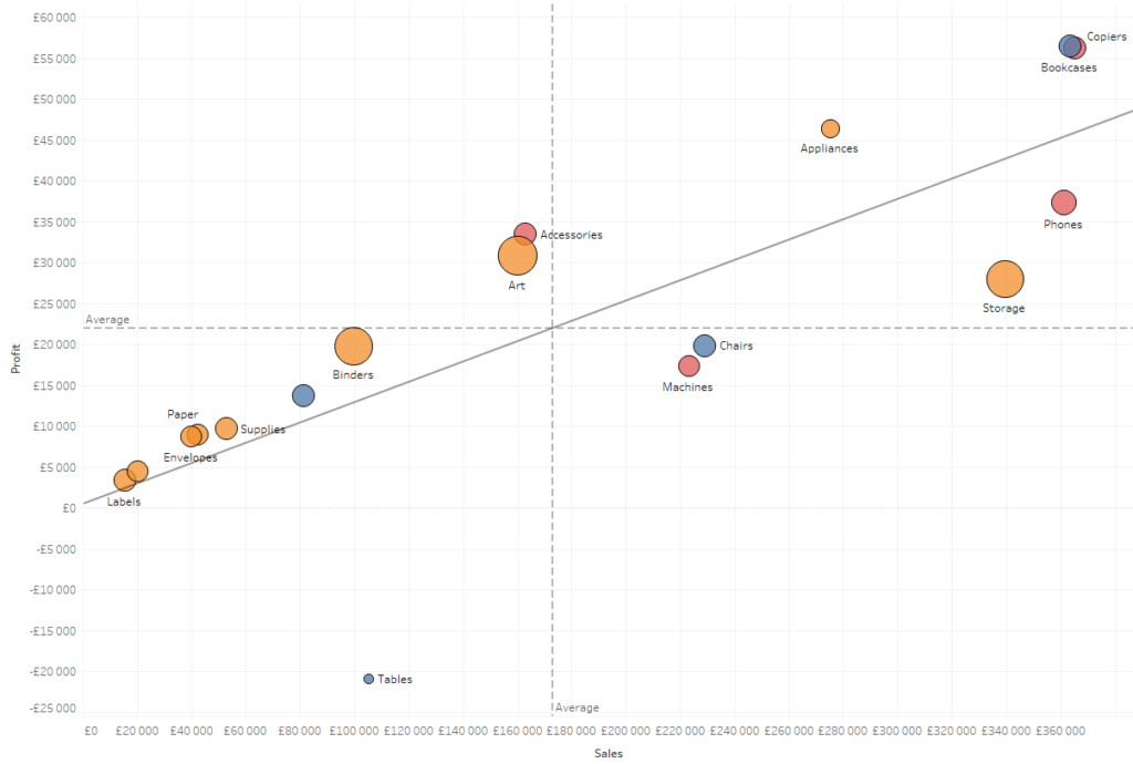
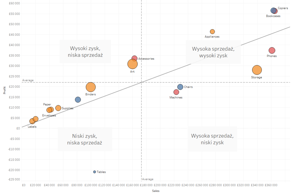
What possibilities does it give us? We have been able to divide the datapoints (categories in our case) into four areas. This way we can easily identify strong categories and the categories to be improved:
More categories and variables
A scatterplot shows continuous variables on its axes; whereas you can use the datapoints to demonstrate the dependencies between category variables. As a result, your effect will be similar to a highlight table or heat map, but you will have an additional dimension – the size. Such a visualization is called a correlation matrix:
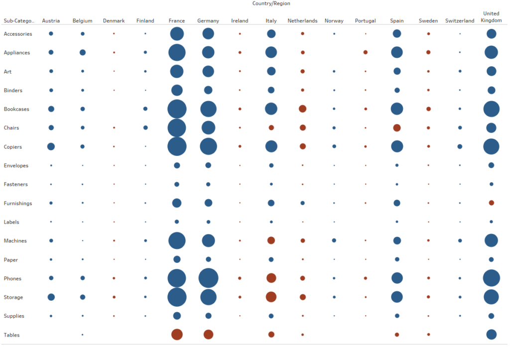
Looking at the above chart, it is easy to identify the main markets (France, Germany, UK) and categories (Phones, Copiers and Bookcases). The color in this case shows the profit, which helps to highlight the unprofitable dependencies between the market and category. For example, Holland or Sween have most of their categories unprofitable. This way you can identify the areas for optimization. A correlation matrix is less functional compared to the scatterplot – you can visualize two continuous dimensions (size and color), instead of four dimensions in the scatterplot (X-axis, Y-axis, size and color); however, you get a second category dimension, which also has certain advantages.
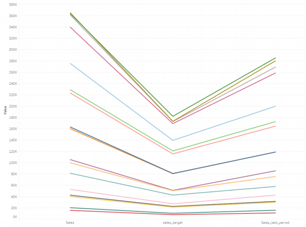
Another option is to use parallel coordinates, which is a chart that shows the changes in the continuous variables for various dimensions. This chart is helpful when you want to present the dependencies of more than two variables the same way as on the scatterplot. The only limit is the common axis, which means that the dimensions should have a similar order of magnitude. Otherwise, the chart will become illegible.
What other options are available?
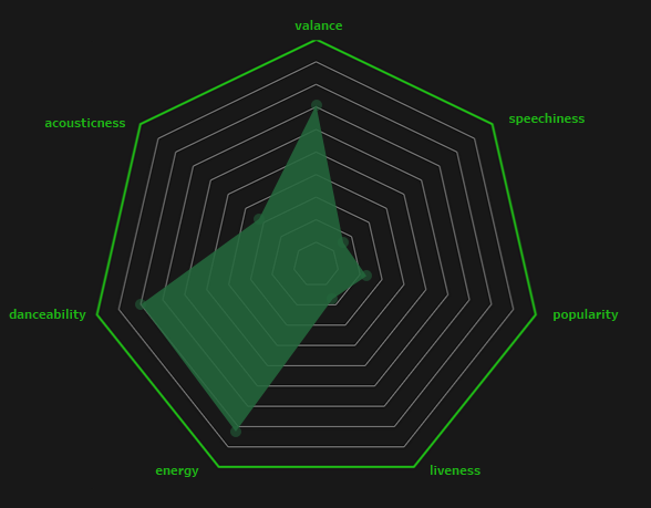
There is a range of other visualization options, however, none of them are as easy to present the information as a scatterplot. For example, a radar chart consists of one continuous variable and several categories:
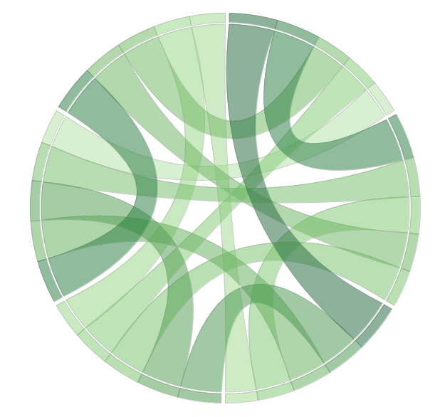
A chord diagram is another example – it shows interactions between the categories:
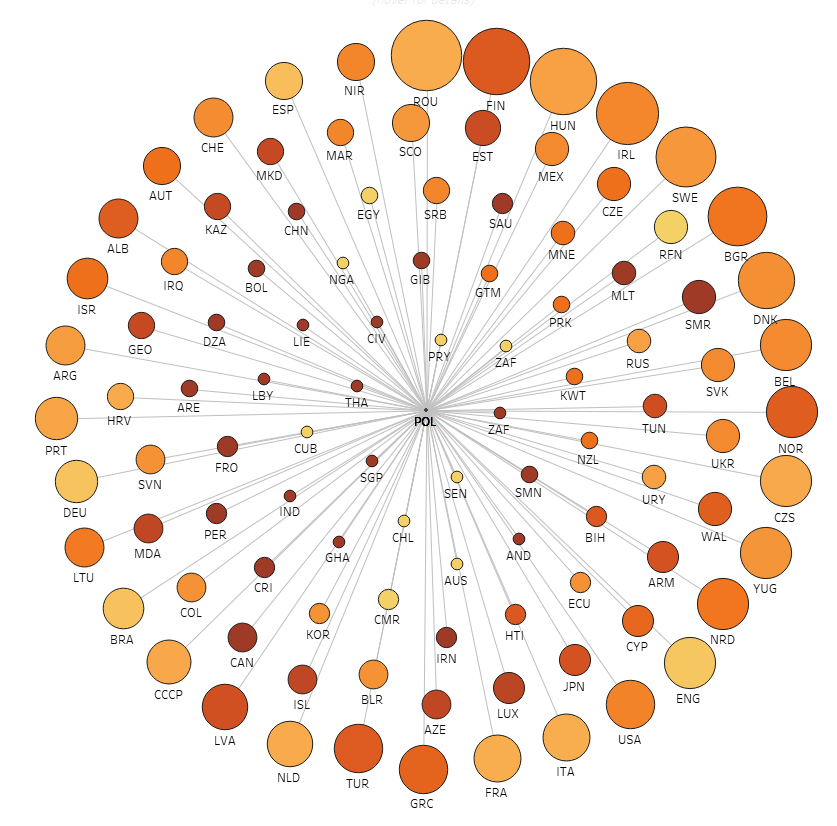
These charts are not easy to prepare and understand, and as such, they are not widely used. Another aspect are the organizational charts that show the hierarchy within the organization. Similar to them are network diagrams. Dendrograms (charts showing decision trees or hierarchies) are currently becoming increasingly popular.
Relationships = a Scatterplot
When setting out to visualize relationships between data, it is always good to start with a scatterplot. This chart is easy to prepare, moreover, it’s a very flexible and useful tool. It is also quite easy to understand by end users. The additional features such as adding size, color, trend line and reference lines, make it a very powerful data visualization tool. Only in specific cases (such as visualization of hierarchy), it is recommended to use more advanced solutions to visualize the relationships.
Mateusz Karmalski, Tableau Author


