Data visualization is one of the stages of analysis, but usually one of the final ones – based on it we can assess the condition of our business, make conclusions or offer recommendations. However, before we get to this step, preparation, data modeling is necessary. The old analytical adage says that every analyst spends 80% of their time preparing the data and 20% on the actual analysis. Therefore, every top Business Intelligence tool offers an ETL (Extract, Transform, Load) tool to some extent. For Tableau, it’s Tableau Prep, and for Power BI, it’s Power Query. Of course, the market for ETL tools is quite broad and we can find a lot of programs both simple and complex. However, for most basic business applications, ETL add-ons are sufficient. Then we can easily connect to the source, model the data, then load the finished model into Power BI (or Tableau) and do the actual data analysis. So how do you get started with data modeling using Power Query?
Connect and load data using Power Query
The first step, of course, is to connect the data. Power Query can be run from within Power BI – by clicking the “Transform data” box. Connect the data by selecting “Get data”. We have a plethora of connections available – from basic ones like csv or xls to online ones like Azure or SalesForce.
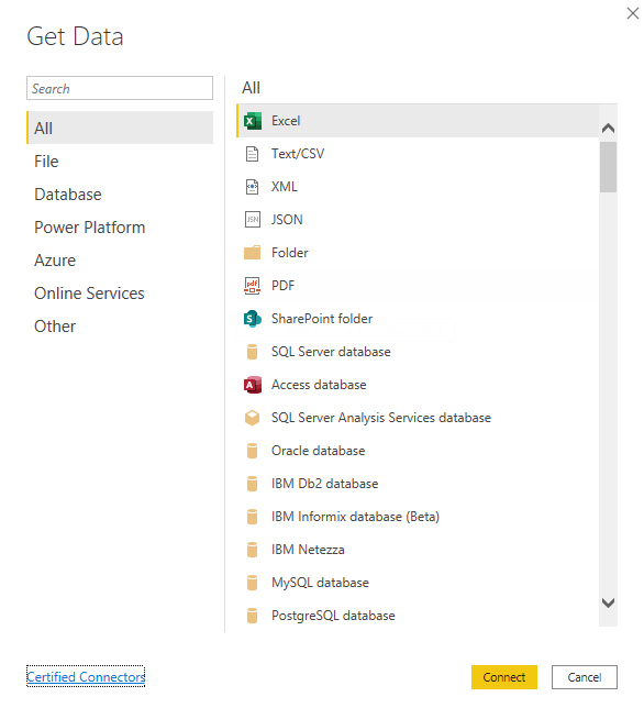
For practice purposes, we will connect to data with match results – staying with the theme of the recently concluded EURO. After selecting File -> Text/CS we get a preview of our data:
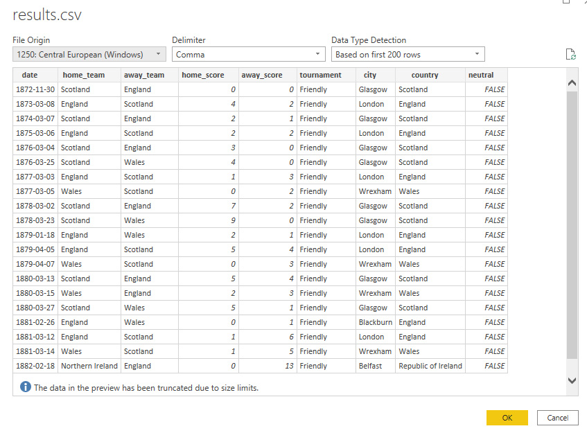
After clicking ok our data is loaded and we can start modeling and transformations. The main Power Query window resembles other Microsoft applications. At the top we have a ribbon with available options, in the middle the main table view, on the left the list of queries (data connections), and on the right the list of actions we performed during modeling. This is a very cool feature that allows us to see what transformations are performed on our data and in what order. Additionally, once defined steps do not have to be defined again, i.e. when developing transformations we do it only once. The list and individual steps can also be edited, making it easy to make changes later.

Clean, model and transform data in Power Query
Once the data is loaded, we can begin the tedious process of cleaning the data to make it suitable for analysis. PowerQuery automatically creates three steps when you plug in your data:
- Source – data connection
- Promoted Headers – treat the first row of the table as headers
- Changed Type – set the data type
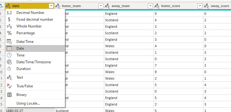
The third point is done automatically based on a sample of data, so it may not always be correct. In our case, the model incorrectly recognized the date. Text was selected instead of Date type. We can easily change this by clicking on the data type in the header:
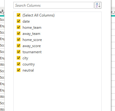
The next step is to select the appropriate columns. It is good practice to leave only those that are relevant for further analysis. This will not only make our model clearer, but also smaller in volume and thus also faster.
After selecting the columns, it is the turn of the rows. If our data contains errors, empty values, duplicates – at this stage we can eliminate them by selecting the appropriate option. In our case, we will remove the rows with incorrect dates.
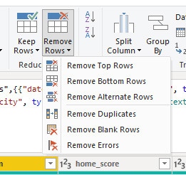
At this point, it is worth noting how Power Query executes our commands. By selecting the appropriate options from the graphical interface, which are the commands on the ribbon, Power Query creates formulas in M. We can view them in the formula bar exactly as in Excel:

Further options on the ribbon allow us to split columns, format them or extract values of interest. Suppose we want to extract the year from a date. We can do this using the split option:
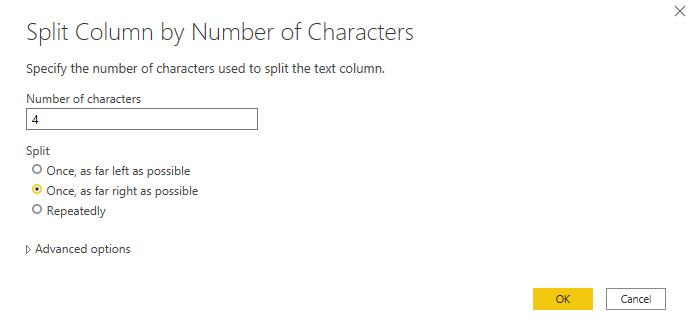
Or by using the Extract command:

The second option has the advantage that the new column replaces the old one. In the case of the Split command, we get two columns, which means we need to add another step – that is, remove the first column. This is often the case when modeling data in Power Query – we can get the desired effect in several ways. We should always look for the simplest one to make our model effective.
Data modeling – we extend the data model with new elements
Using Power Query, we can add new calculation columns to our data table. A separate Add Column ribbon is used for this purpose. We have several options to choose from, and we can type formulas in the editor available by selecting Custom Column. In the case under study, we will add a column with the number of goals in the match, which consists of the sum of the home and away goals:
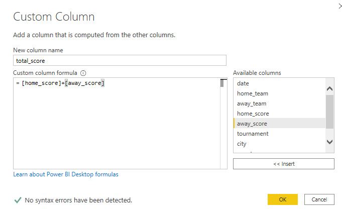
Formulas are defined in the aforementioned M language. It is quite intuitive for basic use, but requires some practice for more advanced applications. That’s why the Conditional Column editor is very helpful, for example, in which we create rules analogous to the if function known from Excel. Suppose we want to add a column to show who won: the home team, the visitor or there was a tie. A function defined using the editor looks like this:
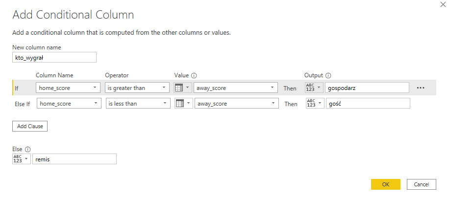
In contrast, the M-language function generated by the editor looks like this. Having experience with logical functions in Excel for example, it is quite easy to read the syntax of the function.

We can also expand our table by including other columns.
We can combine individual queries in two ways:
- Append – Append tables in the same layout to each other one below the other
- Merge – appends data from the second table to the main table, searched by the specified key
The merge option works similarly to joining tables using join. Choosing the Merge option, we indicate the table we want to merge, the fields by which to search for items, and the type of joins (left, right, full, inner). In the case under study, we want to add information about the region where the matches took place to the main table. So we search by the “country” field using the Left Outer join option.
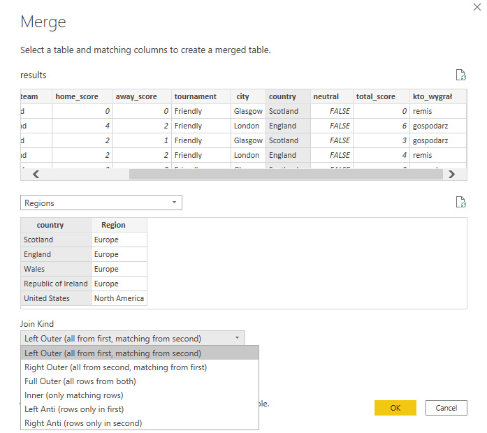
Once the tables are joined, all that remains is for us to select the fields we want to display from the joined table in our base table:
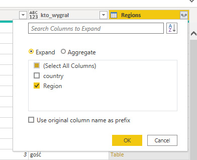
And then we can load the data into the model to start the data analysis and visualization process in Power BI.
Power Query is a really useful and friendly ETL
Power Query as an ETL tool works great. The interface is user-friendly, mostly used to Microsoft products. The graphical editor allows you to model your data without knowledge of M or any SQL type query language. Therefore, we can perform basic transformations quite easily. A great option is a window with applied steps during data modeling, so we can see what is happening with our data at each stage. This makes it easy to retrace your path and edit it whenever your business needs change. Data processed in Power Query is immediately suitable for visualization in Power BI integrated with it, creating a truly cohesive self-service BI suite.
Data modeling – Tableau Prep or Power Query?
The question is as good as whether to choose Power BI or Tableau. There is no one specific answer here, and a lot depends on user preference. The tools themselves are similar in terms of functionality – they are both ETL tools that enable data modeling and transformation. Both prepare our data so that it can then be analyzed and visualized using Power BI or Tableau. Tableau Prep has the advantage of generating ready-made extracts for us to analyze in Tableau. So we don’t need to export the data to csv files. Power Query, on the other hand, thanks to its integration with Power BI, does not require running a separate application (like Prep), which also makes work easier. The Power Query interface for a novice user will also be easier to learn at first because it is the same as other applications like Excel. Tableau Prep, on the other hand, is great at visualizing the flow of data in the form of a so-called Flow, so we can see how our data is modeled. Therefore, it is not possible to unequivocally point to any one as clearly superior – both are good ETL tools.
Matthew Karmalski, Tableau Author
