NewDataLabs

Tableau - Business Intelligence Tools

  • Solutions
    • ETL
      • Tableau Prep
      • Airflow
      • Power Query
      • Microsoft Integration Services
      • Fivetran
    • Data warehouses
      • Snowflake
      • Google Big QUERY
      • Microsoft SQL Server
      • PostgreSQL
      • Web analytics
      • Amplitude
    • Business Intelligence
      • Tableau
        • What is Tableau?
        • How to implement Tableau properly?
        • Interactive management dashboard
        • Tableau price list
        • Products of Tableau
          • – Tableau Desktop
          • – Tableau Server
          • – Tableau Prep
          • – Tableau Online
        • Tableau Audit
        • Tableau Day
      • Power BI
  • Services
    • Tableau workshops on your data – Proof of Concept
    • Preparation of data – ETL
    • Reporting and data visualization
    • Migration services
    • Tableau training courses
    • Embedded Analytics
  • Salesforce
    • Salesforce CRM
      • Customer relationship management
      • Sale
        • Sales opportunity management
      • Business Intelligence analysis
      • Salesforce Manufacturing Cloud
      • Salesforce Service Cloud
      • Salesforce Marketing Cloud
    • Services
      • Proof of Concept
      • CRM workshops
      • Implementation of CRM
      • Post-implementation support
      • Data migration
      • Salesforce training
      • CRM consultancy
      • Salesforce integrations
    • Tableau + Salesforce
  • About Us
  • Customers
    • Our Customers
    • Customer stories
      • Totalizator Sportowy Sp. z o.o.
      • Snieżka S.A.
      • Werner Kenkel Sp. z o.o.
      • DOZ S.A.
  • Events
    • Webinars >
      • Salesforce
      • Tableau
      • Power BI
    • Tableau Training Courses >
      • New Data Model
      • Tableau online course
      • Tableau training courses
    • Power BI Training Course
  • Blog
  • Download Tableau
    • Tableau Desktop – Trial
    • Tableau Server – Trial
    • Tableau Prep – Trial
    • Tableau Reader
  • Contact
EN / PL

Heat Map in Tableau

2020-11-12

The appearance of the Heat Map in Tableau has generated general enthusiasm. No wonder.
Excellent visual effect guaranteed! And yet it turns out that this is not a simple type of visualization. Today about when and how to create Heat Maps in Tableau.

Heat Map or Density Map?

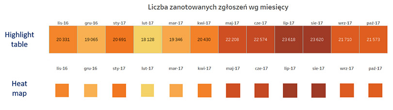
Unfortunately in Tableau this question is important. We are used to calling the heat map a map where the intensity of the color means the intensity of the phenomenon in the area. Alternatively, it may be a table where the cell color indicates the level of the measurement value. That’s the “Highlight Table” in Tableau. The “Heat Map” graph shows the intensity of the shape size feature. Yes, one look at the picture below and what do we see? This “Heat Map” is extremely useless for small differences in value. That’s why it’s rarely used.

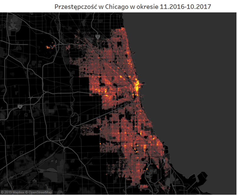
The classic heat map is in Tableau the “Density Map“. It is created by selecting a type of chart with the same name on the shelf “Marks”. Looks like it’s in the picture below.

The key to success: GPS data or “Longitude” and “Latitude”

Heat maps are still not very popular. This was determined by the difficulty of obtaining relevant data. I’ve selected the report data for the Chicago Police Department. Why?

Evening at the police station. A police car trip. Night talk about catching serial killers. Tales about SWAT actions over shrimps in China Town. This kind of thing only happened to me in Chicago. And a souvenir funnel for a hip-flask from the local uniformed services store. The first answer is sentiment.

The second is very specific. It is a large data set – about 200 thousand records, containing precise information about the location of each event. So there are many points available. Often overlapping. They’re the ones that show the intensity of the phenomena. For this type of analysis, we need to have GPS data or other location information available.

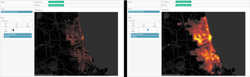
Editing Density Maps in Tableau

The difference between good and great visualization is usually editing. For Density Map we have three variables: point size, intensity and transparency. Additionally, you can operate by changing the style of maps.

Let’s start with the point size – “size”. Depending on the map, our map will reflect quite precisely the distribution of points or look like spilled spots. The optimal option is usually somewhere in the middle.

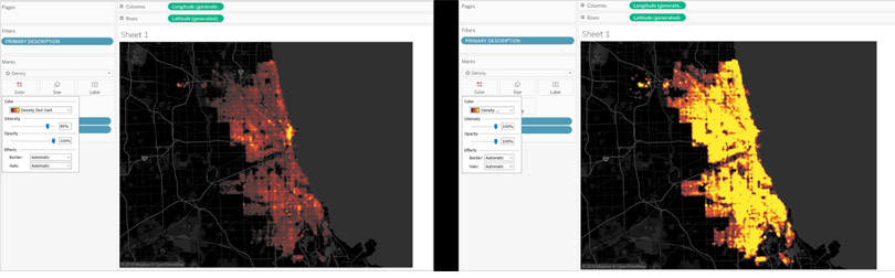
The “intensity” determines how much the color will change when points overlap. It is worth noting that here the appearance of the visualization is affected by a reduction of several percent. 15-20% changes the visualization diametrically. The effect can be weakened by increasing transparency, i.e. lowering the “opacity” parameter.

Effect: distribution of phenomena in space

Thanks to a good selection of data and careful edition of the heat map, or “Density Maps“, they allow you to perfectly illustrate not only the distribution but also the intensity of phenomena in space. In these types of tasks, they are better than traditional point maps, because reading the results is more intuitive.

Check it out for yourself. Below is an overview of selected criminal attractions of the Wind City. You can decide for yourself which parts of Chicago you want to visit or rather avoid.

Webinars
> Amplitude Webinars
> Tableau Webinars
> Power BI Webinars

Tableau training courses
Power BI online course
ETL
> Tableau Prep
> Airflow
> Power Query
> Microsoft Integration Services
Data warehouses
> Snowflake
> Google BigQuery
> Microsoft SQL Server
> PostgreSQL
Business intelligence
> Tableau
> Salesforce
> Power BI
Web analytics
> Amplitude
Salesforce
> Customer relationship management
> Sale
> Sales opportunity management
> Analysis Business Intelligence
> Salesforce Manufacturing Cloud
> Salesforce Service Cloud
> Salesforce Marketing Cloud
Contact

contact@newdatalabs.com


601797783
+48 781 648 194


Adres
Correspondence address:
al. T. Boy’a – Żeleńskiego 26,
51-160 Wrocław

Copyright © 2025

Manage Consent
To provide the best experiences, we use technologies like cookies to store and/or access device information. Consenting to these technologies will allow us to process data such as browsing behavior or unique IDs on this site. Not consenting or withdrawing consent, may adversely affect certain features and functions.
Functional Always active
The technical storage or access is strictly necessary for the legitimate purpose of enabling the use of a specific service explicitly requested by the subscriber or user, or for the sole purpose of carrying out the transmission of a communication over an electronic communications network.
Preferences
The technical storage or access is necessary for the legitimate purpose of storing preferences that are not requested by the subscriber or user.
Statistics
The technical storage or access that is used exclusively for statistical purposes. The technical storage or access that is used exclusively for anonymous statistical purposes. Without a subpoena, voluntary compliance on the part of your Internet Service Provider, or additional records from a third party, information stored or retrieved for this purpose alone cannot usually be used to identify you.
Marketing
The technical storage or access is required to create user profiles to send advertising, or to track the user on a website or across several websites for similar marketing purposes.
Manage options Manage services Manage {vendor_count} vendors Read more about these purposes
View preferences
{title} {title} {title}
The newdatalabs.com/en website uses cookies. We use information saved using cookies and similar technologies, including for advertising and statistical purposes and to adapt our website to the individual needs of users. By continuing to use the site, you agree to the terms.Close