NewDataLabs

Tableau - Business Intelligence Tools

  • Solutions
    • ETL
      • Tableau Prep
      • Airflow
      • Power Query
      • Microsoft Integration Services
      • Fivetran
    • Data warehouses
      • Snowflake
      • Google Big QUERY
      • Microsoft SQL Server
      • PostgreSQL
      • Web analytics
      • Amplitude
    • Business Intelligence
      • Tableau
        • What is Tableau?
        • How to implement Tableau properly?
        • Interactive management dashboard
        • Tableau price list
        • Products of Tableau
          • – Tableau Desktop
          • – Tableau Server
          • – Tableau Prep
          • – Tableau Online
        • Tableau Audit
        • Tableau Day
      • Power BI
  • Services
    • Tableau workshops on your data – Proof of Concept
    • Preparation of data – ETL
    • Reporting and data visualization
    • Migration services
    • Tableau training courses
    • Embedded Analytics
  • Salesforce
    • Salesforce CRM
      • Customer relationship management
      • Sale
        • Sales opportunity management
      • Business Intelligence analysis
      • Salesforce Manufacturing Cloud
      • Salesforce Service Cloud
      • Salesforce Marketing Cloud
    • Services
      • Proof of Concept
      • CRM workshops
      • Implementation of CRM
      • Post-implementation support
      • Data migration
      • Salesforce training
      • CRM consultancy
      • Salesforce integrations
    • Tableau + Salesforce
  • About Us
  • Customers
    • Our Customers
    • Customer stories
      • Totalizator Sportowy Sp. z o.o.
      • Snieżka S.A.
      • Werner Kenkel Sp. z o.o.
      • DOZ S.A.
  • Events
    • Webinars >
      • Salesforce
      • Tableau
      • Power BI
    • Tableau Training Courses >
      • New Data Model
      • Tableau online course
      • Tableau training courses
    • Power BI Training Course
  • Blog
  • Download Tableau
    • Tableau Desktop – Trial
    • Tableau Server – Trial
    • Tableau Prep – Trial
    • Tableau Reader
  • Contact
EN / PL

Heat Map – what exactly is it?

2022-04-22

When I conduct training, I always try to ask participants what their imagination tells them when I say heat maps. I usually hear about a map with shades of brown, red, orange and yellow. Only in Tableau does such a visualization have a completely different name. Today about heat map chart, its advantages, disadvantages and what makes it different from density map and highlight table.

Before I write about heat maps

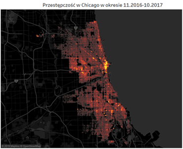
A visualization that tells us the intensity of a feature at a given location on a map by the intensity of a color is… Density map! This I admit can be confusing, because such a map looks exactly like most of us’ idea of a heat map. An example of such visualization can be found below. The brighter the point on the cartogram, the more crime occurred at that location in Chicago.

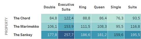
There is another type of chart that is easily confused with what Tableau refers to as heat maps. This is a highlight table for a change, which is a table colored according to the intensity level of a certain feature. The higher the value – in the case of below hotel room ratings – the darker the color. This visualization is also sometimes confused with heat maps, especially when there are no numbers on it.

Heat map in its full glory

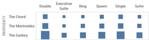
We now know what you won’t find under heat maps in Tableau. So what’s in the Show Me tab? A graph showing the intensity of the feature by the size of the icon! The default will be a square. And be warned! By default – against intuition – you will not find color in this chart. You can add it, but you don’t have to at all. In other words, a table with average room ratings as heat maps would look like this:

Advantages and disadvantages of Heat Map

Is the table presented in this way more readable? I’m afraid not. Can value differences be accurately determined from it? Also difficult. This is easier than comparing the saturation level of two colors, but it is still a difficult task for the human eye. The human eye is good at comparing segment lengths. With comparing the areas of figures, no more. It’s half bad when we compare squares or rectangles. With more complex shapes, this is almost impossible. It is enough, by the way, to use wheels. There are studies confirming that the larger they are, the more we are wrong, underestimating their surface when comparing. You can, of course, deal with this by comparing not the area of the circles but their radii. However, this approach is not intuitive for most audiences.

So does such a chart have advantages? You can’t see the numbers on it, poorly suited for accurate comparisons. Instead, it allows you to easily gain a broad overview of the situation. This is convenient, but requires a brief introduction of those interested. A good example is the chart below showing Sample Superstore’s year in business.

It is not very bright at first glance. However, just adding a few facts can change that. The size of the dots here corresponds to the sales volume in each product subcategory in the following months of 2020. The color of the dots is the profit earned by the store. Knowing this, the recipient almost immediately notices in which departments sales were very weak (envelopes, fasteners, labels, art). It’s also easy to see that table sales, while significant, are completely unprofitable. This chart won’t give us much detail, but it will give us a quick way to draw global conclusions.

Agata Mężyńska

Tableau Desktop Certified Profession

Webinars
> Amplitude Webinars
> Tableau Webinars
> Power BI Webinars

Tableau training courses
Power BI online course
ETL
> Tableau Prep
> Airflow
> Power Query
> Microsoft Integration Services
Data warehouses
> Snowflake
> Google BigQuery
> Microsoft SQL Server
> PostgreSQL
Business intelligence
> Tableau
> Salesforce
> Power BI
Web analytics
> Amplitude
Salesforce
> Customer relationship management
> Sale
> Sales opportunity management
> Analysis Business Intelligence
> Salesforce Manufacturing Cloud
> Salesforce Service Cloud
> Salesforce Marketing Cloud
Contact

contact@newdatalabs.com


601797783
+48 781 648 194


Adres
Correspondence address:
al. T. Boy’a – Żeleńskiego 26,
51-160 Wrocław

Copyright © 2025

Manage Consent
To provide the best experiences, we use technologies like cookies to store and/or access device information. Consenting to these technologies will allow us to process data such as browsing behavior or unique IDs on this site. Not consenting or withdrawing consent, may adversely affect certain features and functions.
Functional Always active
The technical storage or access is strictly necessary for the legitimate purpose of enabling the use of a specific service explicitly requested by the subscriber or user, or for the sole purpose of carrying out the transmission of a communication over an electronic communications network.
Preferences
The technical storage or access is necessary for the legitimate purpose of storing preferences that are not requested by the subscriber or user.
Statistics
The technical storage or access that is used exclusively for statistical purposes. The technical storage or access that is used exclusively for anonymous statistical purposes. Without a subpoena, voluntary compliance on the part of your Internet Service Provider, or additional records from a third party, information stored or retrieved for this purpose alone cannot usually be used to identify you.
Marketing
The technical storage or access is required to create user profiles to send advertising, or to track the user on a website or across several websites for similar marketing purposes.
Manage options Manage services Manage {vendor_count} vendors Read more about these purposes
View preferences
{title} {title} {title}
The newdatalabs.com/en website uses cookies. We use information saved using cookies and similar technologies, including for advertising and statistical purposes and to adapt our website to the individual needs of users. By continuing to use the site, you agree to the terms.Close