NewDataLabs

Tableau - Business Intelligence Tools

  • Solutions
    • ETL
      • Tableau Prep
      • Airflow
      • Power Query
      • Microsoft Integration Services
      • Fivetran
    • Data warehouses
      • Snowflake
      • Google Big QUERY
      • Microsoft SQL Server
      • PostgreSQL
      • Web analytics
      • Amplitude
    • Business Intelligence
      • Tableau
        • What is Tableau?
        • How to implement Tableau properly?
        • Interactive management dashboard
        • Tableau price list
        • Products of Tableau
          • – Tableau Desktop
          • – Tableau Server
          • – Tableau Prep
          • – Tableau Online
        • Tableau Audit
        • Tableau Day
      • Power BI
  • Services
    • Tableau workshops on your data – Proof of Concept
    • Preparation of data – ETL
    • Reporting and data visualization
    • Migration services
    • Tableau training courses
    • Embedded Analytics
  • Salesforce
    • Salesforce CRM
      • Customer relationship management
      • Sale
        • Sales opportunity management
      • Business Intelligence analysis
      • Salesforce Manufacturing Cloud
      • Salesforce Service Cloud
      • Salesforce Marketing Cloud
    • Services
      • Proof of Concept
      • CRM workshops
      • Implementation of CRM
      • Post-implementation support
      • Data migration
      • Salesforce training
      • CRM consultancy
      • Salesforce integrations
    • Tableau + Salesforce
  • About Us
  • Customers
    • Our Customers
    • Customer stories
      • Totalizator Sportowy Sp. z o.o.
      • Snieżka S.A.
      • Werner Kenkel Sp. z o.o.
      • DOZ S.A.
  • Events
    • Webinars >
      • Salesforce
      • Tableau
      • Power BI
    • Tableau Training Courses >
      • New Data Model
      • Tableau online course
      • Tableau training courses
    • Power BI Training Course
  • Blog
  • Download Tableau
    • Tableau Desktop – Trial
    • Tableau Server – Trial
    • Tableau Prep – Trial
    • Tableau Reader
  • Contact
EN / PL

Line Charts in Tableau

2024-02-26

A line chart is a classic and basic tool of everyone involved in data analytics. It is easy to prepare and is intuitively understood by recipients. Can this chart have any hidden secrets? Of course.

What does a line chart show?

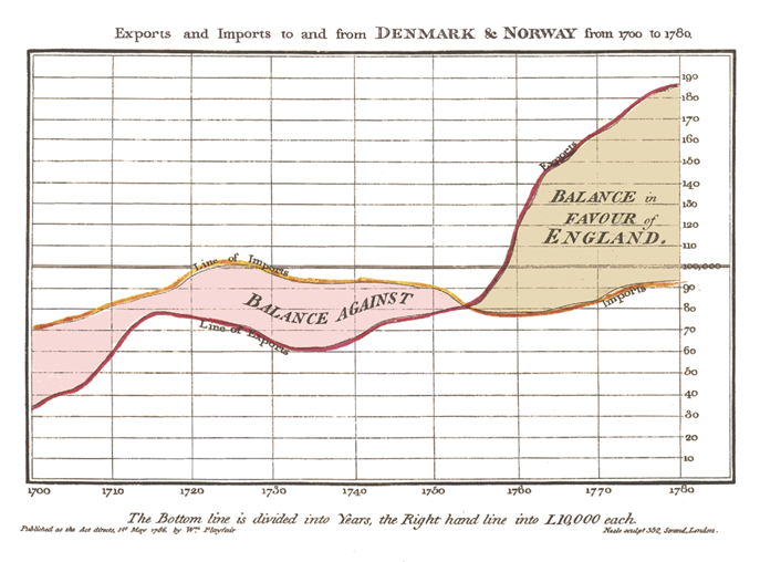
A line chart connects a series of logically linked values. It is most often used to show the continuity over time. It was presented for the first time in 1786 in the publication by William Playfair Commercial and Political Atlas. Playfair used the chart to illustrate the balance of trade between Denmark and Norway. Since then, this method of data presentation has become so popular that today, the continuity over time is presented from left to right. Also, in the cultures where text is read from right-to-left or from top-to-bottom.

However, the line doesn’t have to show the time only. We all remember drawing line functions at school. They usually presented a dependency between age and weight, temperature and density, IQ score and its frequency. Sometimes, at school we also drew the lines that represented non-functional data such as circles. Now, you can draw all of them in Tableau.

The important aspect is that the lines always connect the values, not dimensions. It would be wrong to use a line to connect the sales values for diverse types of products. Even though it’s possible, it would be misleading for recipients of such visualization. It would suggest the existence of continuity, which does not occur in this case.

Drawing a chart in Tableau

In the instruction for Show Me tab, you can read that in order to create a line chart in Tableau, you need one date field and one measure. Everything else would be extra elements. A date field will almost always be available on the Columns shelf, and a measure on the Rows shelf. Additionally, in the Marks tab you need to select the Line chart, even though it usually appears automatically. That’s it when it comes to the basics. What else can you do with a line chart?

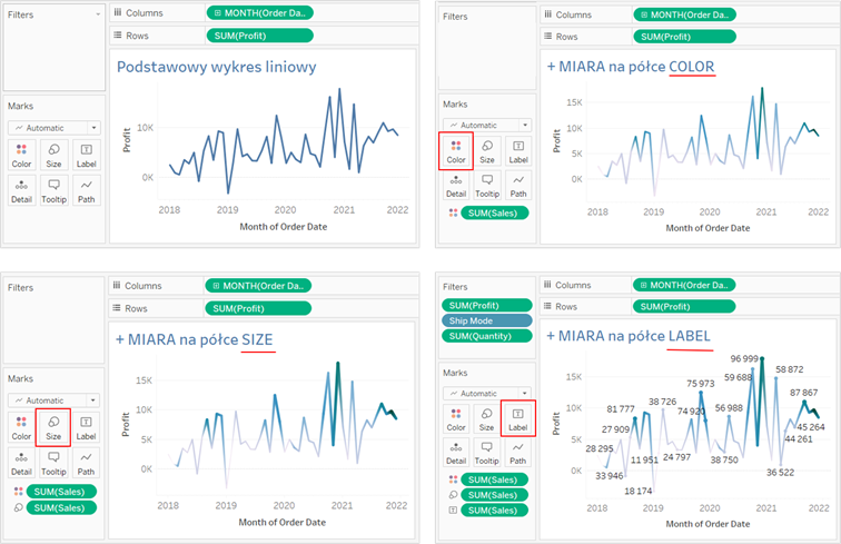
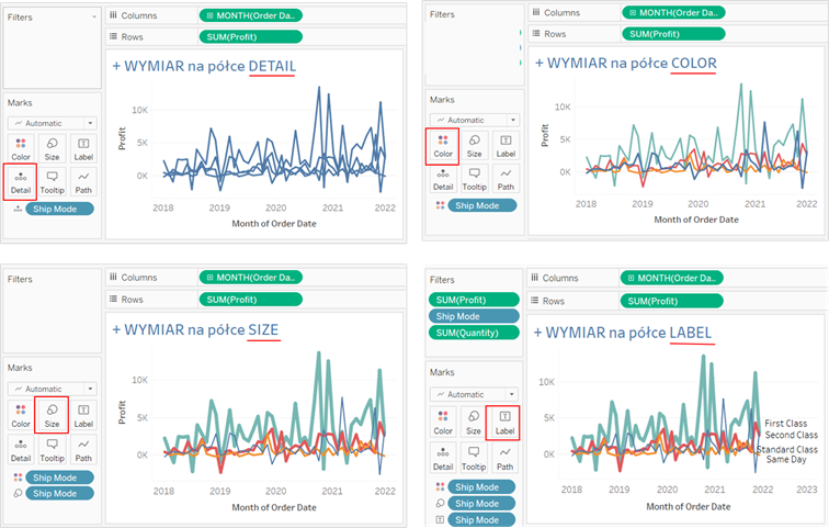
You can add other elements for further tables on the Marks tab. These elements will influence the form of the chart depending on whether they are measures or dimensions. The below illustration shows how they affect the chart after adding them to Color, Size, Label, and Detail tabs. It’s worthwhile to note that the measure in the Detail tab does not change the chart appearance. The Tooltip tab does not impact the display of the visualization either.

Modifying the chart by a measure

Modifying the chart by a dimension

Path Tab

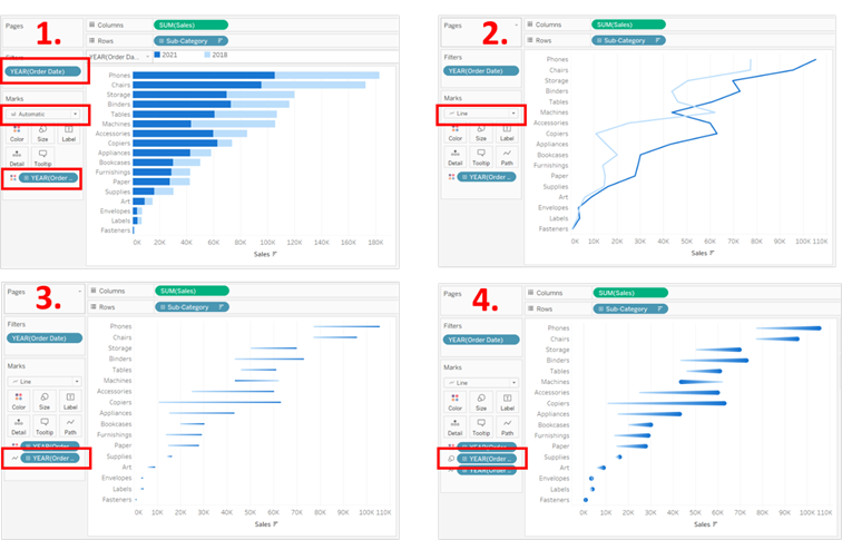
There is also the Path tab. It appears when you select the line chart or when it opens automatically. There is usually nothing there, but it gives you certain options. It allows to define what the line should link. Imagine that you want to draw a chart in the form of comets. It’s a type of line chart. To create it, connect two value lines, for example, sales values over two years.

If you draw a chart showing the sales broken down into subcategories, you are able to filter the data for two selected years, then add the years to the Color tab and change the chart into a line chart – you are almost there. You will see two lines, but they will link the sales values in the specified year for various subcategories. To connect the values from specific years, you need to fill in the Path tab in each subcategory. Let’s use this method to define what should be linked. Place a data pill on the Path tab that represents the years. Next, add the same pill to the Size tab and you chart is ready. You can check how to do that step-by-step on the below illustration.

A “comet” graph is a line chart

A line chart and multiple measures

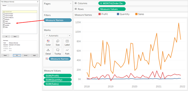
Sometimes you need to draw several lines in one coordinate system to represent various measures. You can do that by using two pills that Tableau automatically creates: Measure Names and Measure Values. Initially, place the first of them on the Filter shelf. It will allow you to select the required measures from the catalogue of all available measures. On the Columns shelf place a field with a date, and drag the Measure Values pill into the Rows shelf. This pill represents the total values of all filtered measures. When the Measure Values pill appears in the rows, a new shelf called Measured Values will be visible under the Marks shelf. The last thing to do is to place the Measure Names pill in the Color or Detail tab on the Marks shelf and your chart is ready.

Multiple measures on one line chart

Agata Mężyńska

Tableau Desktop Certified Professional

Webinars
> Amplitude Webinars
> Tableau Webinars
> Power BI Webinars

Tableau training courses
Power BI online course
ETL
> Tableau Prep
> Airflow
> Power Query
> Microsoft Integration Services
Data warehouses
> Snowflake
> Google BigQuery
> Microsoft SQL Server
> PostgreSQL
Business intelligence
> Tableau
> Salesforce
> Power BI
Web analytics
> Amplitude
Salesforce
> Customer relationship management
> Sale
> Sales opportunity management
> Analysis Business Intelligence
> Salesforce Manufacturing Cloud
> Salesforce Service Cloud
> Salesforce Marketing Cloud
Contact

contact@newdatalabs.com


601797783
+48 781 648 194


Adres
Correspondence address:
al. T. Boy’a – Żeleńskiego 26,
51-160 Wrocław

Copyright © 2025

Manage Consent
To provide the best experiences, we use technologies like cookies to store and/or access device information. Consenting to these technologies will allow us to process data such as browsing behavior or unique IDs on this site. Not consenting or withdrawing consent, may adversely affect certain features and functions.
Functional Always active
The technical storage or access is strictly necessary for the legitimate purpose of enabling the use of a specific service explicitly requested by the subscriber or user, or for the sole purpose of carrying out the transmission of a communication over an electronic communications network.
Preferences
The technical storage or access is necessary for the legitimate purpose of storing preferences that are not requested by the subscriber or user.
Statistics
The technical storage or access that is used exclusively for statistical purposes. The technical storage or access that is used exclusively for anonymous statistical purposes. Without a subpoena, voluntary compliance on the part of your Internet Service Provider, or additional records from a third party, information stored or retrieved for this purpose alone cannot usually be used to identify you.
Marketing
The technical storage or access is required to create user profiles to send advertising, or to track the user on a website or across several websites for similar marketing purposes.
Manage options Manage services Manage {vendor_count} vendors Read more about these purposes
View preferences
{title} {title} {title}
The newdatalabs.com/en website uses cookies. We use information saved using cookies and similar technologies, including for advertising and statistical purposes and to adapt our website to the individual needs of users. By continuing to use the site, you agree to the terms.Close