In business, it is often necessary to build rankings. For example, it’s important to know the top selling products. And in the case of managing sales teams – rankings of sales assistants/representatives. A ranking shows order, but it ignores value – it’s worth to keep this in mind, as some places may differ by 1%, while others by even 101%. It’s good to remember this to ensure full context. Tableau offers several ways of calculating and visualizing rankings. Check, how to create rankings in Tableau.
Calculating positions in a ranking
Tableau offers five types of ranking calculations, which take different approach to the same values. These functions are RANK, RANK_DENSE, RANK_MODIFIED and RANK_UNIQUE. The last one – RANK_PERCENTILE – is an exception here and is calculated differently, which I will explain further on in this post.

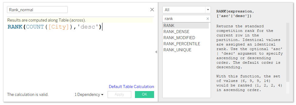
Let’s start with the basic function – RANK. The first argument is the measure according to which you want to structure your ranking. It also must have aggregation (for example, sum or average). The other optional argument is the ranking calculation method – ascending or descending. Descending order is set by default:
To better understand the way ranking is calculated, I will use the list of cities in Sweden grouped according to the number of orders placed (from the Sample Superstore database in Tableau):
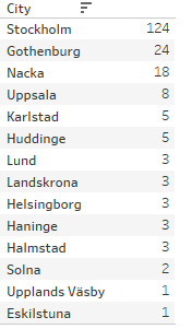
The beginning of the list is quite clear, then there are several cities with the same number of order. After adding a field with ranking, we get the following result:

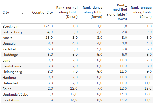
As you can see in the table, ranks are allocated according to the applied measure (Count of City). It’s good to pay attention to the positions with the same value – they receive the same rank. For example, Karlstad and Huddinge are ranked 5, and the next city is ranked 7. A position number 6 doesn’t exist.
Another important thing is that RANK functions are array functions. In the aforementioned example, the ranking is calculated along the Table (down). You need to bear that in mind when modifying tables and visualizations to ensure that ranking is calculated correctly.
Rankings in Tableau- RANK DENSE, MODIFIED, UNIQUE AND PERCENTILE
As I already mentioned, the basic difference between these functions is how positions with the same values are treated:

It is best illustrated by our example. There are 14 cities, and depending on the calculation method, cities with the same value can be positioned differently:
The situation is slightly different for RANK_PERCENTILE, which also is the least intuitive. The function returns a ranking percentile for a given position. In general, this type of function is not suitable for calculating rankings.
Visualizing rankings
It’s best to visualize ranking in the single point of time in the table. Why? Because we know the leap (or difference between levels), so adding information in the form of bar chart contributes very little:

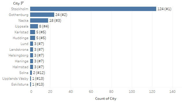
Ranking can also be placed as the additional element in the label on the bar chart with the main measure (a bracketed value):
Or as the element of the row header in a discrete form:

In the case of diverse types of score cards or KPI cards, you can use the highlight table – it will work best. In this context, ranking can be treated rather as a discrete value than a continuous value, and a highlight table will be perfect here. Below is the example calculation of ranking for product subcategories for four measures:
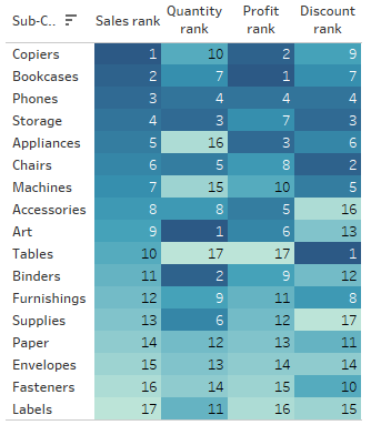
Based on this table, you can try to spot certain dependencies. For example, the “Tables” position is in the second part of the table, when it comes to sales, and at the very end when it comes to quantity and profit. This category also has the highest discount. This raises a question whether the least profitable category with the highest discount should be optimized in some way.
Adding time dimensions
The change of ranking over time can provide a little more input. The Context is particularly important in presenting the data, therefore it’s vital to understand the dynamics over time. We use a line chart for this purpose, adding time dimensions in columns, and the rank field in rows:

It’s worth remembering at this point that RANK functions are array functions. When you add another dimension (time), you also need to configure this function correctly to properly calculate ranking. You also need to pay attention to filtering and order of Operations in Tableau.
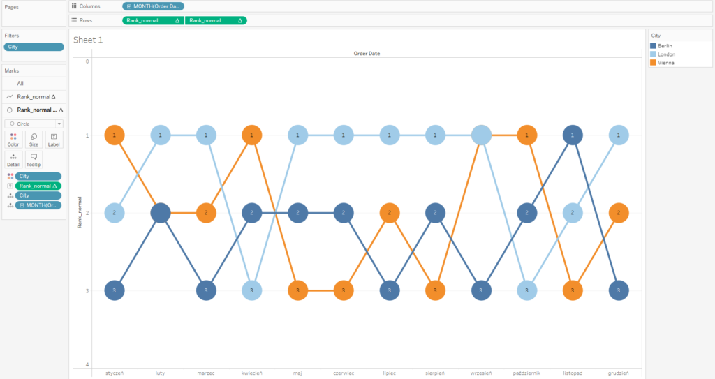
The ranking chart can also be enhanced by adding another graph – a circle chart in the dual axis, for example, to emphasize the labels. As a result, you will get the Bump chart:
Bump Charts
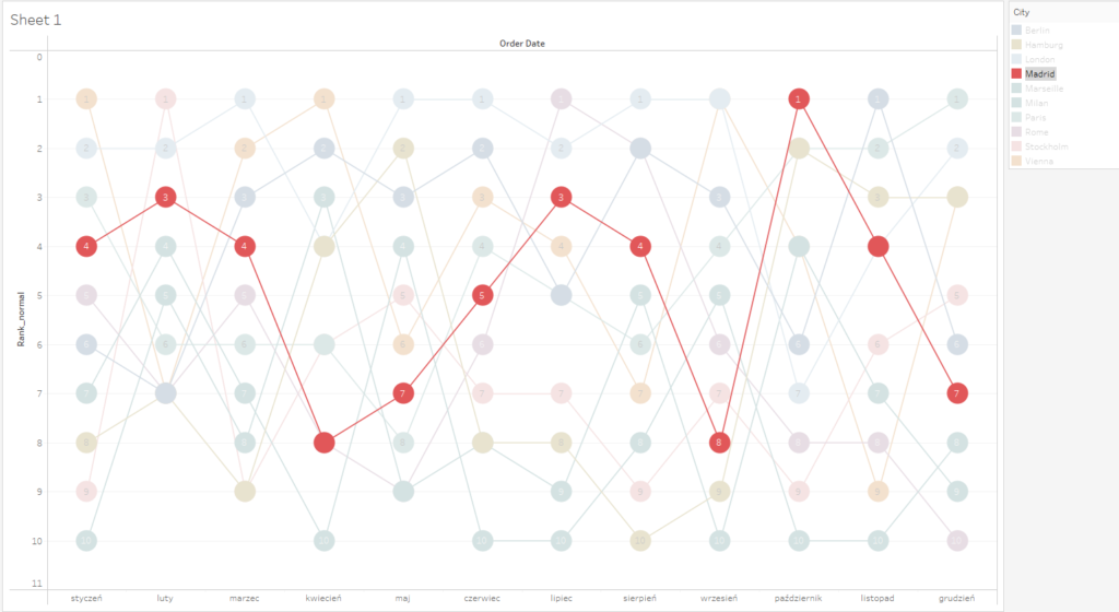
When creating bump charts, you need to pay special attention to the readability of the chart. When you have more categories, the chart becomes unclear and useless for recipients. For example, when you change the above chart from three to ten cities, this will impact its transparency. You can enhance its usability with the highlight option – to track changes in a given position over time:
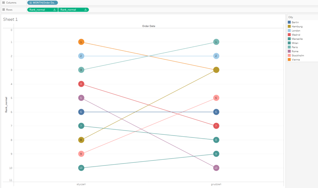
A slope char is a specific type of bump chart – it’s when you have two points in time. The chart becomes more transparent; however, it transmits less information.
In what situations are rankings helpful in Tableau?
In short – whenever order is important. Let’s assume that we supervise sales teams, and we want to introduce competition (or gamification) for our sales representatives. Every week or month – TOP3 get an extra bonus. Ranking will be perfect here, and the bump chart will provide the historical context. Rankings are a key element in sports – league tables, striker tables, tennis players rankings (WTA), FIFA rankings or boxing association rankings. It’s important to bear in mind that ranking is just one of the elements of communication, and it doesn’t show the value of a key KPI on its own. In our example of sales representative ranking, a bump chart will show us who’s number one, number two and so on, but it doesn’t present the differences between them. Similarly, in sports rankings the different between the first and second place can be minimal or huge. Therefore, when visualizing rankings in Tableau, it’s good to remember about complementing the picture with the values or indicators. As a rule, it should be the other way round – ranking can be an additional element of the visualization of the KPI performance.
Mateusz Karmalski,
Tableau Author
