On 24th April, Tableau launched two new types of charts for testing in Tableau Public: Sankey and Radial. It is the first of its kind beta testing of new functionalities that has been made widely available, and it will continue until 30the June. The feature will disappear after this date, but it is not unlikely that it will become a part of the basic Tableau. The time will show whether or not it is going to happen, however, it is worthwhile to have a closer look at the new options and test them in this unique pilot run.
Sankey Chart – history and application
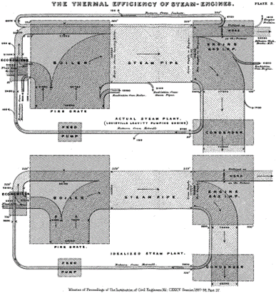
Sankey Chart is named after its creator – an Irish captain and engineer – Matthew Henry Phineas Riall Sankey, who in 1898 created a diagram of steam engine efficiency:
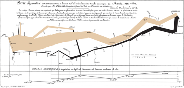
Later on, Sankey chart became a popular diagram which visualized different types of energy, heat, or material flows. It was used mainly in engineering or physics; over time it was also applied in other domains. Even before it was named Sankey diagram, Charles Minard had used a similar type of visualization to visualize Napoleon’s Russian campaign of 1812. The flow visualising the number of army men was marked on the map to highlight how devastating that war was.
Sankey Chart – currently and in business
Nowadays, Sankey chart isn’t widely used in business. It may seem to be too complicated at first glance, but when enhanced with interactivity, it doesn’t have to be like that at all. It can be applied in all scenarios with two or more dimensions or when you want to show the change in the process over time. It won’t not be suitable for executive dashboards, but it will work fine for operational dashboards.
Up to now, it was possible to create a Sankey chart in Tableau, but it required a lot of work. The calculations needed to recreate flows often reached a two-digit number. There were various templates to choose from, but they always involved adaptation of the data. The new function may be of great help and make the Sankey Chart more user-friendly, however this type of chart should be used carefully not to overwhelm users with too much information.
How to Create a Sankey Chart in Tableau Public
After logging in to Tableau Public, you will see a message:

Let’s start by opening the Web Authoring mode from the Create menu:

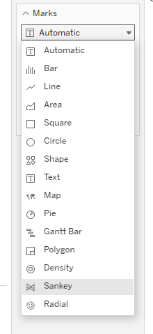
The web version of Tableau Public will open in a browser window. Next, you need to connect to the source of data – in this case, it will be Sample Superstore, the Orders sheet. In the next step, in the Sheet tab you will find a new type of chart in the Marks box:
After selecting the Sankey Chart, you will see new, previously unavailable features.
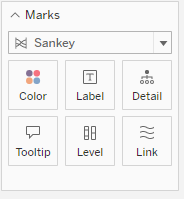
The first one is the Level, which is a node that shows various flow stages or dimensions which relationship we want to demonstrate. The second element – the Link – will define the connection between the nodes. Its thickness will reflect the flow value.
To create a Sankey chart, let’s start with the nodes:
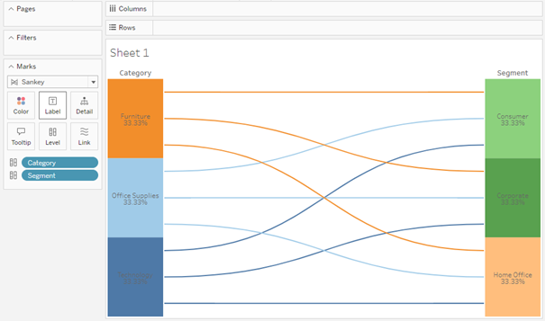
By adding the Measure to the Link shelf, you will get a full Sankey chart in less than one minute:
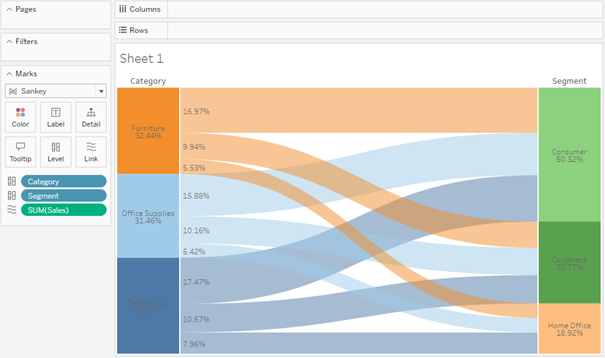
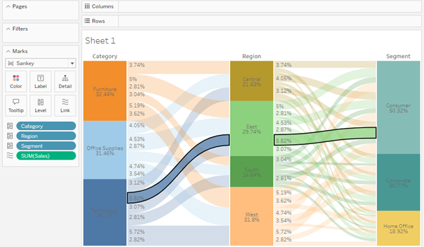
You are not limited to two nodes only, you can add more, however, it is easy to overdo it with the amount of information. Interactivity will be helpful here:
The current pilot version has some restrictions: you can’t edit the labels, the nodes aren’t interactive (only flows are), but if the charts are made available permanently, I am convinced that Tableau will solve these issues.
Radial Chart
Radial Chart is another type of diagram available in the pilot programme. It’s more like a Sunburst Chart – a multi-level Donut chart used to visualize multiple hierarchy levels. The Donut chart is in turn a Pie Chart with a hidden centre. Accessing this diagram was rather simple in the past – through dual axis or map layers – but now it seems to be even easier. After selecting this chart, you will see the following options:
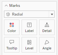
The Level is a new option that indicates new levels on the chart. The Angle which is well-known in Pie Charts, shows the size of the section:
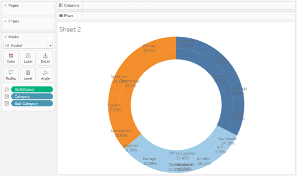
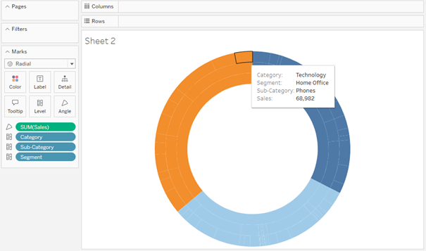
If you drag two dimensions in the Level and one Measure in the Sales you will get a Radial chart, which is in fact a two-level Donut chart. All steps are much easier than before, but because it’s a testing environment, there are considerable limitations: you can’t edit the Labels or the Colours, and only the outer ring is interactive. You can add new layers, but you should bear in mind that they need to be clear and functional:
The Radial Chart is less impressive than the Sankey Chart and has some limitations, as it’s more like a Pie Chart with several levels and an empty centre. Nevertheless, it can be a useful tool to visualize hierarchical data, as long as it’s not too much.
New chart types are a great way to expand the existing visualization tools
Sankey and Radial charts are excellent tools that complement the standard set of visualizations available in Tableau. They cannot be applied in all business processes, but can be useful in some other areas. Most importantly, Tableau will be even more flexible, making the preparation of complex charts a less time-consuming task. There are many more other diagrams to come such as Chord, Rose, Stream…
Mateusz Karmalski Tableau Author


