A bullet chart is a variation of the bar chart developed by Stephen Few. The aim was to replace gauge charts, which worked similarly to the gauges in car dashboards. Bullet charts are helpful when you need to compare gauges with one or more references, and is perfectly suited for comparing KPIs or the extent to which the goals have been achieved.
Gauge vs bullet
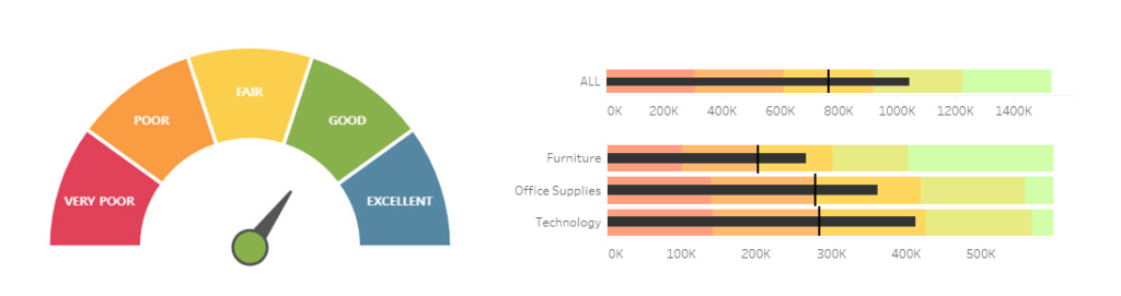
Analytical dashboards were often referred to as “manager cockpits.” It corresponds to the manager sitting behind a steering wheel of the business, who needs a set of indicators, the same as a car driver or pilot. For this reason, dashboards also have gauge indicators which show KPIs. Although they are visually attractive, they pose certain challenges. The first is space – they occupy quite a lot of space compared to the information they present. And space plays a vital role in dashboards. The second drawback is that they aren’t good for comparing different measures – they are fine in terms of visualizing one measure, but if we need to compare the same measure according to different dimensions (e.g., categories or reasons), this can be challenging. The third drawback is that it’s difficult to interpret changes over time. Some of these problems can be solved with a bullet chart, which is a “stretched” gauge:
Bullet chart – elements
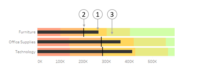
Before we start creating a bullet chart in Tableau, it’s good to understand its elements. The first and the most important is a bar, which indicates the main KPI that is measured (1). The next one is a reference in the form of vertical dash – it can show us the previous period (2). “Background” under the bar is a third element, which shows the extent of the KPI achievement by means the color defined earlier (3).
The above example clearly demonstrates the advantage of the bullet chart versus the gauge chart – the chart with three categories occupies the same space as the gauge for one category. It’s not only easy to compare the gauge in the specific category versus reference, but also the values in between them:
How to create a bullet chart
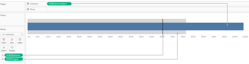
We can create a bullet chart in Tableau from the “Show Me” menu. We need two measures in order to prepare a basic bullet chart. We are going to use Actual Sales as the first measure and a Reference.
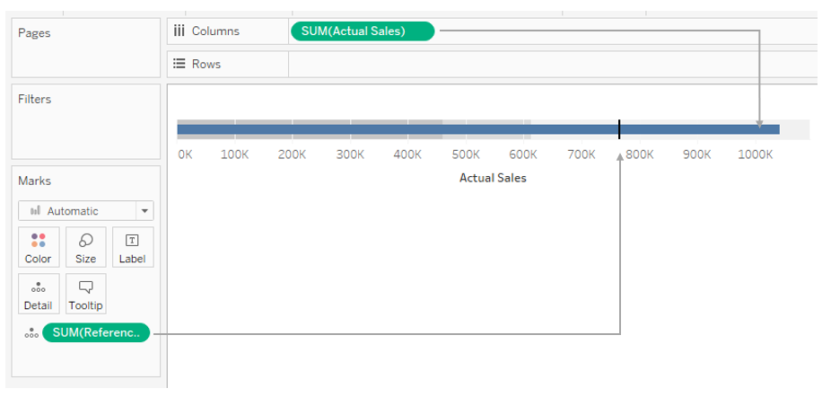
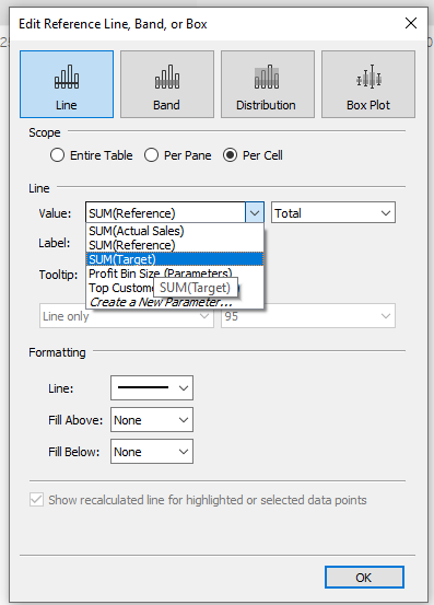
Tableau has automatically populated a bullet chart; however, you can modify it to suit your needs. It’s advisable to first understand how Tableau populates this chart. It’s simply a standard bar chart enhanced with two additional elements: a reference line and a distribution band. You can check this by clicking on the X-axis and displaying the Edit reference line menu:
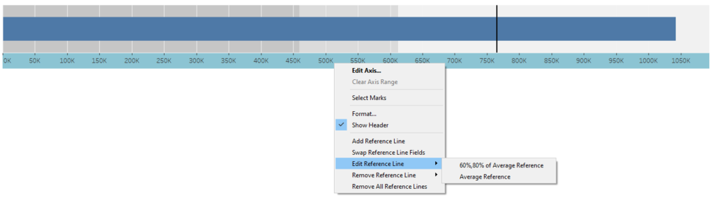
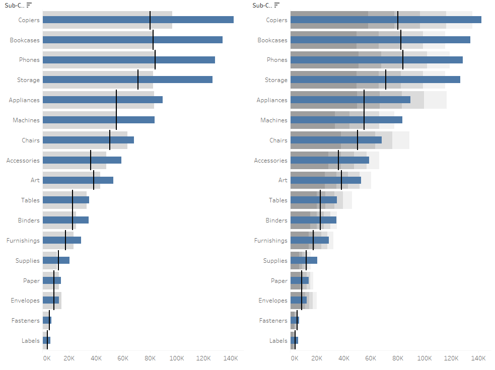
Most importantly, you can edit these elements as needed. As default, Tableau creates a reference band as the ranges of 60-80% of the value. We can change this – for example to 50, 75 and 125%:
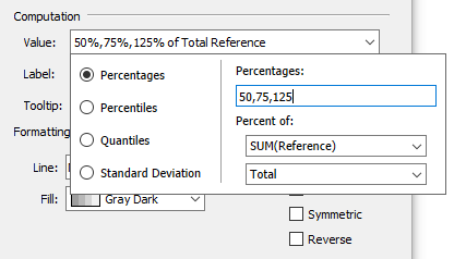
You can choose percentiles, quantiles and standard deviations. A modified bullet chart can look as follows:
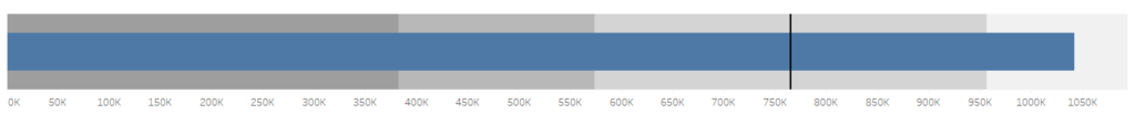
The ranges are: 0-50%, 50-75%, 75-125% and above 125%. You can see at a first glance that the execution of this indicator exceeds 125%.
Adding a third measure
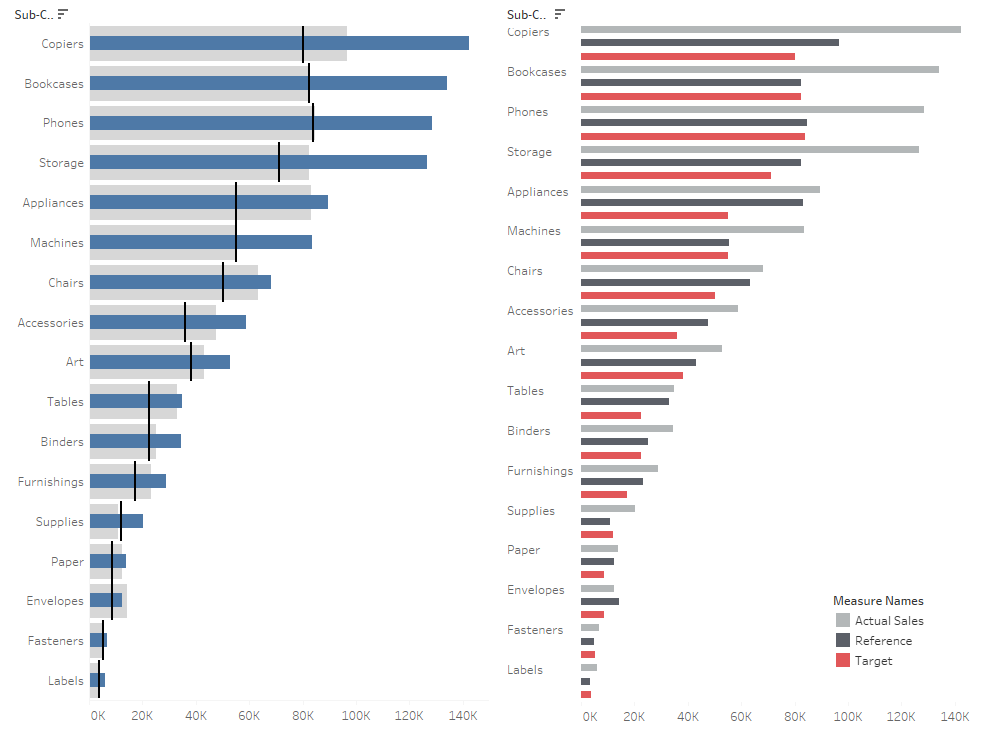
Similarly to the distribution band, you can also modify the reference line. In our example, we will add another measure (“Target”) to fully exploit the potential of the bullet chart:
As a result, the chart shows Actual sales (Bar) vs Reference (Distribution band) and Target (Reference line):

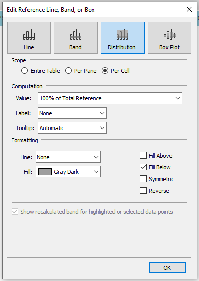
To simplify it further, if you don’t need the execution ranges of the KPI, you can set the distribution band to 100% and deselect the Fill Above field:
As a result, you will get a KPI chart that corresponds to two reference measures (e.g. the previous period and the target, forecast and budget etc.):
I have already mentioned that a bullet chart is simply a bar chart enhanced with a distribution band and a reference line. Even if the template available in Show Me is easy to use, it’s often better to build a chart from scratch. This way you are able to place specific measures in respective fields that represent the relevant elements. You can also add other options (reference lines, distribution bands), but please take into account readability of your chart.
Bullet chart- applications
Bullet charts, both in a simple form and a more sophisticated one, will always work, if you need to report KPIs or measure the achievement of goals. Presenting the KPIs only, e.g. for sales, does not tell the recipients much. Is sales at the level of 1 million good or bad? It is a lot or a little? Without a context, history, or reference, we are unable to determine it. A bullet chart helps you add the context. Moreover, its compact form allows you to present a significant amount of information in a relatively small space. Let’s compare the execution of the target against two references in a standard bar chart and in a bullet chart:
It’s much easier to understand the situation from the bullet chart. However, you need to remember to not overload it with information, as it will become unreadable and more difficult to interpret. Especially, when you add too many ranges, they might be hard to distinguish in the color scale at a first glance:
Various distribution bands will be a good option when you need to evaluate the percentage proportion of the target completion – having one range for the entire area simplifies interpretation. You can enhance the main message by coloring bars according to the level of completion. To some extent, it is a repetition of the information hidden in the distribution band, however it facilitates quicker understanding of the situation by looking briefly at the chart:
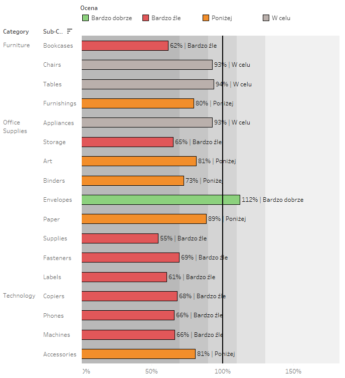
In summary, a bullet chart can definitely be especially useful when visualizing the execution of KPIs. However, you must bear in mind not to overload it with information, so that the chart is not only useful, but also transparent and comprehensible. For these reasons, simplified versions of this chart usually work well in dashboards – with one or two references and without distribution bands. When you want to use distribution bands, remember to label them properly – so that the end user knows what’s going on in the chart.
Mateusz Karmalski,
Tableau Author


