Visualizing the Distribution of Data. At the early stage of analysis, it is vital to know the data with which you are working. Are these numerical or descriptive values? Which variables are important? And how are these values distributed? The last element is key in understanding your data, as it helps find answers to the essential questions – What is the range of variables? How are they distributed? Is their distribution symmetrical? Are there any dominant characteristics or significant outliers? The answers to the above questions will allow you to build knowledge about the data you are working with. How to facilitate the understanding of the distribution of variables using data visualization tools?
Using a histogram to analyze numerical variables
Histogram is a specific bar chart, where the Y-axis counts the values, and the X-axis counts the categories or ranges of the numeral value. This type of chart can be easily created in Tableau – all you need to do is move the required measure to your chart to be able to see the option Histogram in Show me:
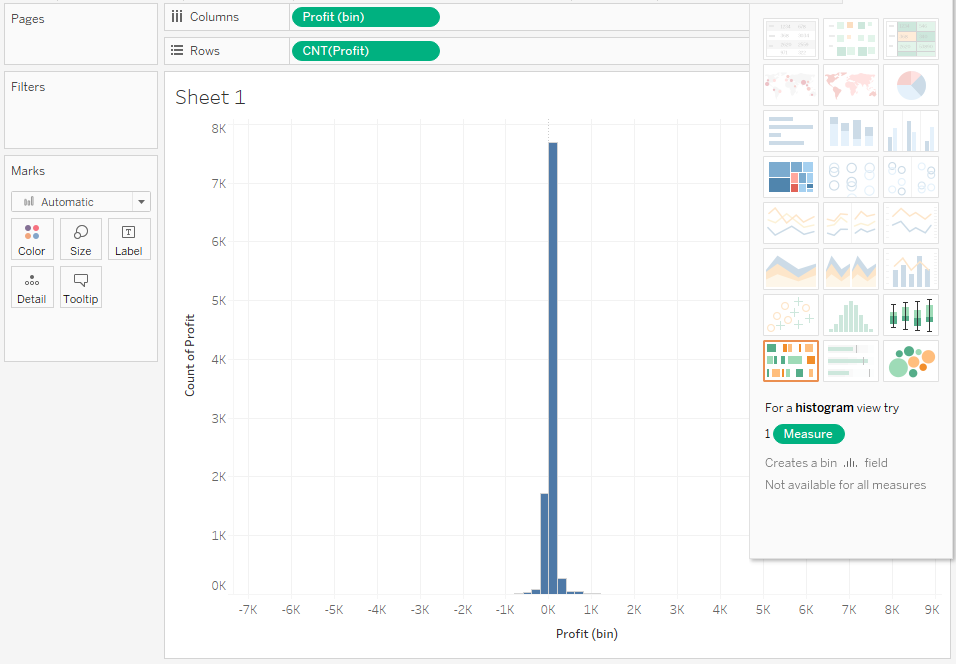
As is always the case, the chart created by Show me requires further processing. Let’s start with the interpretation of the chart. The distribution is symmetrical; however, it is slightly outstretched on both sides. This indicates that there are outliers which hinder the actual analysis. At the same time, they are so small that they cannot be identified on the chart. Let’s try to remove these values by limiting the scope of the Profit variable:
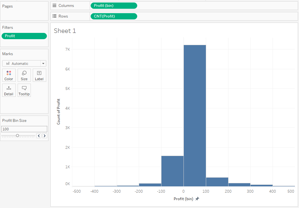
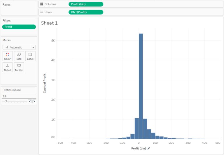
As you can clearly see, most of the values fall in the range of 0 to 100. You can reduce the size of bin on the X-axis to better understand the distribution of variables in the range close to 0:
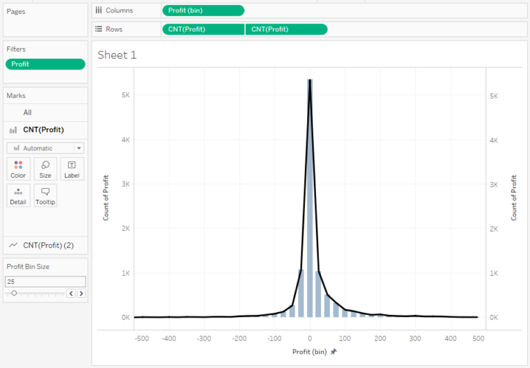
It is also possible to analyze the histogram as a line chart or area chart, by applying another axis with a line or area chart:
The distribution of variables for categories
Let’s try to analyze the distribution to get a better understanding of the categories. For this purpose, we will assume that we want to see the distribution of profit according to such categories as Region and State:
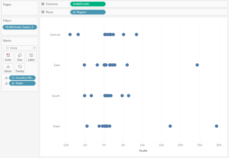
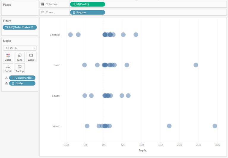
The problem of this approach is that the points overlap each other, making it more difficult to identify where the data is centred. You can resolve this issue by reducing Opacity:
If the clarity is still not good enough, you can change the above dot plot to a jitter plot, by adding random distribution of the data points in the category:
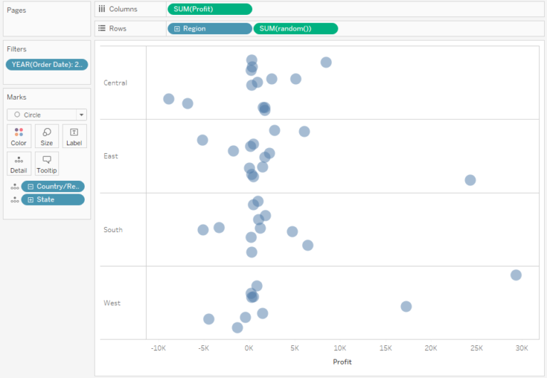
This way you can easily identify the data points, as overlapping is now limited. However, this can give rise to questions, such as what is shown on the Y-axis. Users will usually try to seek the additional meaning of the vertical position of a given data point, whereas it is a random and unsignificant number.
If there are a lot of points – use a Box Plot
If you had a larger number of data points, it would be hard to make any conclusions based on the dot plot, or jitter plot. In this case, it is better to use a Box Plot – it is a visualization technique that allows to depict the statistics of a set of points:
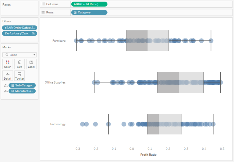
How to interpret the box plot? The main point is the median, from which the 25th and 75th percentiles are measured. The area between them forms a box, and the line in the middle, which divides the box into two parts, is the median. Another elements are whiskers, which show the lowest and the highest values in the dataset, however their distance is not greater than 1.5 times the range between the 25th and 75th percentiles (it is called the quartile range, which is the width of the box). All values except for the whiskers are considered as the outliers:
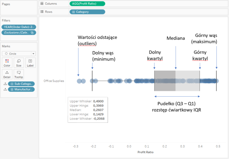
A Box plot is a useful technique for visualising datasets. However, it’s important to bear in mind that not all users know how to interpret it. Therefore, when working with this chart you should use appropriate labels to avoid misinterpretation.
The distribution of variables according to several categories
Up to now, we have been visualising one numerical variable, and according to one dimension. However, if you need to analyze the distribution according to two categories, you can use a heat map, or – in other words – a highlight table. Extending the table by adding bar charts on the sides will allow you to analyze another aspect by comparing the accumulated values:
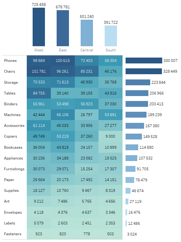
It is a very useful way to expand the tables which are the most popular among users, with additional visual aspects.
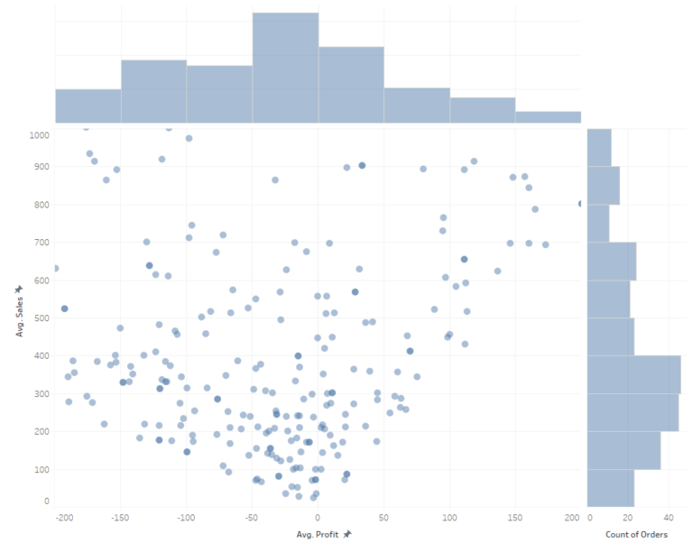
Another approach is to analyze the distribution of two numeral variables at the same time. In the case of a large number of data points, it allows to view how they are distributed. In the below example, a scatter plot is the main chart, and it has been extended with marginal histograms:
Visualization of distribution is always a simplification
The distribution of data provides the summary information such as what ranges of values it includes, what their variability is like, whether the distribution is symmetric, which values are the most common, and whether there are any outliers. Due to a large number of data points, such aggregative approach is usually the most suitable, since showing all observations may be overwhelming and unreadable to the users. The above methods don’t cover all of the visualization techniques available, however, they are the most practical. They are also the easiest to prepare and understand. Apart from these tools, there are also such charts as a beeswarm – similar to a jitter plot, however here the data points are distributed evenly. A violin chart is another option which enables you to create a histogram by combining the area chart with the box plot. As you can see, there are various options available, but the best approach is to rely on simplicity and usability, while keeping in mind the needs of the end users of your visualizations.
Mateusz Karmalski Tableau Author
Tableau Author


