NewDataLabs

Tableau - Business Intelligence Tools

  • Solutions
    • ETL
      • Tableau Prep
      • Airflow
      • Power Query
      • Microsoft Integration Services
      • Fivetran
    • Data warehouses
      • Snowflake
      • Google Big QUERY
      • Microsoft SQL Server
      • PostgreSQL
      • Web analytics
      • Amplitude
    • Business Intelligence
      • Tableau
        • What is Tableau?
        • How to implement Tableau properly?
        • Interactive management dashboard
        • Tableau price list
        • Products of Tableau
          • – Tableau Desktop
          • – Tableau Server
          • – Tableau Prep
          • – Tableau Online
        • Tableau Audit
        • Tableau Day
      • Power BI
  • Services
    • Tableau workshops on your data – Proof of Concept
    • Preparation of data – ETL
    • Reporting and data visualization
    • Migration services
    • Tableau training courses
    • Embedded Analytics
  • Salesforce
    • Salesforce CRM
      • Customer relationship management
      • Sale
        • Sales opportunity management
      • Business Intelligence analysis
      • Salesforce Manufacturing Cloud
      • Salesforce Service Cloud
      • Salesforce Marketing Cloud
    • Services
      • Proof of Concept
      • CRM workshops
      • Implementation of CRM
      • Post-implementation support
      • Data migration
      • Salesforce training
      • CRM consultancy
      • Salesforce integrations
    • Tableau + Salesforce
  • About Us
  • Customers
    • Our Customers
    • Customer stories
      • Totalizator Sportowy Sp. z o.o.
      • Snieżka S.A.
      • Werner Kenkel Sp. z o.o.
      • DOZ S.A.
  • Events
    • Webinars >
      • Salesforce
      • Tableau
      • Power BI
    • Tableau Training Courses >
      • New Data Model
      • Tableau online course
      • Tableau training courses
    • Power BI Training Course
  • Blog
  • Download Tableau
    • Tableau Desktop – Trial
    • Tableau Server – Trial
    • Tableau Prep – Trial
    • Tableau Reader
  • Contact
EN / PL

What is a Heat Map?

2024-01-03

When I conduct training sessions, I always try to ask participants what their imagination tells them, when I say a heat map. I usually hear about a map with hues of brown, red, orange and yellow. Only in Tableau, this visualization has a completely different name. Today I will discuss a heat map, its advantages and drawbacks and also, how it differs from a density map and a highlight table.

Before I focus on heat maps

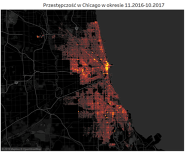
Visualization, which informs us about the intensity of a characteristic in a given place on the map by intensifying color is a …. density map! This can be confusing, because this map looks exactly like what most of us would imagine a heat map. An example of this visualization is shown below. The brighter the point on the cartogram, the more crimes occurred in a given place in Chicago.

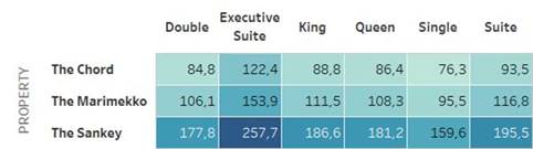
There is also another type of chart which can be easily confused with the heat map in Tableau. It’s a highlight table, which is a table colored in accordance with the intensity of the characteristic. The greater the value – as in the below assessment of hotel rooms – the darker the color. This visualization also gets confused with the heat map, in particular when no numbers are shown in it.

Heat map in full glory

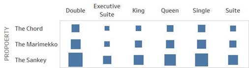
We know now, what you will not find under a heat map in Tableau. So, what does the Show Me tab contain? The chart showing the intensity of the characteristic by the size of the icon! As default, it’s going to be a square. And attention! By default – contrary to your intuition – you will not find color in this chart. You can add it, but you don’t have to do that. In other words, a table with the average evaluations of hotel rooms in the form of a heat map would look like this:

Advantages and drawbacks of a Heat Map

Is this table clearer? It isn’t, I’m afraid. Can you precisely determine the differences in values on its basis? It’s also difficult. It’s easier than comparing the density of two colors, but it’s still a challenging task for a human eye. The human eye is able to compare lengths of sections, but not the sizes of figures. It’s fine when we compare squares or rectangles. It’s almost impossible in case of more complex shapes. Circles would be sufficient. There is a research evidencing that the bigger they are, the more confused we get, as we tend to underestimate their size. Of course, we can handle this by comparing circle radiuses instead of their sizes. This approach, however, is less intuitive for most of the recipients.

Does this chart have any advantages? You cannot see figures on it, and it’s not suited for precise comparisons. However, it helps get a broad understanding of the situation. It’s convenient, but it requires to make a brief introduction to the audience. A good example is the below chart which presents one year of the operations of the Sample Superstore.

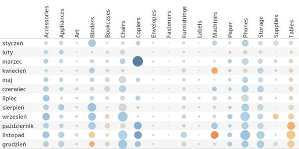
At a first glance it looks rather unclear, but if you add a few facts, it will become more informative. The size of dots corresponds with the size of sales in individual product subcategories in the following months of 2020. The color of dots is the profit made by the store. With this knowledge, the user can almost immediately spot, which departments had exceptionally low sales (envelopes, fasteners, labels and art). It’s also easy to see that the sales of tables, even though it’s significant, it’s actually unprofitable. This chart will not tell us many details, but it allows us to make quick global conclusions.

Agata Mężyńska

Tableau Desktop Certified Professional

Webinars
> Amplitude Webinars
> Tableau Webinars
> Power BI Webinars

Tableau training courses
Power BI online course
ETL
> Tableau Prep
> Airflow
> Power Query
> Microsoft Integration Services
Data warehouses
> Snowflake
> Google BigQuery
> Microsoft SQL Server
> PostgreSQL
Business intelligence
> Tableau
> Salesforce
> Power BI
Web analytics
> Amplitude
Salesforce
> Customer relationship management
> Sale
> Sales opportunity management
> Analysis Business Intelligence
> Salesforce Manufacturing Cloud
> Salesforce Service Cloud
> Salesforce Marketing Cloud
Contact

contact@newdatalabs.com


601797783
+48 781 648 194


Adres
Correspondence address:
al. T. Boy’a – Żeleńskiego 26,
51-160 Wrocław

Copyright © 2025

Manage Consent
To provide the best experiences, we use technologies like cookies to store and/or access device information. Consenting to these technologies will allow us to process data such as browsing behavior or unique IDs on this site. Not consenting or withdrawing consent, may adversely affect certain features and functions.
Functional Always active
The technical storage or access is strictly necessary for the legitimate purpose of enabling the use of a specific service explicitly requested by the subscriber or user, or for the sole purpose of carrying out the transmission of a communication over an electronic communications network.
Preferences
The technical storage or access is necessary for the legitimate purpose of storing preferences that are not requested by the subscriber or user.
Statistics
The technical storage or access that is used exclusively for statistical purposes. The technical storage or access that is used exclusively for anonymous statistical purposes. Without a subpoena, voluntary compliance on the part of your Internet Service Provider, or additional records from a third party, information stored or retrieved for this purpose alone cannot usually be used to identify you.
Marketing
The technical storage or access is required to create user profiles to send advertising, or to track the user on a website or across several websites for similar marketing purposes.
Manage options Manage services Manage {vendor_count} vendors Read more about these purposes
View preferences
{title} {title} {title}
The newdatalabs.com/en website uses cookies. We use information saved using cookies and similar technologies, including for advertising and statistical purposes and to adapt our website to the individual needs of users. By continuing to use the site, you agree to the terms.Close