The term “Dashboard” originates from the concept of management dashboard, where the company officer, like a plane pilot or a car driver, has access to the most important information needed to manage the business. This concept has been further developed – right now the dashboard is an analytical tool used at all levels of the organization, from the CEO to regular employees. Many companies have adopted a data-driven approach, where dashboards serve as the interfaces between the users and the data. Designing dashboards is a broad and complex topic that would require a book, but I’ll try to describe some basic concepts you should know in order to create them.
1. Begin with functionality and users
When you are about to start designing a dashboard, you must know what you want to achieve and who will be using it. There are many types of dashboards, including management, analytical, operational or strategic dashboards. All of them will have different users and organizational levels, which means that you will have to adapt your approach to present the data, its scope, and the level of detail required. The CEO needs to see the entire organization but will focus on the key measures. The operational employees should see their section in more detail. Therefore, it is good to start by considering the functionality of your dashboard and gathering the requirements and expectations from the business point of view.
2. Creating a dashboard is an iterative process
It rarely happens that we create a dashboard, implement it within the organization and that is the end of the process. Users will report feedback and their needs tend to change. Developers must take it into account when designing a dashboard. It is easier to create a basic version and improve it over time than to develop a perfect product. You need to start with a beta version, present it to the organiation, gather feedback and release the updated version.
3. Select KPIs
The scope of the Key Performance Indicators depends on the dashboard functionality, but whatever the case is, you need to keep in mind to avoid too much detailed information. Irrespective of the function, users have a certain level of perception that can easily be overloaded. It’s better to create more views with less information rather than have fewer views with more details.
4. Ensure you have context
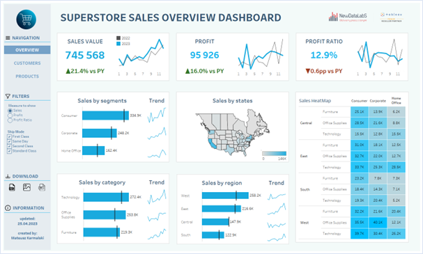
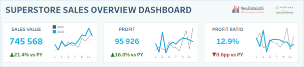
The indicator value in itself often doesn’t tell very much. Let’s assume that the sales in X company have reached 1.2 million this year. Is it a lot or too little? Is that good or bad? It’s hard to answer these questions out of context. Even if we know the business, we are unable to keep a track record of all these indicators in our brain. So it’s important to provide context in two forms. The first is a reference: it can be a prior period, budget, objective, target, or forecast. Anything that can help compare the actual values with the reference values and tell if the business performs well or bad. The other way to provide the context is to show a time trend – is the current performance level of the indicator a result of a long-term trend or is it a one-off event? Presenting both these elements alongside the actual performance will give a full picture.
5. Be consistent
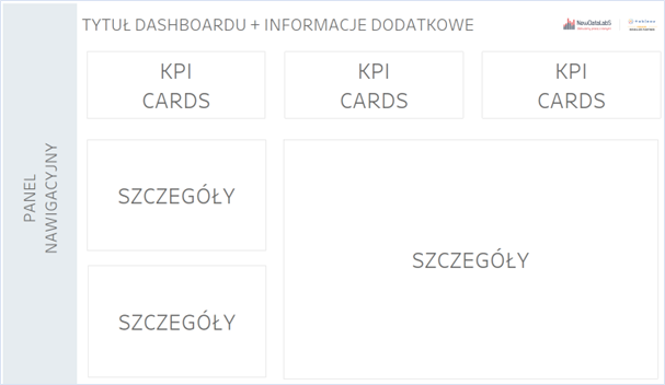
When creating a dashboard, you should keep in mind that it must be consistent – that the user knows their features and is able to find them when navigating through various views. The title always goes on top – users must know what they are looking at. Taking into account the user experience and the similarity to applications or web developments, the navigation panel should be placed on the left side. You can add such features as navigation, filters, functions (e.g., download views), and additional information. Such a dashboard will look more like an application, so it’s important to keep in mind the user experience. Moreover, the colours should be used consistently – the same colour palettes and the same labels should be applied in all dashboards.
6. Be specific
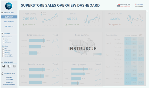
The quality of data should be a top priority, as it will determine the usability and credibility of your dashboard. In addition, you should pay attention to providing clear definitions of the various capabilities available in your dashboard – to define KPIs, units of measure, or abbreviations. Users should also be made aware of any interactive elements. Developers must not leave room for interpretation of the information presented in the dashboard, as everyone of us can have a different understanding of the same concepts. Drawing different conclusions based on the same information is another thing, but we must first focus on providing the relevant information. For this purpose, we can use tooltips, collapsible containers or dynamic zone visibility – to display or hide the instructions:
7. Why Back-End matters
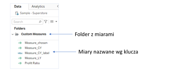
When developing dashboards, we tend to focus on users and their experience, however, in order to simplify the process of providing management information, we must integrate the back-end functionality. This will make creating dashboards easier and allow us to adapt them to the changing business requirements, or design new underlying tools. How to do that? The best practice is to keep order when naming calculations by using the same format in a consistent way (e.g., Sales_Actual, Sales_LastYear). To ensure better transparency, measures or dimensions in Tableau can be grouped in folders.
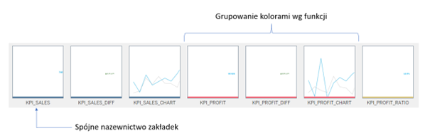
Similar rules need to be applied to tabs with charts in the Worksheet – they should be named according to the adopted key principle, and they can be grouped by colours to differentiate their functions. To facilitate navigation, it’s a good idea to hide the tabs which have been already used. Another useful practice is to create documents with descriptions of calculations, views and functions – this will make it easier to go back to any dashboard if needed in the future.
Dashboard is a living organism
To summarize, a dashboard should not be treated as a finished, one-time product – it is more like a living organism, which achieves its final form over time. This doesn’t mean the end of its management process as the business needs are changing, the analytical capabilities are increasing, and the design trends are evolving. The role of the developer is to keep the dashboard alive. To do so, you need to ensure that you have a good back-end, maintain ongoing communication with the business to respond to the feedback and introduce changes if needs arise, while providing the best user experience possible.
Mateusz Karmalski Tableau Author


